
NOTE: I've rewritten this post and redone the graphic. The original map on which I based the reconstruction, provided by the USGS, is distinctly different than the one the USGS provides today. The difference is, in fact, rather dramatic. In comparing the older and newer versions of the maps, I have decided to assume the later, more recent, version is more correct. I admit to being a little annoyed at the USGS providing a truly bogus map on their web site, but that is water under the bridge, as it were. So, the following post is edited a bit and a new graphic is provided. Thanks to wehappyfew for pointing out the likely error on the map.
There have been times in the past when there was very little ice trapped in glaciers. During this time, sea levels were higher because that water was in the ocean (most of it, anyway). It has been a long time since then. However, with global warming, more and more glacial ice is returning to the sea and this contributes to sea level rise.
The amount of fossil carbon that needs to be released into the atmosphere to cause most of the glacial ice to melt is not known. We can't directly use ancient time periods to assess modern sea level rise by measuring the sea levels from those periods because there has been too much other stuff going on in ocean basins and along current coast lines. But, we can estimate that there was very little glacial ice during, for example, the early Eocene, and the transition of Carbon in the atmosphere to the formation of glaciers might be under 800 ppm. So, if we double the current amount of CO2 in the atmosphere, maybe that would melt all the glaciers. There was more methane in the air at that time as well, but we are releasing plenty of methane as we also release Carbon, so that's not much of a problem. The biggest factor is probably this: The configuration of continents have changed since that time to increase the likelihood of glacial formation at the poles, so returning to some Eocene (or other) atmospheric CO2 value may result in much less melting. But that's OK, because we can certainly increase the amount of carbon to more than around 800 ppm!
If we release CO2 at approximately modern rates (baed on population size), and have population increase up to a point, thus increasing CO2 release (in other words, do nothing significant to mitigate Carbon release, increase the number of people actively releasing it, and population goes up towards 8 or so billion) we can reach over 1000 ppm by 2300 AD, or sooner. That's surely enough to melt most of the glaciers except bits and pieces in the coldest regions of Antarctica.
It is estimated (see this web page.) that there is about 80 meters of ocean trapped in glacial ice. There are plenty of web sites out there that allow you to add ocean height to see how coastal regions would change, but the ones I know about don't go to 80 meters. So, to find out what North America would look like, I found a map that has pixels to indicate altitude, with different colors representing topography, at a fine enough level to work with.
The USGS has a map with color coded topography. There is a color break at 60 meters, which is much less than the maximum possible sea level rise. The next break is at 114 meters. That is higher than sea levels will rise. However, if sea level rises to about 80 meters, it will do so unevenly (it may, for example, be much higher in the Carolinas). Then, as sea level rises, the land will be pushed down various amounts by the weight of the water, so 80 meters might be considered a minimum estimate of rise in some areas. Even more important, I suspect, erosion would cause important changes. If you look at, say, a 60 meter topo line in a region made of something other than hard rock, you have to assume that transgression of the sea including the effects of erosion would move way inland in some cases, beyond that topo line.
So, since we are at present looking for an 80 meter contour line easily located on the right scale map, and we only have 60 and 114, but the real contour line we are probably looking for is higher than 80, we could round UP to 114. But that would almost certainly depict inundation of areas that won't actually be inundated. So, what I've decided to do is to put the ocean at 60 meters, then make a grey area (to reflect, well, this being a grey area!) between 60 meters and 114 meters. With ALL of the ice melted, the shoreline will likely be somewhere in this grey area, probably covering all of it (and more?) along the south coast and probably much less in Maine. Either way, Florida is toast. Wet soggy toast.
Also, I decided to focus in on this map a bit and depict the US east of the Rockies. At this scale, the west coast is fairly uninteresting using this method (the continental margin is right at the coast, so it is very steep). And, the transgression effect, the sea moving laterally across the land after a rise, is probably very locally variable and unpredictable there anyway.
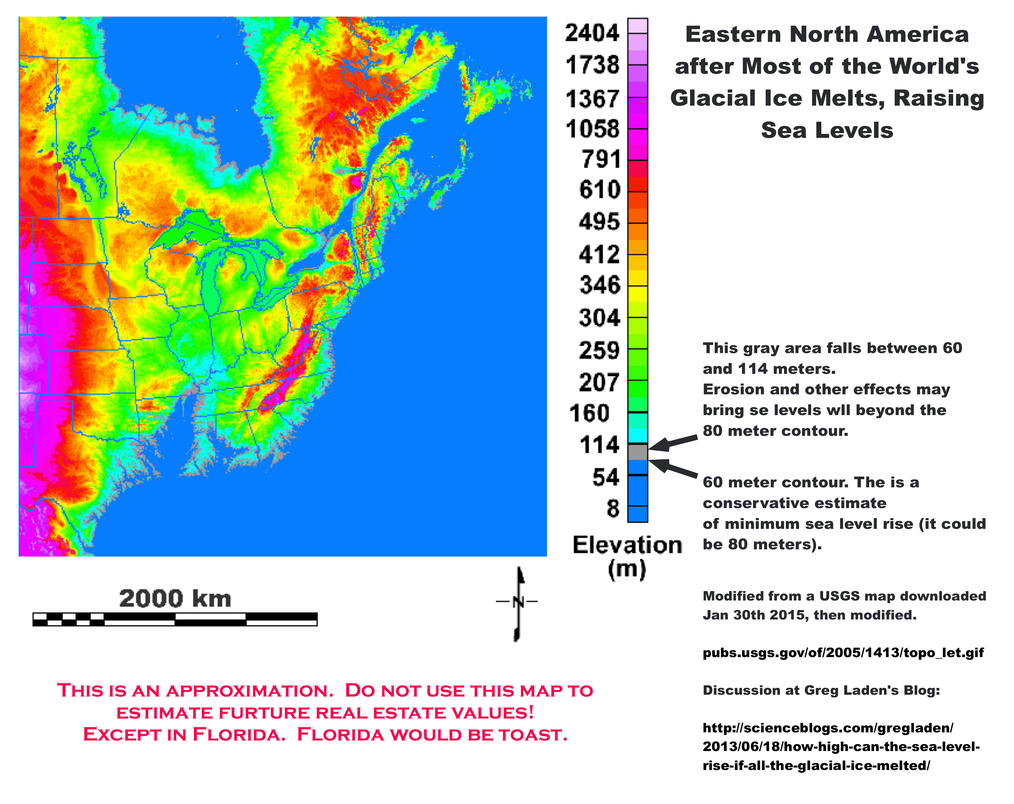
One of the interesting things I discovered is that when defining the zone between 60 and 114 meters, that turns out to be a fairly narrow strip along much of the coast. This is what one would expect if somewhere in that zone is the original high strandline from the last time sea levels were that high (a few million years ago or so). So that's cool.
This is a VERY ROUGH approximation. Just for fun.
I'm not sure if there's a large sea in the middle of Mexico, or a large region below sea level.
Yea, I think it is an inter-mountain region, probably not connected to the sea.
As a caveat, the estimation that we could reach 1000 ppm by 2300 assumes that we will continue to have huge human populations consuming fossil fuels at similar rates. Most geologists do not seem to think there are enough high-quality, "easy" fossil fuel reserves to continue at today's extraction rates for anything near 300 years before continued extraction for wasteful uses like burning becomes economically or energetically unfeasible. Of course, there is always the carbon to be released from killed forests and methane clathrates. If we do manage to keep producing carbon at that rate, though, we would then get the pollution crisis predicted in the second "Limits to Growth" scenario. Imagine the climate in 2200 - the crop failures, famines, water shortages, and the massive wars with which humans would inevitably respond. It doesn't seem possible that we could sustain a population of eight billion for very long under such conditions. The take-home message should be that we all WILL consume a lot less in future - either because we develop more rational cultures, or because we are forced to - so we might as well minimize the pain by moving in that direction voluntarily, and that will also minimize the baked-in environmental damage.
If I were feeling unkind, I'd say that the most noticeable feature of that map is the inundation of exactly those areas of the USA that nobody in the rest of the world would miss. Shame about the California central valley, but there's always collateral damage...
Well, don't worry about North Carolina. Their legislature has amazingly powerful and magical capabilities: they have simply outlawed sea level rise.
Seriously, tho, Greg, great post!
What I see is an awful lot of productive farmland, as well as major coastal cities, going under. A 60 meter rise would be a catastrophe almost beyond imagination -- and that's just in the US. Then there's the rest of the world...
Jane, it does not assume that actually. It is using a model that assumes that the population crashes and is in the seven figure range by that time. If population does not crash we'd reach that much, much sooner. There's more than enough carbon available in easyish to get coal, tar sands, etc. to get close there. The take home message is actually that we will have major population crashes and ruin the environment at the same time. It is probably the case that the idea that climate change is the solution to the population problem which if solved will save the climate is very wrong.
One of the problems is that while CO2 will eventually return to fossil sites where we are removing it from, that requires a mass extinction event in at least one major ocean. So, I suppose that would be good!
Karen: Right. Entire countries would totally disappear! The US would be lucky, as would much of Africa (like in that movie).
Given the long response time of the climate, there is probably already enough CO₂ equivalent GHGs in the atmosphere to create this scenario by the end of this millennium, unless we act soon.
Seems to me that the long-term survival of our species will depend on our ability to regulate GHG concentrations on a massive scale using CO₂ reservoirs, or risk going 'out of bounds', which is where we are headed already.
Trees won't be enough to sequester CO₂ quickly enough - so need urgent development on atmospheric and oceanic sequestration on an unimaginable scale.
As the planet becomes overpopulated, deforested and turned into a gigantic conglomeration of favellas, factories and shopping malls, our descendants will need to regulate the atmosphere, oceans and food system artificially. Not a nice prospect.
I guess our current generation is the last to have enjoyed the best that the Earth had to offer, before tanking.
Been an honour to share this little blue dot with your all for a few billionths of the age of the universe! :-)
It is using a model that assumes that the population crashes and is in the seven figure range by that time.
As people get hungry and thirsty, they are likely to go to war over resources like food and water. That, if nothing else, will ensure a population crash. Some of our most valuable agricultural land ends up under water: not only does California's Central Valley become an extension of San Francisco Bay, but Puget Sound extends itself southward to Oregon's Willamette Valley (leaving the present-day Olympic Peninsula and Willapa Hills as islands), and at least three entire states (Florida, Louisiana, and Mississippi) disappear. That's in addition to climate shifts, as well as depletion of irrigation water pushing much cultivation out of Kansas and Nebraska. And as Greg points out, the US fares better than many other countries which would disappear entirely: Bangladesh and the Netherlands, to name two.
Then there is the question of what happens to refugees. Sixty meters of sea level rise will inundate a number of cities which are well inland: Memphis, Portland (OR), and Montreal would be among the definitely lost. Nashville, St. Louis, Dallas, and Fairbanks end up near the new coastline, so they might be able to reinvent themselves as seaports, but they'll have to deal with the influx of people whose homes end up at the bottom of the expanded ocean.
"It is using a model that assumes that the population crashes and is in the seven figure range by that time."
Thanks. That couldn't be determined from the original post, which did not describe the model, but said: "If we release CO2 at approximately modern rates (baed on population size), and have population increase up to a point ... (... towards 8 or so billion) we can reach over 1000 ppm by 2300 AD, or sooner." Presumably, then, we are predicted to emit enough carbon before the predicted pre-2300 population crash to get the levels up to 1000 ppm by 2300.
Previously, this prediction appeared to be excessively cornucopian in terms of both available fuel and population trends. On the other hand, I would say that a population crash down to seven figures by 2300, i.e., less than 10 million or an almost 99.9% reduction from mid-21st century levels, seems unjustifiably doomerish. Even all-out nuclear war would not reduce the population that much, and there must be well over 10 million people in the world who would rapidly be better off if the imperial powers self-destructed.
Right, I did not describe the model correctly. Then I went and checked and several billion people were missing!
And when I said 7 figures, I meant 8 figures, of course. Just under 100m, which is still pretty doomerish.
However, here's a quick heuristic. How many people get 60% of their calories from a system that does not require long distance transport of food or fertilizer? I think there are very few. Everyone who does require the transport of food or fertilizer could be without food for months if the system in their region collapsed. There is no existing model for that.
It is also important to remember that this map is for 60 meters, but there are 80 meters in the glaciers, the map does not account for depression, and it does not account for erosional transgression. But, it also does not account for differential relative height of the sea.
How many people get 60% of their calories from a system that does not require long distance transport of food or fertilizer? I think there are very few.
This is definitely going to be a problem at some point. War and famine are likely to result. The good news is that these things might stop sea level rise short of 60 m. The bad news is that they would achieve this by plunging us into nuclear winter.
Pakistan, which has nuclear weapons, is in a precarious state right now. They've lost most of the last two years of food harvests to weather fluctuations on steroids. Oh, and by the way, one of their principal cities, Karachi, is at sea level. So who would they go to war against? Their traditional rival is India, which also has nukes. They also border China, which has nukes, and Iran, which is widely believed to want nukes. There is high potential for something going badly wrong in that part of the world.
Good article, Greg, and in line with the USGS's estimate of sea-level rise of 260 feet if all the ice currently held in glaciers melted,
Don't forget that high water may lag the melting of the last ice by hundreds of millenia- however long it takes for te isostaic recovery of the million or so square miles of land and seabed currently pushed down into the geoid - the base of the NE Greenland ice is about a thousand meters below sea level
I am doing some homework and I want to know a number on how high sea levels will rise when a glacier melts...
Kessia, look here: http://pubs.usgs.gov/fs/fs2-00/
"This is a VERY ROUGH approximation. Just for fun."
Fun, he says...
I notice that nothing is said here about positive feedbacks. Consider all the carbon trapped in permafrost in Siberia and northern Canada. All that would be released at some point.
True, we don't know where that point is. But I think it's safe to say that if sea levels rise by 80 meters, that tipping point will have been passed.
It seems the St Laurence merges with Lake Ontario, not Lake Erie according to your map.
You are correct. I've always gotten those two lakes mixed up for some reason. Maybe because culturally, Erie (the city) is closer to where I grew up than Ontario (the province) even though I grew up closer to Ontario than Erie and not too near either of them.
I have no faith in any argument that talks about carbon when they mean carbon dioxide. Ones a gas & the other is what diamonds are made of.
We commonly use the word "carbon" instead of carbon dioxide for a number of reasons. For one, the C in CO2 is carbon. If it was just O2, that would be different. For another, the C in CH4 is also Carbon, and that's a greenhouse gas as well. Also, this meshes with the phrase "keep the carbon in the ground" which means keep the fossilized carbon in the ground. That carbon is not in petroleum, coal, or gas as CO2.
The "release of fossil carbon" is not the "release of fossil carbon dioxide." It is the release of Carbon from fossil hydroCARBONs and burning that material, which associated the Carbon with Oxygen, thus CO2.
So "carbon" is correct, never incorrect, and in many instances, lets the verbiage and/or concepts being discussed transit the chemical changes in which Carbon goes from part of a hydrocarbon to a constituent of a gas.
So, now your faith is restored and you know why you were wrong. Thank you very much for your comment.
A similar map can be found in this National Geographic feature documentation
Earth Under Water - Worldwide Flooding | Sea Level Rise (SLR) http://www.youtube.com/watch?v=baGrtqyWSRM
Yes, we came out with ours at the same time. Mine is more accurate because they left out horizontal transgression.
We have been in a global warming stage since the last ice age & will continue warming til the next one. One can see the very old reefs in S. Florida neighborhoods where the ocean use to be. Some deserts also have signs of former marine life. I was watching a show about superfreighters, each of these ships releases more emissions per year than all the automobiles combined per year. Its a good thing co2 is not a pollutant & is good for the plants. Climate Change, formally know as Global Warming has been going on far longer than we've been on the planet & will contiunue far after we're gone. With current weather modification technologies we have, who knows what disasters government has in store for us. A greater concern is nuclear pollution & GMOs.
John, you seem concerned about the environment, but you are very badly misinformed.
If you know about ice ages, then you should have a passing familiarity with Milankovitch cycles. The transition to an ice age is not sudden. We are supposed to be already on the - very gradual by human standards - downward trend towards the next glaciation.
If you're not fond of climatology, perhaps a geologist or astronomer might be more to your liking. https://www.youtube.com/watch?v=Yze1YAz_LYM&hd=1
If this all happens ,it is not the first time, remember Noah and his ark !
John, you need to be careful - there is a lot of misinformation being deliberately spread by those who don't want to be hit with the cost of emitting CO2.
Here is a sea level graph, which shows quite clearly that the warming which occurred 7,000 years ago was not following by an ongoing wamring trend to the present day:
http://en.wikipedia.org/wiki/Sea_level#mediaviewer/File:Post-Glacial_Se…
With out water encroachment the rise would be 219.6 feet.
With water encroachment the rise would be only 216 feet.
A national science set the rise at 218 feet = 66.44 meters.
After sea floor lowering, and continental rise,
60 meters is about correct. Good Job.
Hello-I just have a question. I am not a scientist and have not studied climate change. Some of the terminology, I must admit, is a little out of my knowledge base along with the technology to create such a model. Wouldn't even have any clue where to start. I can see the Great Lakes on your model map are gray in coloration and then there is a very large portion of the mountainous western U.S. that is also the same color, but by my estimation is roughly where the Rockies are located. Is this just an oddity that the great lakes and the Rockies are both gray in this model?
C.S: good question. If you look at the map above, you'll see that the high elevations in the rockies are a different color from the lakes. The change in colors to the map showing sea level rise is an artifact of process that doesn't impact on the map's utility.
Greg-thank you for the clarification, as stated, I am really looking at it with layman's eyes. Your answer confirms for me what I sort of thought-without being able to differentiate the colors well. In this model, the Rockies are basically affected only in the sense that sea level has risen, thus altering their elevation in relative terms, but they themselves didn't really alter, correct? I'm asking as a matter of little bit of research for a writing project and seeking out whether what was in my own mind bears any plausibility. Thank you again so much for taking a minute to answer my questions.
That is correct. For the most part, sea level rise that would be very dramatic along the coast will not affect high elevation areas, but it does in the sense that the relative altitude does change, as well as the relative distance to the sea in many cases. So the overall lat/long relationship and atmospheric moisture related issues all change sometimes perhaps a lot. I suspect, though, that changing temperatures would alter the treeline more than the change in sea level rise. But they would be changing the tree line in the same direction.
COMMENTS ABOVE THIS ONE ARE ABOUT THE OLDER GRAPHIC.
COMMENTS BELOW THIS ONE ARE ABOUT THE UPDATED POST. IF THERE ARE COMMENTS THAT IS.
Love it!
Well... maybe that's the wrong word, but I appreciate the update and improved accuracy.
Lousiana, Delaware, most of New Jersey, 2/3rds of Maryland... also sunk.
The sunken parts of Arkansas, Louisiana, and New Jersey are some of the most productive farmland in the world. Not good for US food outlook.
Thanks for the input that caused me to fix it!
Yeah, you think New Jersey is bad, what about Thailand and Bangladesh!
The graphic is pretty good (if that's the word!) for the America's but what about the rest of the world? What will Europe , Africa, Asia and especially fro my interest my land of Australia look like? I was expecting a global view of everywhere - maybe I'm missing something obvious here but I'm not seeing it.
PS. I vaguely recall seeing a cup on TV (in a news snippet) some time ago - end of the Bush II era if memory serves - which had a global map that changed based on whether it was full or empty. Would love to have got one of those actually. Think I'm recalling right?
Your map does nicely depict the old fall line/coastal plain of the late Cretacecous and Eocene (Paleocene-Eocene Thermal Maximum?)
http://blog.al.com/wire/2013/02/sifting_for_ancient_shark_teet.html
The article notes "You are not going to find anything unless there is limestone", but we found our 70M year old shark teeth in raw, red sandstone cutout banks from a sandstone mining operation in Montgomery.
Global warming good news? "Greenland will be Green again!"