
The World Meteorological Organization has announced that they expect 2015 to be the warmest year on record, and that we are in the warmest five year period on record. We are speaking here of global surface temperatures, though similar descriptions probably apply to the upper 2000 meters or so of the ocean as well.
The global average surface temperature in 2015 is likely to be the warmest on record and to reach the symbolic and significant milestone of 1° Celsius above the pre-industrial era. This is due to a combination of a strong El Niño and human-induced global warming, according to the World Meteorological Organization (WMO).
The years 2011-2015 have been the warmest five-year period on record, with many extreme weather events - especially heatwaves - influenced by climate change, according to a WMO five-year analysis.
"The state of the global climate in 2015 will make history as for a number of reasons," said WMO Secretary-General Michel Jarraud. "Levels of greenhouse gases in the atmosphere reached new highs and in the Northern hemisphere spring 2015 the three-month global average concentration of CO2 crossed the 400 parts per million barrier for the first time. 2015 is likely to be the hottest year on record, with ocean surface temperatures at the highest level since measurements began. It is probable that the 1°C Celsius threshold will be crossed," said Mr Jarraud. "This is all bad news for the planet."
Greenhouse gas emissions, which are causing climate change, can be controlled. We have the knowledge and the tools to act. We have a choice. Future generations will not."
They have some nice graphics:
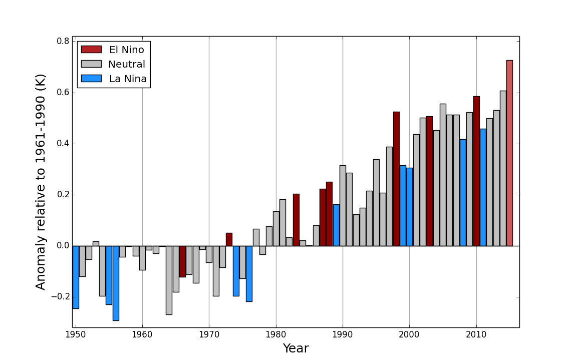 Global annual average temperatures anomalies (relative to 1961-1990) based on an average of three global temperature data sets (HadCRUT.4.4.0.0, GISTEMP and NOAAGlobalTemp) from 1950 to 2014. The 2015 average is based on data from January to October. Bars are coloured according to whether the year was classified as an El Niño year (red), a La Niña year (blue) or an ENSO-neutral year (grey).Note uncertainty ranges are not shown, but are around 0.1°C.
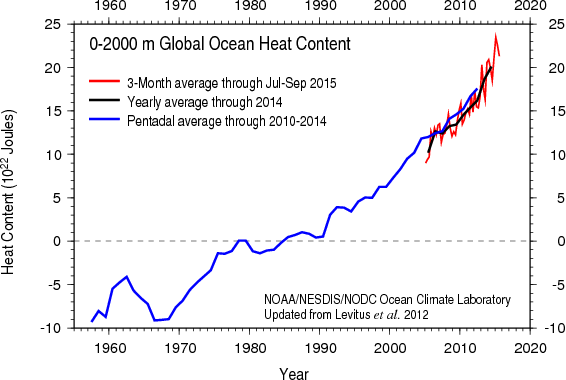 Ocean heat content down to a depth 2000m. Three-month (red), annual (black) and 5-year (blue) averages are shown. Source: NOAA NCEI
Caption for the graphic at the top of the post:
Global annual average near-surface temperature anomalies from HadCRUT4.4.0.0 (Black line and grey area indicating the 95% uncertainty range), GISTEMP (blue) and NOAAGlobalTemp (orange). The average for 2015 is a provisional figure based on the months January to October 2015. Source: Met Office Hadley Centre.
Damn. I was hoping for a hiatus, pause, and/or stop. I very much like the temperature anomaly graph color coded to ENSO--- a brilliant idea!
Roughly 2,315,513,501,476,190,000,000,000,000,000 Joules. Hey, ah, is that a problem?
#1
"I was hoping for a hiatus, pause, and/or stop."
You got it!
No Warming Since 50,000,000 BCE.
(Maybe you should give the good news to Lamar.)
"Maybe you should give the good news to Lamar"
I would, but he would respond by subpoena demanding that I had over my underwear, which does not exist.
According to NASA there was a ≈38% probability that 2014 was the warmest year on record. NOAA's figure was ~48%. For denialists this meant that there was a ~62%/52% probability that it wasn't the warmest.
Based on what we know now, what would be the probability that 2015 is the warmest? What would be the probability that either 2014 or 2015 is the warmest?
Also, although (to my understanding) the amount of data we have since 1998 normally would make it difficult to speak of statistical significance, would the warming trend since 1998 justify asserting that the trend from 1998 to 2015 is statistically significant?
This calculator will tell you the answer to that question: http://www.skepticalscience.com/trend.php
Also, try GISTEMP from 2010.9 (which includes December 2010) to now. You may be very interested in the result.
#6
Thanks for your reply. I don't have a background in math and science, so I'm pushing my limits here. To start with your second suggestion. After looking at the SkS trend calculator I went over to Wood for Trees. Please correct me if I'm wrong, but I think you're showing me an example of two can play this game, here doing the opposite of what denialists do, i.e. going from a low point to the El Niño influenced point we're at today. It was indeed interesting, and the degree of incline was horrifying.
Regarding the trend since 1998, your suggestion didn't provide me with the solid answer that it would have given those with an understanding of math, but your answer encouraged me to learn a little more than I knew before. This may be an unreasonable question, but do you have any idea where a math dummy like myself could learn enough about the relationship between trends and confidence intervals to be able to recognize when a trend is statistically significant? (I expect that the next denialist ploy will be to drop the no warming since 1998 or for x years claim, and to confuse the issue by claiming that the warming is not statistically significant, or not really real.)
No it's not the opposite. Denialists used to claim that there was no statistically significant warming in any record since before 1998. No exceptions. I'm pointing out that there are now exceptions, lots of them. It has gone from a supposed lack of evidence of global warming since 1998 to "statistically significant" evidence of global warming since 1998.
Until this year, the denialists' point was that even starting at a low point, 1999 for example, it was not possible to get statistically significant warming over any following period. That situation no longer applies.
It has a very large confidence interval which is a demonstration that using very short intervals is not a very accurate source of information and not particularly meaningful. The same applies to a lesser degree to the somewhat longer period of 17 years but in spite of that, denialists endlessly droned on about "no statistically significant warming in 17 years" as if it was some huge revelation. There may be another 17 year period of no statistically significant warming one day but at least, for what it's worth, the denialists can't drone on about that again until that day.
The definition is when the confidence interval does not include the zero trend line. Or when the mean trend is further than 2 standard deviations above or below the zero trend line.
That's what they've been doing, claiming no statistically significant warming since 1998 or whatever. What they've moved onto now is claiming that the surface records, apart from HADCrut3, are all the product of a global conspiracy and that only the satellite radio measurements are accurate.
Thanks again. When I spoke of the opposite, I was referring to the period from 2010.9 to now, not the period from 1998. The short period ending with a high point seemed to me to be the opposite of what denialists do – starting with a high point, e.g. 1998, and ending with one that's lower. The two can play that game is inspired by Tamino's review of David Whitehouse's methodology:
“You wanna play that game? OK. Let’s take the difference between the lowest and highest annual averages after 1940. That gives a post-1940 warming of 0.85 deg.C.”
https://tamino.wordpress.com/2012/12/20/fake-skeptic-draws-fake-picture…
The trend in the 2010.9 period is unmistakeable, but I understand that the period is too short and the confidence intervals too large to speak of statistical significance.
I wasn't sure whether the warming from 2014 and 2015 would mean that the trend from 1998 now is statistically significant. Thanks for clarifying this. Obviously, this would affect the significance of years with lower starting points.
"The definition [of when a trend is statistically significant] is when the confidence interval does not include the zero trend line. Or when the mean trend is further than 2 standard deviations above or below the zero trend line."
This is still over my head – an illustration might help – but I understand a little more about statistical significance today than I did yesterday.
I share your view that the current warming, or, to use another word, reality, won't change the the substance of the denialist narrative. But I'm wondering how long the current discrepancy between the satellite data and the surface data can continue. An honest peer-review of the latest set from UAH might discover why they now register even lower temperatures than before, and could make the denialist charges against surface records less credible and more difficult to maintain.
An example might help.
The skeptical science calculator gives a trend of 0.178±0.033℃/decade in GISTEMP since 1974. This means the confidence interval of the trend covers the range of trends from 0.145℃/decade to 0.211℃/decade. And this means that there is a 95% likelihood that the underlying warming, if you remove the short term variations, is within this range.
The range of trends from 0.145℃/decade to 0.211℃/decade is completely above the zero trend line so is statistically significant (by quite a long way).
No, actually, it doesn't. The 95% confidence refers to the fact that if the "experiment" were repeated many times, with identical sample sizes, and data used for a 95% CI each time, over the long run 95% of those intervals would contain the true slope. For any particular instance we have no way of assigning a probability of containment. (Caveat: this comment is based on the interval being a traditional "frequentist" style confidence interval which, as far as I can tell, it is. If it is based on Bayesian procedures than it is possible to assign a coverage probability.)
This does not contradict the overwhelming evidence and support for climate change.