
The "Phylogeny" of Scientific Life.
Image: created by Websites as Graphics.
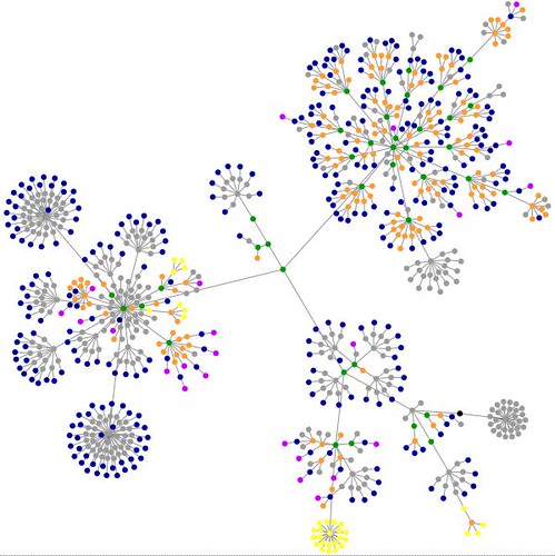
KEY: What do these colored dots mean?
blue: for links (the A tag)
red: for tables (TABLE, TR and TD tags)
green: for the DIV tag
violet: for images (the IMG tag)
yellow: for forms (FORM, INPUT, TEXTAREA, SELECT and OPTION tags)
orange: for linebreaks and blockquotes (BR, P, and BLOCKQUOTE tags)
black: the HTML tag, the root node
gray: all other tags
After PZ posted the graphical representation of web tags for his blog, I couldn't resist doing the same for my site, especially since this graphic superficially resembles an unrooted phylogenetic tree, which is one way to analyze the molecular sequence data I generated from my research birds.
So, what does this graphic mean? Basically, it is a graphical description of the structure of a particular website or blog, with specific html tags color-coded. The creators of this code write;
Everyday, we look at dozens of websites. The structure of these websites is defined in HTML, the lingua franca for publishing information on the web. Your browser's job is to render the HTML according to the specs (most of the time, at least). You can look at the code behind any website by selecting the "View source" tab somewhere in your browser's menu.
HTML consists of so-called tags, like the A tag for links, IMG tag for images and so on. Since tags are nested in other tags, they are arranged in a hierarchical manner, and that hierarchy can be represented as a graph. I've written a little app that visualizes such a graph, and here are some screenshots of websites that I often look at.
You can watch the computer build this tree in real time, too. Try it for your own site!
What are the groups of yellow dots?
i think the yellow flower represents the coding for the comment form since i do not use any of those tags in my own writing. i also think this applet script analyzes only the entries that are visible on the main index page since none of my table coding shows up (those are red dots). i don't use tables very often, but i do use them (i used one last weekend in fact, but it does not show up in this picture, and it also is not visible on the index page).
I suspect the yellows are the search boxes for your blog, for the rest of the SEED blogs, and for the Amazon Ad.