
Update: Thanks to the readers who caught my error. I've updated the post here.
A tale of two graphs. But before I get to them, I have to admit that this post by Amanda gave me the needed kick in the ass to write about the huge increase in housing prices relative to annual income. Amanda writes:
...above all, I'm concerned about this belief that housing prices must be maintained at the ridiculously high levels they reached during the bubble, no matter what... My feeling is that we're taking a hit on the economy any way you slice it, so why can't housing costs come down to a point where ordinary people working honest jobs could, you know, buy a house? Before the crisis really came to the forefront, I couldn't even believe how high housing prices got, because it seemed impossible that there were so many people that were so rich that they could afford homes that cost a quarter of a million dollars or more. What we've learned now is there weren't that many, and that loans were being extended to people who simply couldn't afford them, and the housing market was artificially inflated. And now the common wisdom is that we have to keep the average price of a house way out of the range of what most people could ever afford to keep the economy from tanking. The flaw in that reasoning should be obvious---it's a forest/trees problem, where everyone is concentrating so hard on the immediate problems that they don't realize that not addressing the larger crisis just means putting off the problem into a future that will be here soon enough. If they prioritized the issue of affordable housing over the whinging of bankers, I suspect their decisions would be sounder....It's easy to moralize about people who borrow too much, but I have to point to the cost of housing and say that it's not so much that we live overly extravagant lifestyles so much as just maintaining the basic standard of living as an American costs more than you make, end of story. If you want to own a house and you're just making a middle class income, then you better be prepared to take on more debt than you could probably ever pay back, becauses houses cost that much now.
Which brings me to graph #1. Below, on the Y-axis, is the ratio of the median house price (not adjusted for inflation; from here) to the median income (not adjusted for inflation; from here and here). So a value of 1.0 means that the median house costs as much as the median income, a value of 2.0 means that the median house costs twice as much as the median income:

Here are the underlying numbers; obviously, median housing price is the higher line, and median income is the lower line:
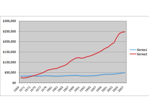
(the figures stop at 2007 because I can't find the right wage data for 2008)
I realize people can argue if the ratio in the first figure is the appropriate comparison: we don't know the individual incomes of home owners and the worth of their house. Likewise, you might be getting 'more house' than before (i.e., houses are bigger). But I think the overall pattern is so overwhelming, it is significant. And keep in mind, until 1974, the median house price was lower than the median income. I'm guessing many, if not most readers, can't believe that's real--an entire generation of Americans (maybe two, depending on how you want to count) has lived in a country where housing has steadily become unaffordable.
That's why I'm not optimistic about the Geithner/Obama plan: until housing becomes more affordable, Big Shitpile will still be big and shitty. This is only the start of a long overdue correction in housing prices. These assets are not undervalued in the long term.
In other words, median house price has skyrocketed; the median income has not. That's the real crisis.
Related post: Atrios assesses the assumptions of the Geithner/Obama plan:
This might make sense if you truly believe the magic market you believe in fervently is genuinely incorrectly pricing the assets, perhaps because you genuinely believe that if you could turn around the economy fast enough that you could massively reduce expected foreclosures.
But if you genuinely believe that, I don't think you've been paying too much attention to just what's been going on in the housing market. I don't think you paid too much attention 3 years ago when you didn't realize that it didn't quite make sense that so many people could afford $700,000+ homes in Orange County. I don't think you paid too much attention to the degree of speculation and outright fraud that was happening in parts of the country.
- Log in to post comments
Speaking as one who bought his home in 1977, your graph looks about right for that period. However, given that there has been an increasing trend toward two income families, might it be somewhat more realistic to look at median family income?
I should say that I've been thinking all along that there's no way for the economy to really improve until wages/incomes for the vast majority of people start keeping pace with all the increasing costs of living an ordinary life.
can you tell me how the wages and home prices are adjusted?
Was median income really 25K-35K in 1969? Not according to my middle class parents.
homes seemed to be about 25-20K.
I think there is an error in your data. I followed your link for the median household income data, and the source says the numbers are in 'constant dollars'. I think that means the numbers were inflation adjusted.
Here is the pertinent statement 'household income rose a very modest 6.3 percent in constant dollars (from $33,072 to
$35,172).'
Here is the link: http://www.census.gov/prod/3/98pubs/p23-196.pdf
So you are actually comparing inflation adjusted income to actual costs of homes, which greatly skews your results.
Median income in 1969 was not $33k in 1969 dollars. It was about a quarter of that. The table you used is in 1996 dollars.
See here for unadjusted values, I think:
http://www.census.gov/hhes/www/income/histinc/h05.html
I did a quick calculation, so I may have made a mistake, but it looks to be that the 1969 ratio is 3.1 and the 2006 ratio is 5.1 - an increase, but not by anything close to what you've reported.
I'm not sure why we *shouldn't* expect the ratio to increase over time. The population is increasing, but the amount of land is staying the same, so the cost of land should increase absent other factors. I'm sure it's more complicated than this, but that is a supply and demand effect pushing prices higher.
You are absolutely right that houses are unaffordable. The old rule of thumb was that a borrower could afford a house costing 3x his income, which is about what I paid when I bought my house in 1998. The exact number will depend on interest rates, which have been low for most of the last decade, but the variation isn't that much. By 2003 I realized that despite my higher income I could not afford to buy my house at market prices, and this market (New Hampshire) was not nearly as bubblicious as CA/FL/NV/AZ became. Prices in my town will need to come down 30-40% from peak levels to become affordable, and we are better off than most of the state. Some areas--Boston exurban bedroom towns and resort areas with no visible means of support--will be hurting badly by the time this is over.
@chezjake: The increasing participation of women in the workforce masked the failure of real individual incomes to rise in the 1970s and 1980s. But that effect saturated by the mid 1990s, so most of the price increase since then was driven by availability of easy credit.
@MRW (you posted while I was typing): "They aren't making any more land" was a common refrain during the bubble years. The argument has some merit if you are talking about oceanfront or midtown Manhattan. But in most of the US laws and infrastructure are designed to make it easy to spread out. Work in Boston but can't afford Lexington? Come out to Andover. Can't afford Andover either? Keep going into New Hampshire or Maine or Rhode Island or Connecticut. The "drive till you qualify" phenomenon existed elsewhere, too: LA pushing into the Inland Empire, the Bay Area into the Central Valley, DC into West Virginia, etc. As long as gas is cheap (which has been true for most of the last 50 years), it's easy to sprawl.
Mike, I hope you repost the two data sets, once you get the correct one for median income. I.e., either both in constant dollars, or both in nominal dollars. This is an interesting comparison, and it would be worth seeing and publicizing what the graph looks like.
I remember that the house my family bought in 1969 was $25k and that my father was making a little less than $10k as a new assistant prof. I too would like to see the figure again with corrected numbers. A year ago, I bought a house for 4.5 times my annual salary, thus contributing to the problem. I started out with an upper limit around 3 times, but then I saw the perfect house and the load officer said "No problem, you can afford that." The upside is that the house was a foreclosure and I could probably still sell it for more than I paid.
Another thing to consider is that interest rates matter a lot here: I remember being told by my parents that one's housing payment should not be more than 1/3 of income and that, as a rule of thumb that translated into 3-4 times income for what one could afford in a house. However, it's the monthly payment that determines what you can afford, not the base price of the house. As people with ARMs have found out, the interest rate is what really determines affordability.
I'm not an economist, but it seems to me that a little bit of inflation with home prices not keeping up (just going up more slowly than the overall inflation rate) might offer the most painless way out of the mortgage crisis.
Below are the corrected numbers for 1967-2006 (if I didn't make a mistake in the cut and paste). It's not nearly as bad - starts at around 3 in the late 60's, gradually rises to around 4 by the mid 80's, and then stays right at 4 from 1987 to 2001. From 2001 to 2005 there is a very sharp rise to around 5. It seems like these numbers SHOULD have set off alarm bells at the SEC and Fed four years ago, but there wasn't much to worry about prior to 2001. Hmmmm..... now what was going on 2001 to 2005?
19673.18
19683.19
19693.05
19702.68
19712.79
19722.85
19733.09
19743.21
19753.33
19763.48
19773.60
19783.70
19793.82
19803.65
19813.61
19823.44
19833.61
19843.56
19853.57
19863.70
19874.01
19884.13
19894.15
19904.10
19913.98
19923.97
19934.05
19944.03
19953.93
19963.94
19973.95
19983.92
19993.96
20004.02
20014.15
20024.42
20034.50
20044.98
20055.20
20065.11
It seems like these numbers SHOULD have set off alarm bells at the SEC and Fed four years ago
It's not the SEC's bailiwick, even if they were into regulation (which I'll grant was not the case during the Bush administration). The Fed, however, should have been more on the ball. Ditto the Office of the Comptroller of the Currency, which instead chose to exempt most mortgage lenders from whatever state regulations existed.
As for affordability, don't forget that most insidious of mortgages, the negatively amortizing option ARM. In many cases, the borrower could apparently afford the mortgage because he was not covering the interest on the loan, never mind the principal. Then along comes the recast (not the same as a reset), and now he has to amortize the loan, which he can't afford to do as the payment is now ~2x what he was paying before. Until about 2006 he could sell or refinance, but now he's underwater and stuck until foreclosure.
First off, Real Estate is a MARKET. The stock market is a market. The term market in this usage involves an investment rather than a "durable good" (such as a car). Instead of looking at individual or household incomes try comparing the housing market to the various financial markets such as the Stock Market and so on. So even though household income and real estate values can be compared it is not correct to expect them to remain constant and linked.
Others have done the number crunching and shown that the numbers in the graphs may actually be off or at least misleading so I will do more of a qualitative critique from a statistical standpoint rather than get back into the quantatative numbers. In statistics a graph is only as accurate as the factors taken into account, so on to those points:
1) What about average income? The chart mentions Median income, not average, and median house prices, not average. Sounds like apples and apples, but it may not be, Median means the midpoint and it can well be possible for an average to increase significantly while the median remains much more constant. Keep that in mind while I go on.
2) What percentage of the population own homes? This point has two factors: a) What percentage of the population rents (to compare to median income) and b) what has happened to rental prices in the same time frame. For example, if 50% of mericans own there own home then most likely almost all homeowners would be in that top 50% and thus median income would be more of an indicator of the lower end of home ownership and median housing prices would be most comparable to somewhere above that. The numbers we are looking for in home ownership are 62.9% in 1970 and 66.2% today as per http://www.census.gov/hhes/www/housing/census/historic/owner.html
So although home ownership has increased 3%-8% over the course of time covered by the graph but is in no way at 100% to make the medians truly relevant to each other.
Here is a site with "Median Gross Rents" in adjusted 2000 dollars http://www.census.gov/hhes/www/housing/census/historic/grossrents.html which the author of the graph would be wise to include as the Income Approach is one of the three basic methods of determining a value in a real estate appraisal (Sales Comparison, Cost, and Income Approach).
So here is this post comparing median values that are not equivalent and have been changing over time and which does not take any other factors into account.
3) Household to poulation ratio is growing as household sizes are shrinking. Back in the 19th century and early 20th century adult children lived with their parents & grandparents, and sometimes aunts & uncles, often all together in the same house. With families getting smaller, including "dual-income, no kids", people living longer, divorce rates, and so on, there are significantly more "households" than there were years ago. Back in the 1950's it was much more common for people to take in borders (both my parents had bordered when they were in their 20's, but my brother rented). Add this all up and what you have is increasing demand and, even though there are more dual-income families there are also more single-parent households. In other words demand is up (especially close to urban employment centers) and when demand is up, markets often rise. Remember, it is a market.
4) Real Estate Markets are local. What does that mean? Well, if you remember the movie Robocop there is a reason it was set in Detroit, as the place was "practically a ghost town" back then and has been declining ever since! There have been SF homes valued at under $35K in the city just to north of me in every year mentioned in the graph above, including during the top of the bubble. It is all a matter of where a person is willing to live, how, and where/how they can get to work. The Midwest has traditionally been much more sane than either coast, and the further one is away from major cities the saner land gets, and there tend to be areas in large cities where SF homes can be picked up very cheap, so what exactly is "median" home price in the US actually tell us? Nothing. Consult a local Realtor if you want better facts about what is going on as they will know the locl market and how affordable homes can really be. Data that varies by that much from region to region is not very helpful as a $38,000 home where I live may be a dump but in a rural area may be "a fortune" especially if local incomes vary bu up to 2x and average home prices by up to 10x or more.
In other words ... "bad facts don't make a good graph". ;)
-DM Zwerg
Eric,
As I said, it's more complicated than that, but supply and demand is certainly an input. Yes, people will sprawl to less desirable locations, but there will still be an increase in prices in the more desirable locations.
Of course, supply & demand isn't the whole reason for the increase. Another reason (probably among many) is a decrease in the apparent cost because of easy credit. If people who once could afford to spend 3x their income now think they can afford 5x their income because of easy credit, the median price will rise.
One more thought: How do these numbers compare to European countries for the same period. Does anyone know where to get the data?