
I've posted several times about how confusing a slowdown in the rate at which things get worse (the second derivative) with an actual improvement (the first derivative) has led to some ridiculous claims about economic improvement. Keith Hennessey has a similar complaint:
He [Obama] said this first after the 2nd quarter GDP report showed a 1.1% decline, and again after last Friday's jobs report showed the U.S. economy lost 247,000 jobs in July. The President is making a common error by looking at the rate of change of a rate of change....Wrong. Things are still getting worse, but more slowly. The mistake is looking at the direction of a trend on a graph of a rate of change. When you're looking at a graph that displays a rate of change, "things are getting better" if the latest point is above the horizontal axis, and things are still getting worse as long as you're below zero. The economy is still losing jobs, and so we are not yet "pointed in the right direction."
....Friday's jobs report was good news because the bad news beat expectations, and because it signaled that things might turn around more quickly in the future. But the President is wrong - the U.S. economy is not yet pointed in the right direction.
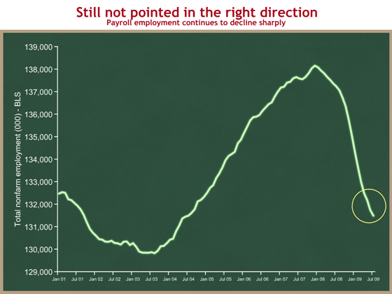
Let's look at some pictures. First, the apparent good news:
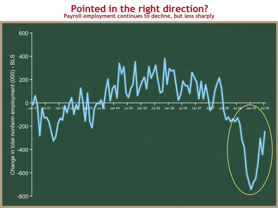
But all this means is that jobs are being lost at a slower rate--jobs are still being lost:
Hennessey notes that different people are interested in the two different derivatives:
People in Washington try to show they're sophisticated by focusing on the first graph, "Employment is still declining, but less rapidly. That's good, right?" Yes, and there is an important distinction between "good news" and "headed/pointed in the right direction."
- Financial markets care about expectations and rates of change. What will the future look like relative to today? Does the new data make my predictions of the future look better? Markets (and economists) focus on the first graph.
- People working in the real economy care about present levels. Do I have a job today? How big is my paycheck? This is better captured by the second graph.
If you focus on the former, Friday's jobs report was good news. The 247,000 jobs lost in July was fewer than expected, and it raised people's expectations about the future path of the economy.
From an employment standpoint, the economy will be headed in the right direction when the number of people employed is increasing - when the second graph turns upward, or when the first graph crosses into positive territory. A minimum break-even threshold is about +100K jobs per month - that's roughly the number of jobs needed to keep up with population growth and keep the unemployment constant.
Once again, mathematical literacy is important.
That's always bugged me, too, and you hear it all the time. When I read Obama said that the downward-heading GDP was headed in the right direction, I noted that I would have guessed the "right direction" was "up."
I think the President knows very well exactly what is being pointed out here and Hennessy's site. It may be infuriating to some that politicians use the language so loosely, but trying to give an upbeat assessment on the economy these days lends itself to such kinds of goofyness. I, personally, will let this one slide.
Now... doing a better job of explaining health care reform and pushing back against the Crazies? That's got me pretty worked up!
Peace.
IANAE, but from what I can tell, a lot of the momentum in an economy is based on a "confidence" feedback cycle. If enough people think that the economy will improve, they will base their decisions on that and (generally) the economy will improve. Same the other direction, only faster. So, if the President can use the bully pulpit to help turn around the "confidence" in the economy, I'm willing to let him slide on the details.
"Once again, mathematical literacy is important."
Indeed, and the second graph would make a fine example in that old classic "How to Lie with Statistics." Specifically, it belongs in the chapter "The Gee-Whiz Graph." Just as Obama's comments appear to be crafted to raise confidence in the economy, that graph appears to be crafted to raise alarm. Hennessey, from my quick web search, appears to be a Republican operative.
Just to be pedantic, the problem with the second graph is that the axis doesn't go to 0. In this case, that magnifies the changes by about 14 times.
I agree about the 2nd derivative not being the best thing to tout, but it looks to me like Hennessey is being critical for the sake of scoring political points. I want real solutions, not political squabbles.
I always think this sort of thing should be done with a logarithmic vertical axis. Anything where *scale* is what matters.
Ditto currency fluctuations.
Paul - I would agree that when presenting to the mathematically literate, a log scale would be ideal. The problem is that mathematical and scientific literacy rates are not so good in the USA.