
There was a article in Scientific American about diversity in STEM collecting together the best demographic data available about the science and engineering workforce. It's a useful collection of references, and comes with some very pretty graphics, particularly this one, showing the demographic breakdown of the US population compared to the science and engineering fields:
 Demographic breakdown of general population vs. science and engineering, from the Scientific American post.
This is a very professionally made graphic, but also misleading in the worst way. When I first looked at this, I thought "Huh. It's actually much less bad than I thought..."
This is, of course, an illusion, caused by the fact that the colored bars aren't actually proportional to the percentages they represent. The "White Male" bar in particular is supposed to represent 51% of the workforce stack, but is only about 35% of the top-to-bottom pixel count.
I understand why they did this-- if you size everything in correct proportion, the smaller ethnic groups are basically invisible-- but it has the effect of undermining the point they're after. If you want to really see what the situation looks like, the correctly proportioned stacked bar graph is in the "featured image" above, and I'll reproduce it here for the RSS reader crowd:
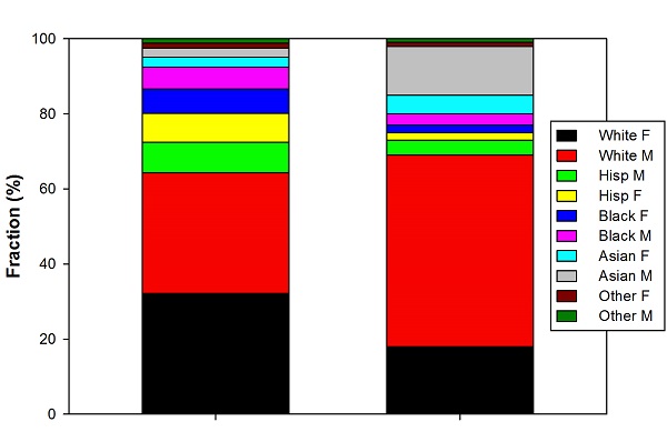 Demographic breakdown of general population vs. science and engineering, redone to correct proportions.
(General population is on the left, STEM workers on the right; converting from SigmaPlot to .jpg ate the labels, which I didn't notice right away, and don't want to take time to fix...)
This makes the usual point a little more dramatically: white males and Asians are dramatically overrepresented relative to the population of the US as a whole, at the expense of blacks and Hispanics.
Anyway, this is a minor quibble, but given my initial surprised reaction, I thought it was worth a quick post. On the whole, it's a useful article, and not a shameless and stupid bit of clickbait, so good for Scientific American.
I would be curious what this would look like if we broke it down by age. I am willing to bet that the gender ratio is closer in the under 40 age bracket.
The sizes in the original graphic aren't bad - it's the spacing that might be misleading, but if you take out the spaces between the bars, it's basically right. Your bars and theirs are the same sizes, so it's only the split that's possibly problematic.
Sure, but it's not like you can un-see the gaps between the bars. I was serious when I said that my first impression was that this presented a more positive picture than I was expecting, because all those gaps reduce the proportion of the total figure occupied by white males.
I also agree that a similar graph limited to a younger cohort of STEM workers might very well look better. But then, the general-population graph would also change (I believe the overall population is becoming less white), so it might not be as much better as you might think, in terms of distribution by race.
I think that my eyes parsed it as a strict comparison between bars in the left and right columns, instead of comparing part-to-whole for left and right, so I just looked at the relative sizes of same-color bars in the left and right. Maybe that's why it didn't strike me as egregious.
Hmm. The "Two Cultures" illustrated. (Plus, I'm guessing, an overall issue with time constraints. Haste makes waste.)
The designer graph did something good though by attempting to organize information by color. M and F are grouped by color and differentiated by value (relative darkness). The sciencer graph, speaking of optical illusions, is practically a piece of op art, which is very distracting if you're sensitive to that sort of thing.
My second thought was "why not plot the ratios?", perhaps with bars whose width indicates the population size.
My first thought was "what if you used a log plot?" That would simultaneously make the small groups more visible but deemphasize the differences. THAT would be a bad graph! At least linear is honest, and apparently the pixel count in each bar is correct (right?) so your main complaint is about the gaps added that make it possible to see some bars that are invisible in yours.
What I like about theirs is the way it clearly shows the reordering of the demographic groups. There is a tradeoff between that approach, where each column is in its natural order, and yours, where the groups are in the same order. Yours has the flaw that it is very difficult to see how large the anomaly is for over-represented groups or to compare female-to-female sub groups. This problem is typical of those kinds of bar graphs.
One way to do that is to match them in the middle rather than at that bottom. You could do that by population size (white and hispanic on one side and everyone else on the other) or paired up by contrasting anomalies (white and black on one side and hispanic and asian plus other on the other). A gap at the middle horizontal line would aid seeing the pattern.
PS - I recall seeing a cartoon decades ago that graphed an animal on lin-lin, lin-log, log-lin, log-log, and some more exotic combinations. I think one put the exp of the function on one or more axes to exaggerate small differences.
I decided to make a graph to implement my suggestion.
http://doctorpion.blogspot.com/2014/09/diversity-in-stem-graphic-displa…
Don't rely on it for anything, however, as there are places where cleaning up the jpeggy noise must make the bar sizes unreliable. I'm just showing what you can see in this presentation that isn't as visible in the Scientific American one. I also learned that the real reason for the white space in their version was to allow enough room for labels on the smaller population groups. I had to leave some out.