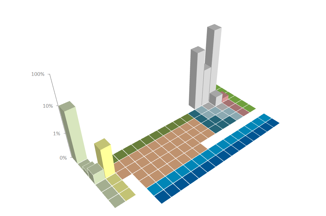
So here's a crude attempt at something that's been on my mind for over a year now. I thought it'd be interesting to represent the elemental composition of different objects using a three-dimensional periodic table. So, for example, here's the elemental composition of the human body:
It's not a great mockup, but it's the best I could do with the tools and skills available to me. I made the chart in Excel using data from Wikipedia, and manually coloured all those little cells. When it came time to do the lettering I really couldn't figure out a way to do it that didn't involve scissors and glue, so you'll have to imagine.
By itself it doesn't really tell us a huge amount - but it'd be fun to be able to see, say, how insects differed from humans, if at all (chemical composition is probably a lot more important). It really works at the bigger scale though - you could use something like this to compare planets and other celestial bodies. Maybe galaxies! And even make a point that 80% of the physical universe doesn't have a place on this table!! I really wish I had the coding skills to create this in an animated format, so you could pick the thing you wanted to see graphed and watch the little bars climb and fall. That would be sweet...
- Log in to post comments


If you can find little periodic table squares of the elements, then you can add them to the top of the Excel bars using
Format Data Series...
Pattern...
Fill Effects...
Picture...
Select Picture...
Apply to End only (because having the picture on the sides as well looks gross)
It would be nice to see more of the trace elements (expand on the logarithmic scaling down to hundredths/thousandths of a percent). Wouldn't it be interesting to show that iron, fluorine, zinc and silicon are all present in approximately the same amount (at least order of magnitude)? And that rubidium, strontium, bromide, and lead are the same? That may also bring out greater differences in types of organisms.
I also would have used percentage of atoms and not mass percent, but that's a style choice.
@andre - ah, I did input data for trace elements like Rubidium (present in the 0.0001% scale) but Excel threw a tizzy and started plotting negative values(???).
I'll give it another go, and use Derek's tip above, see if I can get this a little more informative.
Hi Frank - I like this. Would suggest plotting some kind of log10 value rather than %, then you'd stand a chance of seeing variations between the trace elements from different species. However, I would expect variation to be small unless you are comparing between broad groups like mammals vs insects (chitin exoskeleton instead of calcium phosphate endoskeleton, copper-based 'blood' rather than iron-based).
More like a periodic cityscape.
Of course it did negative values, since logarithms of numbers less than 1 are negative. It should also give you errors for 0's.
One way to get around this is to do a log plot of the part per billion present of any element, and just change the scaling to reflect the %.
@andre D'oh, of course, how silly of me. Much work to do on this prototype then...
You should use the Apple app SketchUp