
"I have an existential map. It has 'You are here' written all over it." -Steven Wright
So just because the Ask Ethan series is becoming way more popular than I can handle -- I've got more than 200 questions that I'm sitting on by now -- doesn't mean you should stop sending your questions! There are some really good ones, and today's comes from Robert Plotner, who asks:
When maps of the CMB are depicted, they are shown as a flattened ovoid. How does this correlate to our view of the sky which is a sphere? For example, a global map of the Earth is either distorted to show it in two dimensions or sliced up. What actual part of the sky are we looking at when we see the CMB represented? Is it distorted to show it in two dimensions? If we are only seeing part of the sky represented, is there any missing information that could add to our understanding? Thank you.
Robert, of course, is talking about the famous pictures that look like this:
 Image credit: ESA and the Planck Collaboration.
It might seem difficult to believe, but as unconventional as it may seem, there's actually the entire sky encoded in that image.
Think about the Earth, if you will.
 Image credit: IDL online help, via http://climserv.ipsl.polytechnique.fr/.
A map like this is probably what you're used to when you visualize the Earth. Maybe if you live in the USA, you're used to the Americas being centered; maybe if you live in the U.K., you're used to the map being centered just so that France is cut off of both the left and right sides. In any case, this is the most common styling of maps of Earth that you're likely to find.
It's also wildly inaccurate. You might be surprised to learn that Africa is more than double the size of Antarctica, that South America is actually larger than Russia, and that Australia is more than three times the size of Greenland! This is due to the fact that the Earth isn't a flat, 2D surface; the surface of the Earth resides on a sphere!
 Image credit: Wikimedia Commons user Wikiscient, using NASA's "Visible Earth".
But if you take the surface of a sphere and try to "unroll" it, or create a flat surface out of it, it doesn't work out nicely at all! Don't believe me? Take an orange, peel it (carefully), and try to lay the peel down flat on a level surface. Chances are, if you do a really good job, you'll end up with something like this.
 Image credit: Nathan P. Belz, M.S., E.I.; U. of Vermont.
The problem is, when you take a spherical surface and try to lay it out flat, something's going to give.
If you insist on making a flat map like you're used to seeing for the surface of the Earth, you can make a completely connected map with nice grid-like (perpendicular) latitude and longitude lines, but you have to sacrifice the accuracy of area. (That type of map projection is called a Mercator projection.)
You can keep the accurate area and the perpendicular latitude/longitude lines if you're willing to give up connectedness, like the Goode homolosine projection, above.
Or, you can do some sort of compromise, keeping a connected map with perpendicular latitudes/longitudes but compressing latitudes the higher they get, getting you closer to equal areas (but not quite there), as you can see below.
 Image credit: Donald Smith, Jr., of @mire labs; © 2002-2012 Duraspace.
None of these are entirely satisfying, and they couldn't possibly be! It's impossible to keep perpendicular latitude/longitude lines, accurate areas, and a completely connected map without sacrificing something; that's because the surface of a sphere isn't flat, and it's impossible for it to be accurately laid flat.
This is true for a map of the (almost plenispherical) Earth, and it's true when we look up at the heavens, too.
 Image credit: Massimo Mogi Vicentini of http://www.mogi-vice.com/.
So whenever we go to visualize the entire sky and present it in a two-dimensional format, we've got to sacrifice something. The only question is what it's going to be!
Because size (or area) in astronomy is so important, that can't be something we sacrifice. It's also important to keep everything visually connected, because there are no gaps in space. So we wind up sacrificing the perpendicularity of latitude and longitude (or declination and right ascension, as we call their analogues in astronomy), and lose the accuracy of angles and shapes in order to preserve the things that are important to us. We could (but don't usually) do the same thing to Earth!
 Image credit: UNC Chapel Hill, via http://www.learnnc.org/.
This particular projection is known as a Mollweide projection, and if you remember those three things I told you about the Earth earlier:
- that Africa is more than double the size of Antarctica,
- that South America is actually larger than Russia, and
- that Australia is more than three times the size of Greenland,
they're probably much easier to believe looking at a projection like this! Well, this is what we do to the sky -- or simply how we project it -- when we present it in a 2D visualization!
So rather than show you a shot of the galaxy like this, which is only part of the sky...
 Image credit: Kelly Montgomery.
we show you the whole thing, as shown in a galacto-centric Mollweide projection!
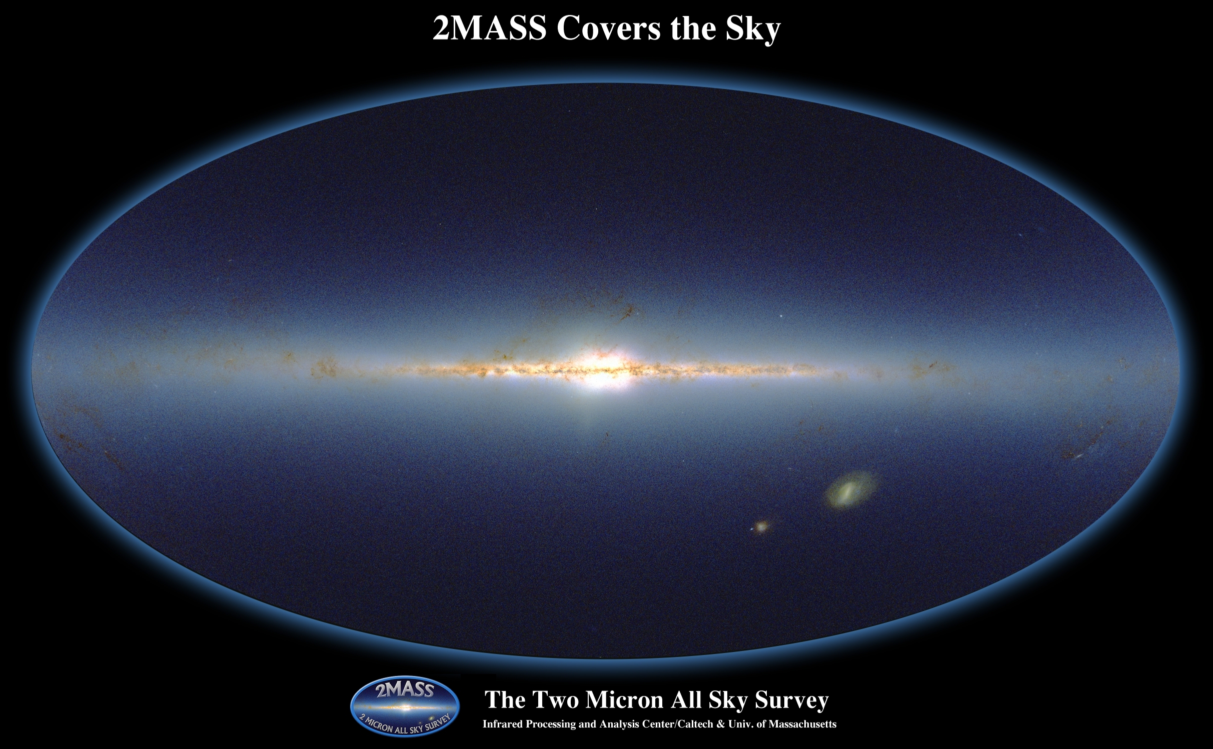 Image credit: Two Micron All Sky Survey (2MASS) / IPAC / Caltech & UMass.
When we look in the microwave portion of the spectrum, like the Planck spacecraft did, it sees everything from all the sources in the sky, including the galactic foregrounds, the zodiacal light and dust, as well as the primordial, cosmic light from the Big Bang.
 Image credit: ESA / LFI and HFI Consortia.
And finally, when we subtract out those galactic foregrounds, the "average" 2.725 K blackbody temperature...
 Image credit: COBE DMR team, NASA.
the CMB dipole, or our peculiar motion through the Universe,
 Image credit: NASA / COBE science team.
that's when we can finally see the important stuff from the CMB's leftover glow.
 Image credit: ESA and the Planck Collaboration.
We then break that up into its different components (using spherical harmonics), analyze it, and that's how we learn about the Universe! But we do all of it in a Mollweide projection, and that's why the maps of the sky appear in the shape they do! But there's nothing missing; you're seeing the whole sky all at once. It just takes a little getting used to.
So keep sending your questions, and I'll keep teaching you about the Universe, or whatever it is you're asking about!
You've mapped this out very well. Cheers. :-)
Googled for:- "spherical harmonics" CMBR...
Hit a wall of mathematics
If anyone knows of an online idiot guide please let me know here :)
BTW Ethan, I always check the "Notify me of followup comments via E-Mail" box when I comment, but it doesn't work.
@2 Michael Fisher
The short version:
Think of Fourier analysis, any function on the real line can be written as a sum of sines and cosines of varying frequencies and amplitudes. Studying those frequencies and amplitudes (the spectrum) can tell you something about the function. High amplitude low frequency (co)sines tell you there are repeating large scale patterns. High frequency means lower scale patterns.
Spherical harmonics does the same, but for functions on a sphere. The functions are a bit more complicated, as they have to fit on the surface of a sphere as opposed to a line, but the spectrum again gives you information about whether there are large or small scale patterns.
The long version: A 2nd or 3rd year calculus textbook should give a detailed explanation.
test
"just so that France is cut off of both the left and right sides"
I don't get how that would work, given that the UK and France are at largely the same longitudes.
I'm also puzzled by the recent growing trend of nasty remarks about the British in American blogs. Is this related to the recent vote against bombing Syria? Are we now the new Freedom Fries?
Map projections! I love them.
Michael @2,
You might want to check out the 11th image (the animated one) in this post here, that shows a breakdown into spherical harmonics: http://scienceblogs.com/startswithabang/2013/03/27/the-science-of-the-c…
derek @5,
I had a professor in college who taught geophysics, and one day he showed a map of the Earth (in a Mercator projection) that ended on the left side right where the center line comes down on the third image I showed you here, and picked up again on the right with Ireland, Portugal, and the western tip of Africa. (The prof was French.) When I asked him where England was, he just went on to the next slide.
As for the growing trend of nasty remarks about the British in American blogs...? I haven't noticed it, but maybe we read different blogs? I certainly don't harbor any ill-will towards the British; that was a remark aimed at the long-standing contempt the British and French had (and in many ways, still have) for one another. Out of line to you?
Being a draftsman with an obsessive compulsion for accuracy, I had to come to terms with the inaccuracies of cartological projections long ago. In spite of my experience, I still had problems visualizing the CMB map from the time the first one was published. I found that looking at a Mollweide projection of the earth immediately before viewing the CMB map always makes the CMB immensely more coherent.
I wonder how the Flat Earth Society ever deals with this. I know they suffered a major blow when they learned their membership had gone global.
It seems that the information which is sacrificed in the Mollweide projection is depth (range, distance, etc.). In the projection of the entire sky, there is no way to determine the distance from our position to any point on the map, nor the three dimensional space between any two points on the map.
Seems to me we should have an answer for this in the form of computer map applications. Bye-bye flat maps, hello virtual globe that you can spin until you find what you're looking for, and then zoom in on it in a particular manner that's related to your purpose for looking at it.
If you're looking to chart navigation or airline routes, you get one type of view. If you're looking for the relationship between sizes of land masses, you get something else, etc. etc.
(Don't anyone say Google Earth, there must be something else that's viable for educational purposes without having to patronize a surveillance monster with a budget many times that of NSA.)
OTOH for classroom use there is something inherently valuable about an actual physical globe. (As a useful side-effect, it viscerally reinforces the point that the Earth is finite.)
As for maps of the universe, how'bout a "reverse globe" software application, where your point of view is from the surface of Earth looking outward?
MandoZink: I don't know about the Flat Earth Society. But the Flat Universe Society are having some problems with all those diehards who think the universe doesn't have an edge!
The map projection issue was also covered very nicely in The West Wing (season 2, episode 16).
G,
Certainly there's something satisfying about a physical globe. It's the only way to represent the entire earth completely accurately. Any graphical representation that you can pull up on a computer monitor is still a 2D projection of a 3D sphere, and therefore must contain some distortion. Only the actual 3D globe can represent the earth without distortion.
Choosing your map projection is a matter of choosing the right tool for the job. If you are sailing a ship, and you don't have access to radio (Loran) or GPS location technology, then you want a map that is conformal (so that shapes are locally preserved) and that maps a course of constant compass heading to a straight line, so that you can be confident you are sailing toward the Southampton harbor (or whatever your destination is) rather than a bunch of rocks that will destroy your ship. Thus you want a Mercator projection, because that is the only projection that satisfies those two properties. But on a global scale, the Mercator projection is usually the wrong choice, because scales are distorted at high latitudes; its widespread use is the result of a British empire dependent on global scale shipping. For astrophysical applications, where preserving area is the overriding concern, the Mollweide projection is a better choice.
Growing up in Australia, my dad bought this map as soon as it came out.
Isn't that 2MASS map an Aitoff projection?