
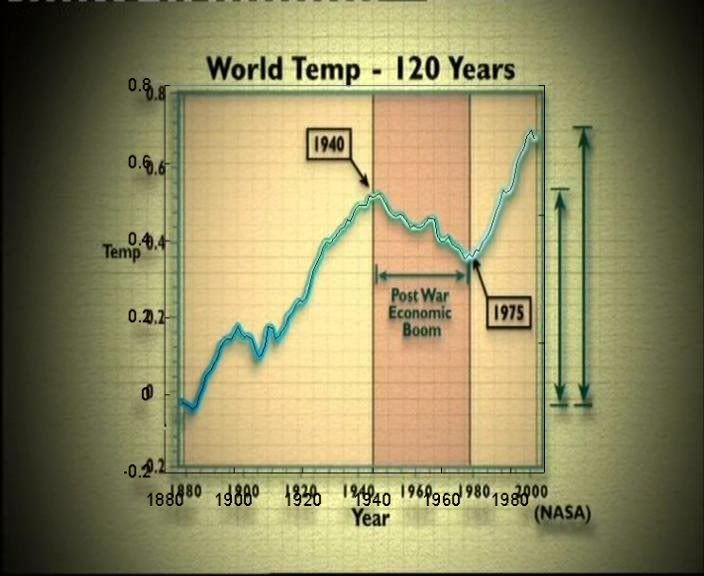
 Someone who probably wishes to remain anonymous has suggested a possible source for the rather odd "120 year temperature" plot that TGGWS used. Which is: its land-only data, 5y smoothed, from 1878 to 1988, replotted onto an 1880-2000 axis. This would explain a couple of mysteries about the original: why the warming at the end is smaller than it should be; and why the point marked 1940 is clearly at 1945, and the point marked 1975 at 1980.
The correspondence of the new version isn't quite exact but it is the best explanation that I've seen so far. If true, it means they have "touched up" pretty well all the graphs they've used (the solar one omitted the recent data; the 400y solar "filled in" solme missing data that was missing for a good reason). Swindle indeed!
[The original of the overlaid plot is here]
[Update: OK, more research (not by me!) has found the true source of the original: its fig 12 of http://www.oism.org/pproject/s33p36.htm . Which seems to match wiggle for wiggle. It too has a shorter time axis, with the peak at 1940, so TGGWS really have stretched the time axis, bad people -W]
[Another update: The graphs overlaid nicely are here (the thin black line is the OISM one). Clearly they are the same, but TGGWS is on the wrong time axis -W]
Do you understand that this is correct time to get the credit loans, which would make you dreams real.
Incorrectly performed essay online can destroy your success. Though, if you buy custom essays of good quality, everything is OK.
Very compelling circumstance about this post, but still this question is to complicate to discuss.That is why we have ordered to create a custom writing service to help enterprising students. They can buy term papers that is custom and made by expert , buy essays or even buy research paper. But when students use this kind of business â an ethical question is raised: Is it ok to use these kinds of services? Is it ok to use them, and will you be punished for using them.
These graphs are not even on the same scale.
[Yeeesss... thats the point -W]
Someone over in the comments at RealClimate claimed that the graph they used is actually the raw, unhomogenized temperature data. As an example of this data, he linked to this graph from the 1975 NAS report. To me it looks nothing like the graph in the documentary, even accounting for the smoothing.
He also said that the "adjustments" add 0.5 C to the trend, but when I overlay the NASA GISS with their graph, on the same scale, the start and end points are similar: it's just the bit in-between which is different. So I'm dubious.
Your graph looks more like it, but it's still strange that there isn't a perfect match.
[Mine uses UEA not NASA GISS -W]
The graphs overlaid, where the thin black line is the OISM data.
But, how did OISM produce it? Fig 12 says 'global surface temperature'. An out of date versions of what's at http://data.giss.nasa.gov/gistemp/graphs/ via ref 23 ?
Just checked my recording of Monday's repeat on More 4:
Now the T scale is right but just goes up to 1988, and the cite to NASA has been removed. Hmmmm.
Here is Monday's version.
these seem like petty arguments next to the argument concerning the stereo observers and the "FACT" that the warming is NOT isolated to earth but extends to every planet in our solar system
[Errrmm... what is the "stereo observers" bit!?! And no, it isn't true that every planet is warming. You want http://en.wikipedia.org/wiki/Attribution_of_recent_climate_change#Warmi… -W]
Either way: Does all this matter? No, it does not.
Because if one thing IS clear, it's that human CO2 'production' is insignificant and NOT driving climate change. Period. The graphs have merely been used to illustrate that fact, not to 'proof' it.
[Well its nice that you're honest: no matter how many graphs TGGWS fakes, you're still going to belive them. And your characterisation of their graphs is spot on: they are used as a drunkard uses a lampost: for support, not for illumination. As to your point: human release of CO2 is indeed sig, which is why atmos CO2 is going up. I could refer you to the various proofs, but you wouldn't read them. But others might, so: http://www.realclimate.org/index.php/archives/2004/12/how-do-we-know-th… -W]
Umm, Julius, you are aware of the isotope ratios which prove that we are contributing CO2 to the atmosphere, the calculations which have been done detailing how we emit far, far more than Volcanos, and also teh years of work that have gone into establishing that the naturally produced CO2 is absorbed again, in a cycle that oscillated naturally until we started adding too much CO2?
Well, obviously not. Do you have a point to make?
Next time be similarly critical towards graphs and statements in movies by Al Gore, which you seem not to be. How obvious, or is it not?
Also, one hard fact you fail to mention is that during long periods of time where CO2 was abundantly MORE present in the Earth's atmosphere, your so-called calculations seem to go dark in that they don't match your 'oscillated naturally' claims. You are only doing what the movie by Channel 4 warns us about: Trying hard to blame humans for everything, making humans "unnatural" and by doing that forgetting the most obvious.
It will take only one supervulcano eruption to render your statement about vulcanoes useless. It is because they *do* happen from time to time that people have started the claim that vulcanoes add much more co2 (in the long run) than humans ever will be able to.
In addition, read:
http://www.informath.org/apprise/a3200.htm
http://medicine.plosjournals.org/perlserv/?request=get-document&doi=10…
What on earth are you on about Julius?
As for supervolcanos, their existence has nothing to do with the simple fact that we emit more Co2 than is currently produced by volcanic activity. What matters is periods of several hundred years. Anyone who wants to average it out over millions of years is missing the point.
As for peer review- so what? It is so far the best we have come up with. I look forwards to your publishing your evidence for climate change not being our fault this time.
So let me get this straight:
You are still trying to tell sane people that a few percent of 0.5% (or thereabouts) of what the earth's atmosphere consists of will make a HUGE difference, and is worth stopping the use of oil and cole generated energy worldwide?
Really, get a clue already.
Oh wait, that's 0.04% actually, according to the latest scientifically sound measurements.
It wouldn't even make sense to take this into account, even IF a concentration this low would be influential.
Wow, these trolls use really cheap datasheets these days.
To illustrate the problems with your posture:
IMagine you are in a room in which I increase the concentration of Chlorine from 0 to 0.001%.
This will result in your needing hospital treatment very soon. Or in other words, the importance of a concentration of something is related to its effects. With regards to CO2, more information can be found here:
http://www.realclimate.org/index.php/archives/2006/01/calculating-the-g…
Strange: this blog is linked by climatists in eco-sceptical german blogs as a big refutation of TGGWS and it's main message - no problem with manmade CO2.
I'm really astonished that there are enough critical comments here, which can destroy such futile hopes.
[I'm not sure which way round your comment is supposed to be. Certainly I think TGGWS is junk, and can point you to the posts about that if needed... well search will do it for you, scroll down somewhat -W]