
Thanks to J who alerts me to this little matter. So, this is all mostly summarised in [[Description of the Medieval Warm Period and Little Ice Age in IPCC reports]]. From which I reproduce:
A schematic (non-quantitative) curve was used to represent temperature variations over the last 1000 years in chapter 7. The vertical temperature scale was labelled as "Temperature change (°C)" but no numerical labels were given; it could be taken to imply that temperature variations of the MWP and LIA were each of the order of 0.5 °C from the temperature around 1900. The section specifically states recent climate changes were in a range of probably less than 2 °C. The 1990 report noted that it was not clear whether all the fluctuations indicated were truly global (p 202). The graph had no clear source (it resembles figure A9(d) from the 1975 U.S. National Academy of Sciences report, which is sourced to Lamb, 1966), and disappeared from the 1992 supplementary report. Within the 1990 report, the LIA is taken to be global in extent but the MWP is not. Climate over the last 1000 years is mentioned very briefly in the SPM of the 1990 report. The MWP is not mentioned at all, and the LIA described by ...probably fluctuated by little more than 1°C. Some fluctuations lasted several centuries, including the LIA which ended in the [19th century] and which appears to have been global in extent. The MWP is mentioned in the executive summary to chapter 7, as MWP around 1000 AD (which may not have been global).
So: just in case it isn't clear from the above: fig 7.1.c isn't useful anymore. It was vaguely useful then because there was nothing better available. It was a hurridly drawn sourceless schematic that no-one uses nowadays; and if anyone *did* use it they would be roundly criticised.
[Update: JM made a nice comparison of the two graphs, available here]
Here is the graph:
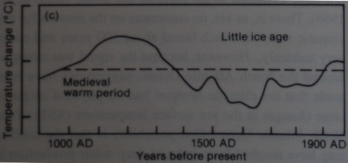
Obviously the *exciting* thing about that graph (if you're a bozo septic denialist) is that it shows that the MWP was warmer than it is now. Woot! Obviously what you think happened (if you're a fool) is that IPCC in 1990 was pure; it released this graph by mistake; but subsequent IPCC reports have had to supress it. Bring on the black helicopters! (I've said this before).
Which brings me to the Wegman report. Here is their picture (fig 4.5, their page 34):
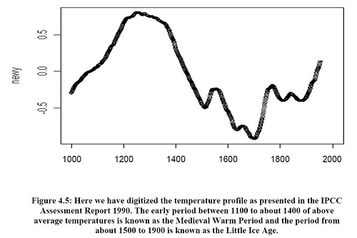
The pic is similar enough that this must be the graph from IPCC '90 that they mean (though being academically careless they don't trouble themselves to say which fig they mean). But the digitisation has been done poorly - there is noise added, most obviously at the height of the "MWP" and around 1850. Perhaps this has been done deliberately to avoid making it obvious just how smooth the original was.
Notice how they have silently added the temperature labels to the Y-axis: these are not in the original. And they have labelled them "newy" - why. The point about the original was that it was a schematic - which explains the lack of axis labels, otherwise unforgiveable. This expalins why Wegman has added the labels, since he wants to hide its schematic nature.
Less excitingly, Wegman has supressed some of the time labels, but has added a label for 2000.
More excitingly, Wegman has completely mangled the "now" end of the graph - his version ends up going upwards, whereas the IPCC version ends up going downwards. This isn't "hide the incline" - this is "fake the incline". But why? I think the reason is that Wegman wants you to think that the endpoint is representative of "now". Obviously, if you see a graph with the T flat from ~1910 you're going to think "oops that isn't right" so he has faked in an increase at the end.
Update: even odder, look at Wegman fig 4.7. What they claim as the "original curve", the blue line, isn't. But neither is the red curve. What are these bozos up to?
Update: OK, the game seems to be: look at the "modern" end and observe that it doesn't look right: the end of it has been truncated. I'm told that if you view this on a slow machine under zoom, you can see the blocks being put in place: if you do that, you can see the "full" curve and then see the end blocked out (presumably if you have PDF writer/editor you can see this too). Also, I can think of a reason *why* Wegman needed to "add the incline": in figs 46 / 47 he is playing some games to prove that MBH's method producing hockey sticks when "properly centered PCA" doesn't; but I rather suspect that if you do that on the actual IPCC series, it doesn't work: I suspect Wegman found he needed to bump up the modern end a bit.
Update: SS has more graph fun at http://www.skepticalscience.com/Common-graphical-tricks-and-the-Medieval-Warm-Period.html
Update: AR says
The appendix in Jones et al. 2009 ("High-resolution palaeoclimatology of the last millennium: a review of current status and future prospects" The Holocene, 19, 3-49) tries to describe where the IPCC 1990 Fig. 7c comes from.
They conclude that it was compiled from a series of publictions by H. H. Lamb and was only based on temperature records associated with Central England, so not global.
Further, Jones et al. point out that "At no place in any of the Lamb publications is there any discussion of an explicit calibration against instrumental data, just Lamb's qualitative judgement and interpretation of what he refers to as the 'evidence'".
I think "newy" should be read "new Y". They made a graph but forgot to change the Y-axis label.
[Aha! That will be it. What technical competence they show :-) -W]
They also messed up the X axis. Around 1200, the original graph has already peaked... the temp has plateaued and and is starting to decline. But on the altered figure, the temp has not even peaked yet by 1200.
They quite clearly haven't digitised that 1990 chart, unless by "digitized" they mean "copied using a crayon, and then scanned in". If I was being kind, I might swap "felt tip pen" in for "crayon".
"... The 1990 IPCC figure that Mr. McIntyre, the Wall Street Journal editorial page, and Dr. Wegman have used in their own assessment of past climate is a cartoon, as stated by Dr. Wegman in his testimony last week. I have confirmed this with a number of individuals who were involved with the 1990 IPCC report or with versions of the schematic that pre-dated the 1990 IPCC report. The schematic is not a plot of data and is inappropriate as a comparison to MBH. ..."
http://webcache.googleusercontent.com/search?q=cache:Wie7JOPPetEJ:www.p…
[Hmm, but has anyone before now noticed that he faked his cartoon? -W]
> before now
Not that I recall.
Has anyone seen his promised subsequent publications described in the hearings? It'd be interesting to compare what got by the reviewers on those journals.
Response of Dr. Edward Wegman to Questions Posed by
the Honorable Mr. Bart Stupak in Connection with Testimony to the Subcommittee on Oversight and Investigations
"... we have been preparing papers that will be peer reviewed for the Applications Section of the Journal of the American Statistical Association, another for the journal called Statistical Science6 published by the Institute of Mathematical Statistics, and finally for a more popular outlet called Chance.....
...
... We also demonstrated the same effect with the digitized version of the 1990 IPCC curve.... The shape of the graph will depend on the underlying data."
Even more interesting. Zoom in on the pdf figure 4.5 in the original report and you will see that the pdf is actually made of an underlying graph which has a further increase and dip (as in the blue curve in 4.7), and then there is a blank square pasted over it. So Wegman very clearly is hiding the incline and decline all at once!
Even more speculation. I think they spliced the scanned data up to 1900(?) with the actual temperature data (smoothed at some point) without mentioning it. Could it be a 'trick'? Inquiring auditors would surely like to know....
PS, last thought (it's the month for field botany, gotta go). Look at the original PDF file of that Wegman report. See the little fragments of lines at the "now" end that don't show up in your scans? What do you suppose was going on there? Could it be a fragment of that last little bit where the original turns down, that got erased? That's too much inference from too few pixels, but the artifacts in the original PDF are there.
My guess is this is politics not science. "Extremism in the defense of liberty" allows, nay requires, assuming the worst ("the IPCC is faking") and using that to justify "doing the same thing back" (fudging the pictures and spinning the story in PR).
Thanks to WMC for this and Hank for the Pew reference, both useful to an ongoing project mine, of which the black helicopters was a related small piece.
The *real* interesting questions are:
a) Did Wegman, et al, actually 8start* with the IPCC graph, and then hack from there?
OR
b) Did they get this graph (and data) *from somebody else*?
HAS ANYONE SEEN THIS ANYWHERE ELSE PRECEDING THE WEGMAN REPORT?
I have been unable to find the exact chart elsewhere, the closest resemblance so far being Fig 5.4 of [ESS2002], and it's not that close.
I looked in places like those shown below.
*[DEF2002] Chris de Freitas, âAre observed changes in the concentration of carbon dioxide in the atmosphere really dangerous?â Bulletin of Canadian Petroleum Geology Vol 50, No 2 (June 2002), P.297-327. Received 03/28/02, Accepted 06/23/02.
web.archive.org/web/20030526163750/www.cspg.org/deFreitas_climate.pdf
The hockey stick is attacked pp.11-14.
*[SOO2003] Willie Soon, Sallie Baliunas, âProxy climatic and environmental changes of the past 1000 years,â Climate Research Vol. 23:89-110, 2003. Submitted: 04/11/02; Accepted: 08/29/02; Published 01/31/03.
www.cfa.harvard.edu/~wsoon/1000yrclimatehistory-d/Jan30-ClimateResearch…
*[ESS2002] Christopher Essex, Ross McKitrick, Taken by Storm â The troubled science, policy, and politics of global warming. November 2002. Neither author is a climate scientist, but the book offers plenty of confusion, and many references to science literature later strongly refuted, like Christy&Spencer on satellites showing no warming, DâAleo, Zbiginew Jaworowski, S.Idso, John Daly, GES, etc
Chapter 5 of 10 (p.155-174) is âT-Rex plays hockey.â â they were attacking that in 2001-2002. This book was basically sponsored by the (conservative) Donner Canadian Foundation.
Maybe I'm missing something here, but the point of using that graph was to show that its shape would be reproduced (See page 37). However I do agree that the caption is misleading.
[I think that may well have been Wegman's intent. However, why do you think he has not used the IPCC data? He seems to have made something else up - possibly he has grafted on the recent instrumental record? Why? -W]
Has anyone published a critique of the Wegman report in a peer-reviewed journal? I haven't followed the saga closely, but this is not the first time I've seen evidence of dodgy stuff in the report. It might be worthwhile to compile all this in one place and put it on the record.
[Don't think I've seen published comments. JM is writing up some stuff on misc errors; we saw some very odd stuff in the refs recently - the magnetic stuff was just one bit. And someone else pointed out that Weegamn claimed to be writing it all up for publication, but never did. Oh, and good t have you onboard, Vlad -W]
Deep Climate is working on getting it all organized, Vlad, but I don't know if he has formal publication in mind. Getting something into the literature as a marker would seem to have some remaining value notwithstanding how long in the tooth things have gotten. Generally, the journals don't like rehashes of stuff that's already appeared on the internet, but maybe Climatic Change (ed. by Steve Schneider) would publish something.
Sorry, Nicholas, a faked graph is a faked graph is a faked graph, especially under those circumstances.
Re #5: That's interesting, Hank. Given the time that's elapsed, one can only imagine that Wegman's thrown in the towel on those. Possibly a factor in that was the evaporation of the Republican Congressional majority in 2006.
Oh yes, I have a modest request: Can we see the graph on Roomba? Even with the cat, there's still the other end available.
re: #10, #11
There will be a post over at DC's place, fairly soon.
I'm doing it, inspired by some of his earlier work, and oddities in the Bibliography found while doing A.10 in CCC.
I thought it would be a quick exercise, but alas...
Right now, it's at 70 pages... and I'm not quite yet done, because problems keep popping up everywhere I look.
===
Back to this one: The WR graph is captioned/discussed:
"Here we have digitized the temperature profile as presented in the IPCC Assessment Report 1990. The early period between 1100 to about 1400 of above average temperatures is known as the Medieval Warm Period and the period from about 1500 to 1900 is known as the Little Ice Age.
Discussion: In Figure 4.5, â¦(repeats words above)â¦The 1990 report was not predicated on a global warming scenario. It is clear that at least in 1990, the Medieval Warm Period was thought to have temperatures considerably warmer than the present era.":
I am unable to find any conceivable digitization of the IPCC graph that puts the MWP that high... having rescaled the IPCC graph to match. The comment "It is clear that..." is the meme carried here ... then they go try to make it look it was useful.
In Skeptical Science, that's Meme#59. Of course, the WR manages to get 20-30 instances of memes from Skeptical Science's lsit, one way or another.
I am certain Wegman shifted the time axis by at least 50 years into the future.
In addition to the main peak shift noted by kevin in comment #2, the minimum near 1450 seems to have shifted to 1510 or so, the peak at 1500 is now at 1550+, the next dip at 1580-ish looks to be now at 1630, the 1640 minimum in the original is now around 1700, the 1700 peak looks like about 1770, and the final 1850-ish dip seems to now be in 1900.
In other words, the upward trend at the end of the Wegman version (which looks like it covers the time period 1900-1960) is really more like 1850-1910 or so in the original.
To properly get to current temperatures on that graph (whatever the vertical scale should have been) you need to add at least another 0.5 to 0.6 C of rise on the end...
[Oh good grief -W]
Wegman's testimony drops hints:
"Could we go to figure 5? To further illustrate this, we
digitized the temperature profile published in the IPCC 1990 report
and we did apply both the CFR and the CPS methods to them...."
then later..
"MR. STUPAK. Let me ask you this. Page 34 of your report, I
think you have it in front of you, your 52-page summary there,
you have a figure that you say is a digitized version of the
temperature profile in the IPCC assessment report of 1990. I
take it you read the 1990 IPCC report? [clarification of page numbers]
DR. WEGMAN. No, I have not been able to obtain a copy of the 1990 report.
MR. STUPAK. Well, then you must have at least discussed this temperature profile.
DR. WEGMAN. The temperature profile that was published in 1990 I believe was related to the European temperatures and was a cartoon--essentially a cartoon. The point of our discussion here was not that we were trying to say that this was what happened in 1990. The point of our discussion was that you could reproduce this shape from the CPF, CFP and the climate plus--whatever--CPS methodology so we are not endorsing that this was the temperature that was thought of in 1990. We are simply using this as an example."
So, they wanted a cartoon example, took a graph without having had sight of the IPCC report and "digitized" it by presumably measuring the scribble with a ruler. Then claimed that this shape was an artefact of the methodology, COF or whatever. It takes an expert statistician to make up such a ludicrous argument..
[Well done for actually reading the testimony. That is a Key Insight I think - thanks -W]
> somebody
I halfway resemble that remark; I quoted from Wegman's written response to Stupiak his mention of upcoming or planned publication in peer reviewed journals.
I didn't say anything about having looked for them, I don't know if they appeared or not (and haven't time to look for a while). Just sayin, if he did submit them, the peer reviewers' comments would be interesting. Possibly these questions arose then.
Skeptical Science has a good post on this 1990 graph.
http://www.skepticalscience.com/Common-graphical-tricks-and-the-Medieva…
What is it with the denialati and dodgy graphs? And shoddy graphics skills? Use of Tippex and tracing paper seems mandatory...
There are a number of (now irrelevant I suppose) things about the original cartoon. The abscissa labelling is incorrect, or at best confusing. "Years before present" implies use of BP dates, yet the tick labels are clearly not for BP dates. BP is indicative of a start date for plotting of 1950 IIRC, yet the cartoon clearly goes to around the mid 1970s by my reckoning. Mythical deity preserve us that anything like this should appear in the 5th IPCC report.
Now, bringing this comment back to the Wegman report (WR) version and partly picking up on what Arthur said above...
Whoever digitised the image seems to have done (at least) a couple of things:
1. They obviously made the MWP hump more pronounced (this doesn't appear to be distortion because of different scales, but another type of distortion -- perhaps innocent, perhaps not) and shifted the peak by ~100 years or so (~1150 in original to ~1250 in the WR).
2. They've curtailed the digitisation of the IPCC original to ~1950 (using my ruler against the screen; perhaps the mid 40s, but caveats apply; an interesting choice from a couple of perspectives perhaps!).
Comparison of the WR F4.5 with F4.6 is possibly interesting also. They've recovered the downward tick of the original cartoon in F4.6, but the digitisation of the cartoon original is now stretched out to the year 2000!
I should read the WR now, I suppose, to see whether what they are doing in F4.5 and F4.6 is just fiddling with generic curve fitting to their generated proxies rather than anything else.
Where to find the time to do something that important is a problem though. ;-)
Hmm, from the SkepticalScience link, Wegman's graph (at least the x axis) appears to resemble far more Durkin's version in GGWS than the original IPCC one. Common origin for both, perhaps?
WMC, Steve,
Yes I agree it is pretty ugly. Now that you bring this whole thing up I'm interested if there is a critique of the Wegman report around?
[I don't think there is a critique of the whole report yet. I know someone writing one - not sure quite how public that is yet. DeepCimate has done a fair bit: http://deepclimate.org/2010/04/22/wegman-and-saids-social-network-sourc… -W]
Here are side-by-sides of the Wegman Report's graph, with the IPCC 1990 version.
I've rescaled the 1990 version to fit, overlaid red grid lines, traced the 1990 line, and overlaid it on the Wegman version. Even allowing for using 1990 dashed line as zero, there is no way this was just digitized from 1990.
Note that the MWP goes substantially higher (~0.85 vs 0.5) and the LIA a bit lower (maybe .2), but some of the interior jiggles are about the same.
to be clear:
1) Wegman & co may have been given a copy of the 1990 graph and started from there.
OR
2) They may have been given a graph described as coming from IPCC, that was already hacked, and they may have digtitized that.
To some extent, this chart was just a "meme-carrier", i.e., the ostensible purpose may be one thing, but the chart and the captioning bring another message, i.e., that the MWP was warmer than current times. BTW: that meme pops up various times in the WR, where journal papers are slightly misphrased to lose caveats, NH Extra tropics are confused with NH, and NH confused with world. I haven't counted the instances yet, but the WR does its best to support a MWP warmer than "current" (i.e., 2006), and ignore the handful of citations to articles and books that tell them of evidence for non-globalness of the MWP.
For example, on WR p.47, they say:
"Both Esper et al. (2002) and Moberg et al. (2005) indicate that current global temperatures are not warmer that the medieval warm period.â
Esper et al (2002) says:
"âThis comparison suggests that MBH is not necessarily missing a MWP. Rather, it has a reduced expression of the LIA compared with RCSâ¦.
⦠evidence for a large-scale MWP (sensu lato) has been reconstructed, and it approaches the magnitude of 20th-century warming in the NH up to 1990â¦.
The MBH reconstruction includes temperature estimates from the tropical and subtropical NH (2), which is not represented in the RCS record. This may explain some of the observed differences. Much of the multicentennial variability in MBH has also been replicated by an energy balance model that includes solar, volcanic aerosol, anthropogenic aerosol, and greenhouse gas forcing (26). Therefore, the large multicentennial differences between RCS and MBH are real and would seem to require a NH extratropical forcing to explain them, one that attenuates toward the equatorâ¦.thermohaline circulationâ
Moberg et al (2005) do not say it either. They say:
âHere we reconstruct Northern Hemisphere temperaturesâ¦
⦠high temperaturesâsimilar to those observed in the twentieth century before 1990â occurred around AD 1000 to 1100â¦â
This stuff is *pervasive* ... if people recall Deep Climate's analysis of the way Bradley's tree-rings text was tweaked with "Confounding" everywhere and key commentary inverted ... well, that was just the tip of the iceberg.
John - can you try getting a better match by expanding the y axis and shifting the x axis a bit, as suggested above?
The best fit is gotten by
a) Duplicating the red line.
b) Moving to the right about 50 years.
c) Stretching it vertically from a [-.7...0.5 range] to a [-.8..0.8] range, i.e. 1.2-> 1.6. That's all by eyeball, but it means a roughly 20-30% extension of "natural variability" over Lamb's chart.
>Obviously, if you see a graph with the T flat from ~1910 you're going to think "oops that isn't right" so he has faked in an increase at the end.
Well that's the best explanation of 'hide the decline'. Good job.
A couple of quick comments. Probably the best place to start for scholarship problems in Wegman et al is here:
http://deepclimate.org/2009/12/22/wegman-and-rapp-on-tree-rings-a-diver…
I hadn't looked at Wegman's version of the 1990 chart much before. But now that I have ...
1) As Arthur Smith noted, the time scale (x-axis) has changed. The original ran from 900 to about 1980 (and is a 50-year smooth apparently). Wegman's is 1000 to 2000.
2) Worse, the y-axis has been stretched so that the temperature range is about 50% greater (assuming the original hash marks are 1 deg. C).
3) There are three blocks in the Wegman report. These block (a) the original title ("Spline Comparison"), (b) the original y-axis (which runs 0 to 1000) and (c) most of the 20th century portion of the curve.
I presume these blocks were blank text boxes overlaid in Word. Block (c) appears to be about the size of the default text box before sizing or moving, so it's possible this one was accidentally left and went unnoticed.
I'll be posting on all this in the next couple of days hopefully. The post will include an emulation of going from the original to Wegman's chart by stretching the original curve in the y-axis and shifting in both. The curve then matches quite well, but not perfectly.
[Aha thanks. Someone with graphical skills to look at this would be good. BTW, there could be an excuse for a 50 year offset on the x axis - the old BP problem -W]
Oops that should read:
(b) the original x-axis (which runs 0 to 1000)
W., can you please correct for clarity?
I notice John Mashey estimates 20-30% - I may have to recheck my 50% figure. But I think it's more than 25%.
Sheesh! One more correction ...
The hidden title of the Wegman version of the IPCC 1990 chart is "Spline Line for Comparison".
re: #29
I did a little more checking, and I'd now say 30%, but that's easily +/- 10%.
#27, #30:
which graph are you looking at that has
y: 0 to 1000 (or 1000 to 0)
and the Spline title?
Those aren't in WMC's copy of the 1990 IPCC.
#27 WMC
I don't understand your BP note. The IPCC y-axis is clearly mis-titled, since it shows 1000AD -1900AD.
So, it's for me to see that this is 2006AD vs 1950AD.
[I've long hated BP, especially in its use of 1950AD ... they could have at least picked 2000AD to have a a rounder number :-) What a way to increase likelihood of confusion, worse than relative-VAX-mips used to be...]
#32
It's the same graph, but the title and original x-axis are hidden behind text boxes, as is the end of the curve. You can see it in Acrobat with the object tool.
I have Adobe Acrobat 9 Standard, and it seems to be acting oddly, or else I'm not using it right.
Has anyone else seen the hidden stuff DC is talking about?
[He's traveling I think.] If so, can you tell me exactly waht you did to see it. Thanks.
I realise Iâm a bit late to be commenting on this post (and you probably don't want to go back to it again) but just read something thatâs particularly relevant.
The appendix in Jones et al. 2009 (âHigh-resolution palaeoclimatology of the last millennium: a review of current status and future prospectsâ The Holocene, 19, 3-49) tries to describe where the IPCC 1990 Fig. 7c comes from.
They conclude that it was compiled from a series of publictions by H. H. Lamb and was only based on temperature records associated with Central England, so not global.
Further, Jones et al. point out that âAt no place in any of the Lamb publications is there any discussion of an explicit calibration against instrumental data, just Lambâs qualitative judgement and interpretation of what he refers to as the âevidenceââ.
Not really the kind of thing you want to be placing much weight on...
[Interesting. If you happen to have a copy of the paper, or at least the appendix, that you'd care to bung me? -W]
Jones, P.D., K.R. Briffa, T.J. Osborn, J.M. Lough, T.D. van Ommen, B.M. Vinther, J. Luterbacher, E.R. Wahl, F.W. Zwiers, M.E. Mann, G.A. Schmidt, C.M. Ammann, B.M. Buckley, K.M. Cobb, J. Esper, H. Goosse, N. Graham, E. Jansen, T. Kiefer, C. Kull, M. Küttel, E. Mosley-Thompson, J.T. Overpeck, N. Riedwyl, M. Schulz, A.W. Tudhope, R. Villalba, H. Wanner, E. Wolff, and E. Xoplaki, 2009: High-resolution palaeoclimatology of the last millennium: A review of current status and future prospects. Holocene, 19, 3-49, doi:10.1177/0959683608098952.
http://pubs.giss.nasa.gov/cgi-bin/abstract.cgi?id=jo00100w
I have included a list of references in the Japanese edition of the Wikipedia article. I am sorry I did not have patience to edit the English edition.
[I could imagine that the Japanese wikipedia might be a more peaceful place that the en. one :-) -W]