Said my wife, appalled. But I can, you know. Let's hope this doesn't happen:
 In Essexshire it happened so
A man went out all for to plough,
As he was ploughing along so fast
Up came sweet Jesus himself at last.
"Oh man, oh man, why dost thou plough
So hard upon the Lord's birthday?"
The farmer answered him with great speed,
"To plough this day I have great need."
His arms did tremble through and through,
Until that he could no longer plough.
The ground did open and he fell in
Before he could repent his sin.
His wife and children are out of place,
His beasts and cattle now all are lost.
His beasts and cattle they die away
For ploughing on the Lord's birthday.
The source I can find for this is here (via mudcat), which says its been recorded by Spiers and Boden, but I'm almost certain I have it from Martin Carthy. Anyway.
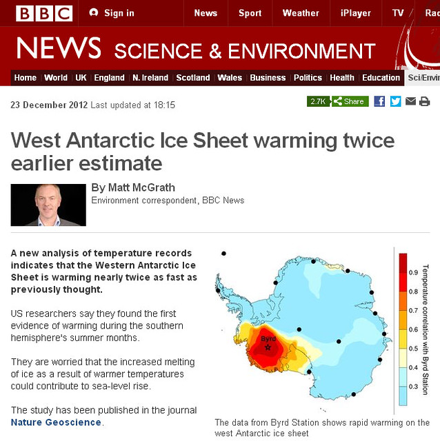
Exhibit A is a pic from Aunty about the recent West-Ant-is-warming-so-Steig-was-right-all-along paper from Bromwich; see RC for more details. And what I want to say is: this pic is inevitably totally misleading to at least 99.9% of the audience, particularly when captioned "The data from Byrd Station shows rapid warming on the west Antarctic ice sheet". How many people are going to read the sideways text on the scale saying "Temperature correlation with Byrd station"? Very few, and even fewer are going to understand it.
The pic shows (as the sidebar says) the temperature correlation between temperature variations at Byrd, and those elsewhere. Its the annual mean, and its from ECMWF reanalysis rather than from observations (it has to be not-from-obs, because its a field available everywhere; they could have plotted it over the sea too if they'd wanted to). They don't even say (as far as I can tell) whether its from de-trended anomalies or not. But anyway: the only point of the pic is to show you that temperature variation at Byrd is fairly representative of temperature variation over much of West Antarctica (although because the re-analysis will have used Byrd, and won't have been corrected by much else, I'd be inclined to wonder how reliable that is). The colour scale makes it hard to see (the portion of the colour bar including zero correlation should be white, obviously) but the correlation over the rest of Antarctica is near-zero. Fair enough: West Antarctica is meteorologically isolated from East Antarctica. Somewhat more surprisingly it appears to be isolated from the Antarctic Peninsula.
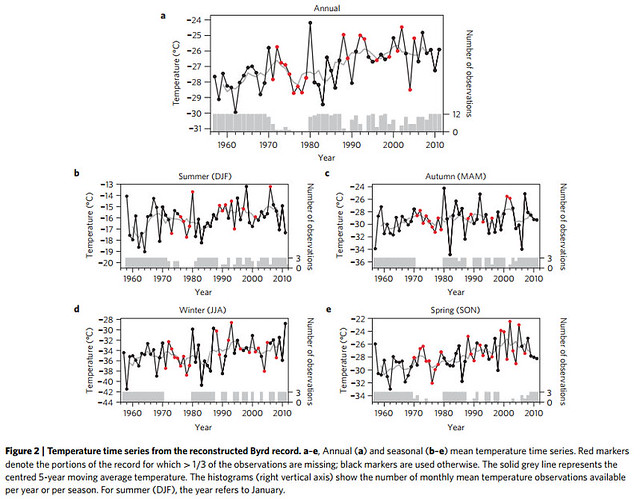
What the pic doesn't show is warming. For all that particular pic shows, W Ant could be warming, cooling, or staying the same. because its just a correlation map. I can only assume that Matt McGrath is a bit clueless, as this isn't the pic you'd choose to illustrate an article about temperatures going up. He meant to use fig 2, which I helpfully include below:
[Update: TC in the comments points out that the same mistake is made by UCAR's press release [cite].


"Somewhat more surprisingly it appears to be isolated from the Antarctic Peninsula."
Surprising indeed, but If the graph is showing recent anomalies it could perhaps indicate sequential warming.
West Antarctica is further south than the peninsula. The latter (probably) receives the full brunt of the circumpolar winds.
In addition, one has to know just where the deep water vertical movement is occurring and in which direction where. That seems more oceanographic than meteorological?
[I'm used to thinking of it more in terms of meteorological conditions in the Bellingshausen / Amundsen sea, which tends to include the Peninsula as one boundary -W]
For what it is worth, the mistake ascribing the map as showing extent of warming rather than correlation with Byrd station was made in the original UCAR press release:
http://www2.ucar.edu/atmosnews/news/8570/west-antarctica-warming-more-e…
[You're right, and made even more explicitly. How appalling. That doesn't absolve the Beeb of its duty of competence, but makes the mistake more understandable -W]
Bad Weasel!
Saw something recently that discussed changes in the circumpolar current in relation to warming on the peninsula that made some sense.
WIlliam
The non-independence of Byrd and the reanalysis is an important point. Still, if you look at the correlation of Byrd with the rest of the continent, using satellite data that are totally independent of Byrd Station (and not used in the reanalyses) you get pretty much the sam picture as shown.
I agree with you it is misleading to most readers of course.
As for Peninsula warming vs. West Antartic warming: they are anticorrelated on the interannual timescale (shifts in the Amundsen Sea Low would do -- and have done -- that, as you know). But both are warming together on the 50-year timescale.
Eric
William,
By the way, you spelled my name wrong, just like Steve McI does. ;)
Eric
[What a way to welcome you to the blog. Apologies, corrected. And you're right about the dipole; I'd forgotten that -W]
Just eyeballing fig. 2, and with the same correlation-logic already presented by others, another headline could have been:
"20 years of no significant warming at West Antarctica."
[Probably better to do it properly than by eyeball; its too easy to mislead that way -W]
In my first comment I had neglected to actually read and register on the Y axis label. Bad me.
An overall T map would still be interesting to see.
Monthly correlation maps:
http://i48.tinypic.com/2ykc6so.png
http://i49.tinypic.com/29pzp5z.png
http://i46.tinypic.com/2llehcp.png
http://i48.tinypic.com/2yklxc3.png
http://i50.tinypic.com/16bka6c.png
http://i45.tinypic.com/hrfr01.png
http://i50.tinypic.com/abtef6.png
http://i50.tinypic.com/o8gigx.png
http://i48.tinypic.com/4j5n2c.png
http://i49.tinypic.com/fk00m1.png
http://i50.tinypic.com/2lsbloy.png
http://i46.tinypic.com/28tf8f6.png
[Thanks, those are interesting. Did you generate them offline, or is there an online tool that allows that? -W]
I created those maps offline with a GrADS script using data from http://nomad1.ncep.noaa.gov/pub/reanalysis-2/month/flx/
I looked up borehole temperature measurements in the Antarctic and found this:
Borehole temperatures reveal details of
20th century warming at Bruce Plateau,
Antarctic Peninsula
V. Zagorodnov1, O. Nagornov2, T. A. Scambos3, A. Muto3,*,
E. Mosley-Thompson1, E. C. Pettit4, and S. Tyuflin2
The warming found by this study is pretty much consistent with the reconstructed Byrd record as far as I can tell - that should help to squash the predictable accusations of fiddling from the usual suspects.
Where's the surprise. Where's the science?
The temperatures are simply a reflection of the natural warming noted since the LIA.
I'm not happy mixing across data sets made at different times. However, this last decade seems to be hinting the way to a cooling trend. As expected.
[You're not happy mixing across datasets... unless you can pick out a cooling trend? And what sort of nonsense is hinting the way to a cooling trend? You've already said in your first para that there is a natural warming trend, so why are you suddenly seeing cooling? -W]
The bigger question is, considering the temps barely ever go above -14C, it always snows but lightly so everything is continually buried, however slowly. The losses are against the very fast moving glacier. So who knows about glacial velocity (cycles) due to increasing/reduced mass?
[That was close to incoherent. Actually it is so incoherent that I can't understand your question -W]
"The temperatures are simply a reflection of the natural warming noted since the LIA."
Incorrect. It is universally accepted (even by the 'skeptics') that natural forcings alone cannot account for the 20th/21st Century global warming trend. In particular, natural forcings have declined slightly since mid-20th Century while global temperature has risen rapidly - a trend which bears several clear signatures of anthropogenic greenhouse gas warming.
Icarus62:
This, BTW, is why it's reasonable to attribute greater than 100% of the current warming to anthropogenic causes.