 A few weeks ago I solicited suggestions for how NOT to give a talk, and I was overwhelmed and greatly amused by the volume and enthusiasm of responses.
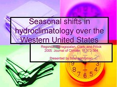
At about the same time, Dave Ng over at The World's Fair was thinking along the same lines. He claims to have created the most evil powerpoint slide ever. Take a look; it's pretty heinous. He also made a totally awesome video montage of things to avoid while speaking publicly.
 I'm not as video savvy as Dave, nor will I lay claim to the absolute slide ever. But I did manage to put together a pretty darn awful powerpoint presentation. Before I give you the link, I'd like you to imagine the presenter dressed in an XL bright red sweatshirt and backwards baseball cap. She of course doesn't know how to make the clicker work, talks with her back to the audience, and when she does figure out how to use the laser pointer, she waves it wildly around the slowly animating words.
One other thing - My deepest and humblest apologies to the authors of the paper I massacred in this powerpoint. I actually really, really like your paper. I picked it so that I could do an enthusiastic job presenting it in the how to give a not-so-bad talk portion of the class.
OK, here's the link. It had my students in stitches. I hope it has a similar effect on you. Feel free to use it in your teaching - obviously you don't have to know any of the content to give this talk. But in case you can't imagine how to deliver it, I've written my delivery notes in the notes section below each slide.
It's vesy fantastic. I love the way you made the figures illegible in so many creative ways.
Wow. Just Wow. I think you were presenting at the last conference I was at...
That is fantastic.
You should also use wildly contrasting styles of clip art in the same diagram. Bonus points if the differences in perspective cause people in the audience to pass out.
Otherwise, excellent work. The size of the file is particularly hilarious.
OMG! That is hilarious. Except I have seen a few of those talks before....
I almost puked when the figures came out, and bounced! That is awesome!
I have a headache from the bouncing and spinning figures. That's some trick! Might give someone seizures.
Cute. Sadly, at our fall faculty kickoff, in a session on "teaching and learning", we were told that "animations in PowerPoint aren't used enough - they really catch the eye of students and drive home your point. Don't be afraid to use them."
I don't think, even if I used PowerPoint, I would take that advice.
Love your sense of humor.
Extra bonus points for making a presentation that really tortures OpenOffice...
First time through I was hitting the space bar trying to get the hideously slow animations to finish. I don't think I'll go through it a second time...to traumatizing.
That's great. I love the way you made the figures illegible in so many creative ways.
Congratulations: you hit your target of "so bad, it's wonderful." Especially how you used several animation techniques that I never wanted to know existed.
Dean, did you think to ask for studies on the spot? And were the people running this session professors of education, or PowerPoint "consultants"? I know I'm not most people, but I find animation more distracting than helpful for driving home the point.
This was awesome! Your notes on how to present had me in tears!
The figurs, they burn!
Fantastic! I swear you must have presented at every meeting I've ever been at.
And yes, wildly bad clip art, especially clip art that has so bearing on the presentation.
Funny story about the clip art...I was going to include some "wildly bad" animated clip art and it is was in my search for some that my laptop contracted its virus and had to have its hard-drive erased. I suppose I could have used some of the built in clip art from powerpoint, but after that experience I was a little put off the clip art. Word of warning: do not google "animated gifs" and go to the first web site listed. Bad things will happen.
Um, I fail to see anything wrong with the presentation. I definitely shows you have more skill using Powerpoint then I do. If I had all them skills I would want to show them off also.
Hilarious! My husband's advisor LOVES animation - probably would've totally missed the humor in your presentation!
Great job! Love the dog story!
Great job - It reminds me of a fifteen minute presentation I created five or six years ago to colleagues (all management consultants - sorry!) on "How to present to clients"
It was, of course, a single slide - with music, dancing text, flashes of color, clip-art and animated charts and graphs. (The music used was the Austin Powers theme - fun to start - hellish when continued for fifteen minutes!)
It was also timed (which was the tricky part for me) so once started it just kept on going. I spoke over the presentation - and people had a really hard time trying to both listen to me, and watch was was happening (What I said, and what was shown were also completely at odds)
The presentation made the point better than a boring seminar would have -- none of those consultants ever went overboard with powerpoint again - those who tried were shouted down by their colleagues!
I had one slide that I displayed for about 1 minute after the show finished (after a 20 second pause). It simply said - don't ever do that in public!
Great job - I was annoyed just watching it! Oh wait ... maybe I was still annoyed from having to sit through several FACULTY presentations this morning that had the exact same animations and backgrounds!! Grrrr.
Oh, my, that was grand. I really liked the letter-by-letter unrolling of that one large paragraph; it drove me absolutely bonkers.
OMFG, that ppt made me feel a little bit STABBY. I've seen some epically heinous PowerPoints in my day, but if you want to see some egregious abuses of color and design, I dare you to look at a teenager's MySpace page.
With that said, I am forwarding that ppt to all my colleagues who are gearing up for APHA in October.
Brilliant. :)
Love the use of Comic Sans ;) I think you hit just about everything here. Thumbs up!
Wow. That presentation is migraine-inducing.
For the next round, you may want to use the sounds animations :) They drive me completely NUTS. But way to go with over-animation!
Great job! If I missed anything it was sound effects. The crowning glory of bad PowerPoint animation is the "lasers shooting text onto the screen letter by letter" animation, with sound. I actually forbade my students to use Comic Sans in their class presentations.
Oh, man. I got to the one with the fall foliage background and the slowly - crawling - text - made me scream OUT LOUD, thus scaring the children and the cat.
Wow, love it. Thanks.
Thank you so much for doing this! I have to coach some 13 year-olds on how to create an effective PowerPoint it was hurting me to come up with some terrible examples. This is truly a work of art.
I will definitely use some of these as counterexamples (credited, of course).