Dataviz
The New York Times decided earlier this week that biological animation warrants its own article. About time! :)
Seriously, for those of you who haven't discovered BioVisions' amazing animations, you should check them out and/or use them in class - with the caveat that they're not "pure" data:
While acknowledging the potential to help refine a hypothesis, for example, some scientists say that visualizations can quickly veer into fiction. "Some animations are clearly more Hollywood than useful display," says Peter Walter, a Howard Hughes Medical Institute investigator at the University of…
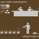
In less than a month (December 2nd), Christie's will auction off Edward Tufte's library - an idiosyncratic collection of first edition books, plates, prints, and ephemera that the dataviz guru calls his "Museum of Cognitive Art," and I call "Jessica's Christmas List."
I'm not going to sample low-rez images of the lots here, because there's a stunning slideshow, complete with curation, at the Christie's website. If you've got ten minutes, this is virtual antiquarian dataviz windowshopping at its best.
There appear to be 160 lots; Tufte's website describes it as "200 rare books, including major…
IBM has a new commercial depicting the constant streams of medical biodata that can be gathered from a human body, and hopefully improve healthcare. In a shameless play to elicit warm fuzzies, they made it about very young babies:
Awwwww. With all the glowing data, it's sort of like a baby TRON. And what's with the virtual-data-baby-mobile? Is it made of giant diatoms, or what?
Wait. . . I know what this reminds me of. . . it's a PLANKTON PARTY!
BTW, there's also a "behind the scenes" clip of the IBM commercial, with the apparent sole purpose of giving the babies extra cute camera time.…
Knight Fellow Geoff McGhee created this polished video documentary series about how data visualization is infiltrating and transforming journalism. Interviews with Many Eyes creators Fernanda Viegas and Martin Wattenberg, Amanda Cox of the New York Times, and other dataviz luminaries are coupled with bios and links to further information, some history of visualization techniques, industry context (is dataviz profitable? who's doing it?) and lots of lovely examples. The last section of the video, "First Steps," is a mini-tour of useful DIY sites like Swivel and Wordle (which is ridiculously…

Hippocampus: Broad Overview
Tamily Weissman, Jeff Lichtman, and Joshua Sanes, 2005
from Portraits of the Mind: Visualizing the Brain from Antiquity to the 21st Century by Carl Schoonover
The first time I created a transgenic neuron, it was in a worm, C. elegans -- a tiny, transparent cousin of the earthworm. I injected DNA into the embryonic worm, let it grow up, and voila: there was one eerie green blotch like a little Pac-Man ghost, its long green axon a lime racing stripe running along the worm's transparent body. The worm wiggled, but I was the one hooked: science is beautiful.
You…
Want to see how Facebook's deafult settings have crept over time from mainly private to overwhelmingly public? Matt McKeon's got you covered with a very nice year-by-year data visualization. By 2010, the only things that aren't public are birthday and contract information. Was this what Zuckerberg had in mind years ago, when he said users were dumb ******s for sharing so much personal data with him? Hmmmm. . .
*yes, it's a pun. I do indeed sink so low, occasionally.
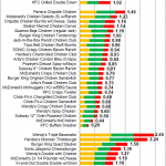
In the munch-inducing lull between election cycles, fivethirtyeight's Nate Silver turns his attention to the KFC Double Down:
I've created an index based on the amount of fat, sodium and cholesterol that the Double Down and a variety of comparable sandwiches contain as a portion of the USDA daily allowance. (In the fat category, saturated fats are counted double and trans-fats are counted triple.) The index is scaled such that the Original Recipe version of the sandwich receives a score of 1.00, a measure of gluttony that will hereafter be known as The Double Down (DD).** (source)
Based on…

from "Visualizing biological data--now and in the future"
Seán I O'Donoghue, Anne-Claude Gavin, Nils Gehlenborg, David S Goodsell, Jean-Karim Hériché, Cydney B Nielsen, Chris North, Arthur J Olson, James B Procter, David W Shattuck, Thomas Walter & Bang Wong
Nature Methods Supplement 7, S2 - S4 (2010)
Nature Methods has a special supplement out right now on bioimaging methods, with five commissioned reviews, "Visualizing genomes: techniques and challenge," "Visualization of multiple alignments, phylogenies and gene family evolution," "Visualization of image data from cells to…

So the word among my friends is that the iPad, which, as Stephen Fry noted, may be the closest thing humanity has yet produced to a Hitchhiker's Guide to the Galaxy, might just be worth buying -- if only as a stunningly cool toy and not, alas, the tablet many of us wanted. For example, I give you TouchPress' ebook The Elements for iPad, by Theodore Grey:
As the first really new ebook developed from the ground up for iPad, The Elements beautifully shows off the capabilities of this lovely device. It is impossile to describe in words the experience of seeing and almost feeling over 500…
Here's a pretty little visualization by Hybrid Medical Animation: a demo reel of clips portraying various physiological processes and medical devices in action, in various styles of animation:
hybrid 2010 reel from hybrid medical animation on Vimeo.
One of my frustrations with medical animations is that they're a Disneyfied look at the body. Real biology is dirty, sticky, unpredictable, and a little dangerous - kind of like Times Square used to be. But in medical animations the body is always a minimalist, sterile Kubrickian utopia, usually in Pottery Barn colors, where pretty little…
Doesn't that title sound weird - like an experimental film? It may help to know that House of Sweden is Sweden's embassy in Washington, DC - a lovely glass building on the Potomac. If you're in the DC area, you should get on their mailing list, because they host interesting science-related panel discussions and receptions. Yesterday, they opened a new exhibit - the Virtual Autopsy Table. It's a touch-screen tabletop that lets you slice into, rotate, and magnify an MRI-based 3D representation of the human body, all with a brush of a hand:
The Virtual Autopsy Table from Norrkö…
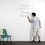
You may have heard from Slashdot that the University of Wisconsin is switching from Arial, a sans-serif font, to Century Gothic, a serif** font that uses 30% less ink, for default printing. The university hopes to save ink, which is both thrifty and eco-friendly. But you may not have seen this art project by Matt Robinson and Tom Wrigglesworth: they used ballpoint pens to scribble large-scale test versions of various fonts on a wall, and the ink level afterward was an analog readout for which font uses more ink. Ingenious!
Word to the nitpicky: while there's no rule that a sans-serif font…
Hi everyone,
I'm officially back from blogcation this week, so thanks for hanging in there while I was (mostly) off the grid! For the next couple of weeks, I'll be slowly wading through the emails and links I got during over the last few weeks.
Plus, I'll not only be posting at BioE, I'll also be contributing over at Collective Imagination, which is focusing this month on technology and personal health, including data visualization and e-health. (These are big interests of mine that I occasionally touch on here at BioE, but are a squarer fit over at CI.) Please pop over and see what you…
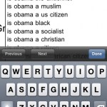
When Google started "suggesting" the most popular search phrases below its query box, I was creeped out. Especially when I saw what it suggests for "is Obama". Yes, I was happier when I didn't know what other people were typing into Google.
However, the folks at HINT.fm took the opposite approach: they created an interface that invites you to explore the most popular search phrases for any given starting words. I took it for a spin to see what the American public is asking about you-know-who: scientists. (You totally thought I was going to say Palin, didn't you?)
click image for a larger…
Mark Goetz makes me LOL:
Via lots of places, most recently Pollster.
Won't the dismal, subdued palette of winter release its hold on you? Never fear, a stripe of spring magenta is approaching! This infographic by Fernanda Viagas and Martin Wattenberg of HINT.fm depicts the dominant colors in flickr photographs of Boston Common around the year, starting with summer at the top:
It makes me wonder what similar graphics would look like for other geographic regions - or even for flickr photos in general across continents or hemispheres. Would seasonal trends be detectable? Do we compensate for the dismal palette outside by photographing lots of technicolor…
Jesse ("Jess3") Thomas's brand-new clip, like a slimmed-down, retro-styled, updated cousin of that ubiquitous "Right here, right now" video, is the perfect appetizer to complement the Pew's brand-new report on participatory news. Enjoy.

A visualization from NOAA representing the dissipation of energy from the Chilean earthquake.