Warmest Year 2014

I just did an interview on Green Diva Radio, and talked about a lot of climate change science news. For those who want to see the sources, here is a quick summary:
On Friday, NASA and NOAA are expected to announce that 2014 was the hottest year on record. I had been planning to write an extensive blog post going into all sorts of details about how that works, how they calculate it, etc. But then the people at Climate Nexus wrote a post that would have blown mine out of the water with the detail and informtation provided in it. Go here to read this excellent post: 2014: Putting The Hottest…
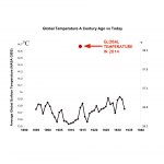
With what may be the warmest year in centuries about to close, I thought it would be fun to have a graphic comparing the march of global average temperature over several years about a century ago with the present state of affairs. This graphic is based on NASA's data, using John Abraham's estimate for the 2014 temperature (it might end up being a tiny bit different). There is more information about those sources here.
[click on the graphic to get to a larger version]
Just to be clear on how to read the graph ... the red dot is not anywhere in particular on the horizontal scale. The X and…