
The WHO came out with a new report today with the latest figures on Ebola. These numbers take us to the end of July. There are two bits of bad news.
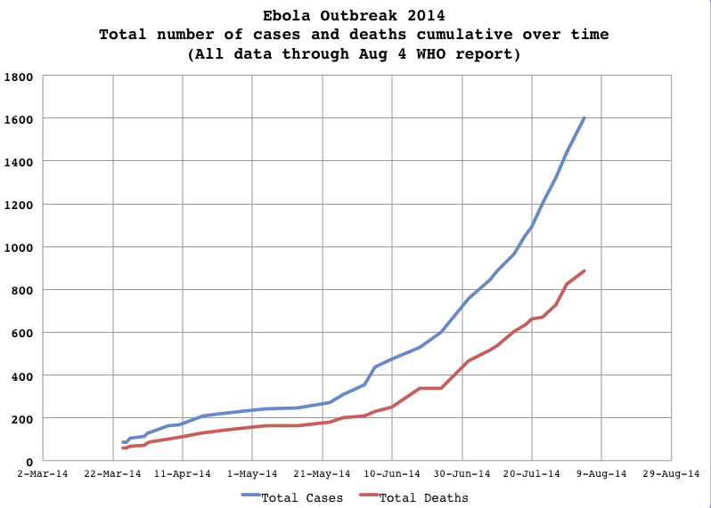
First, the number of new cases is high, as high as any prior report (but keep in mind that these reports cover uneven time periods). There are 163 new cases and 61 new deaths, bringing the total number of confirmed cases and deaths to 1009 and 574, with the total number of confirmed, probable, and suspected to 1,603 cases and 887 deaths.
Second, Nigeria is now in the mix. There was previously only one case in Nigeria, a Liberian man who contracted Ebola in Liberia and died in Nigeria. But now there are three probable new cases in Nigeria and one probable Death (none confirmed). According to WHO, of the Nigerian cases, "...one is a health-care worker and one is a Nigerian who travelled to Guinea — and a suspected case in a nurse." I'm not sure if four cases (if confirmed) is an outbreak yet. If all the cases have quirky explanations having to do with other countries, than this not be anything new. But this could also be the beginning of the spread of the disease into Nigeria.
Here's a graphic of the cumulative number of caeses by country (not counting Nigeria) and the total so far. These are all cases (confirmed, probable, suspected). You will notice that Sierra Leone is contributing the largest number of cases, but Liberia is contributing the strongest uptick in what seems to be an increase in rate of new cases (more on that below).

This graphic shows the number of cases over time and the number of deaths over time (totals). Note that the gap between the two is widening, suggesting a lowering of the mortality rate.
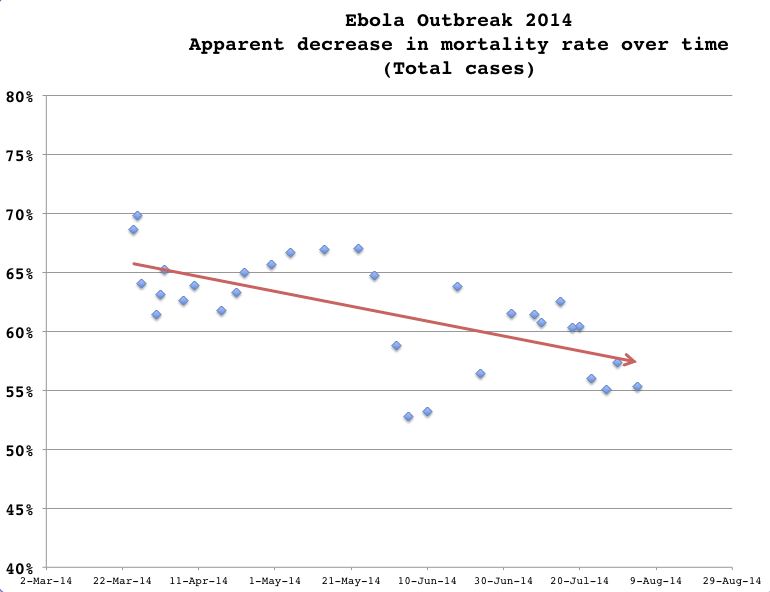
To try to get a better idea of mortality rate over time, here's a graph of the an estimate mortality rate based on the total number of cases and the total number of deaths for each of the WHO reports (which come out every few days) over time. There is no sense in calculating a simple correlation coefficient or R-squared value for these data because each data point is based on the adjoining data point plus or minus (they are not independent) but one suspects a proper time series analysis would suggest a decrease.
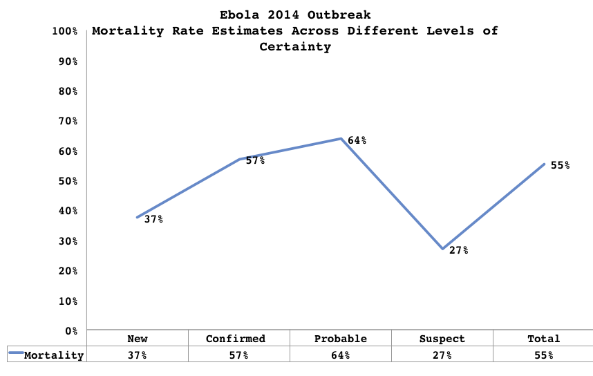
Keep in mind that as the number of cases or deaths shifts along the confirmed-probable-suspected axis, the morality rate can change quite a bit. One might expect that the least certain category would have the lowest mortality rate because one is more likely to incorrectly assign a patient to having the illness than one is to attribute a death to the disease. Here's the behavior of mortality rate across the different categories of available data. Note that the rate for "new" is probably going to be biased downwards if the rate of new cases is going up (because the number of people who have not died yet, but will, is greater than if the rate is going down); that 37% figure, therefore, is nothing to get excited about. Also keep in mind that "Total" is a combination of the other three categories. Given the vagueness of some of the data, one could say that a good estimate of mortality is 55%, but a large number of cases have been added in the last several days, so it might be better to say that the mortality rate in this outbreak is at least 55%.
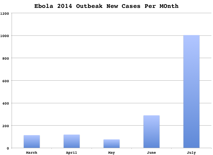
It seems that the number of new cases is going up but this is hard to count. The WHO reports cover different time periods, and I'll wager that even within that constraint the data are a bit funky given the on the ground situation. Over the large scale of time it is clear that the number of new cases is rising. This graph shows the number of new cases per month, but keep in mind that the dates of the various reports do not match the ends of the months cleanly so there is room for error her. These are all cases.
Since the rate of infection can go up or down over a matter of days, or a least, more rapidly than would be reflected in a month by month accounting, here's the same data by half-month:

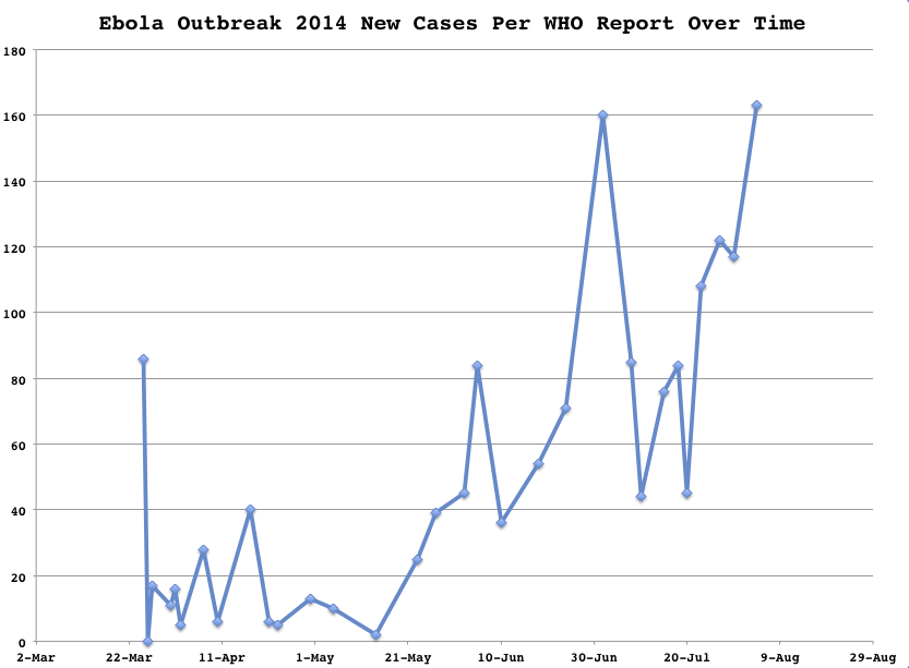
And, because that does not capture important detail here's the data again by WHO report, keeping in mind that the length of time covered by each report varies.
Actual epidemiologists use much more sophisticated methods for analyzing this sort of data, but this should give you the idea that while the rate of new cases varies a lot from report to report, there is a general upward trend in the number of new cases.
This Ebola outbreak is not going away soon, it seems.
Other posts on Ebola:
So the first graph starts at march 2014 and none of them goes back beyong 2011. None of them is normalaized due to population growth. So what exactly do they tell us? That an ebola outbreak increases the amount of ebola victims?
This is a graph of a three month long event. So, no, not normalized for population growth. You need to read the post and understand what it is about better because I think may be you are not fully getting it at the moment.
THE VIRUS IS INDEED SPREADING FAST, HENCE, WE NEED GLOBAL EFFORTS TO COMBAT THIS DEADLY DISEASE.
These graphs are excellent and helpful. Thank you very much.
This is great, when is the next update?
"So far, 2,127 cases of the disease and 1,145 deaths have been reported in four nations — Guinea, Liberia, Nigeria and Sierra Leone" - New York Times, August 15, 2014.
Frank,
I think I can guess the luminance and chrominance of your favorite giant horse.
http://scienceblogs.com/gregladen/2014/09/04/who-releases-alarming-ebol…