(from my old blog)
OK here's a post geared mostly to cell biologists. My big pet peeve about reading the scientific literature is ... colored fluorescent images.
Why do people insist on pseudo-coloring their images? I know that you want pretty pictures and as every kid knows the more colorful the picture the more adoration one gets from approving parents ... but we're talking about data and instructing/convincing your fellow peers about new findings.
So why is color bad for data presentation?
- Your eyes are better at detecting various shades of grey than shades of any hue. Or to rephrase, it's easier to see details in a black & white image.
- Your eyes can also simultaneously detect many more shades of grey than any hue. This is sometimes called dynamic range. If your protein is enriched in one area of the cell and sparse in another location, it's easier to convey the range of concentrations in black & white.
- Then there is the famous green/red overlays. I hate those! You can never tell whether an area is green (just protein 1) or yellow (protein 1 & 2).
So let me illustrate (literally!) what I mean:
Here is the same image (of a protein localized to the endoplasmic reticulum) in black white, and the 3 colors commonly used: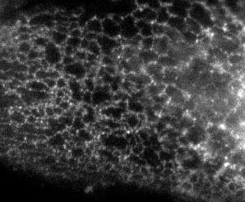
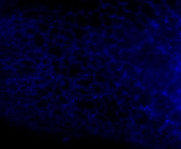


You're thinking, well it isn't so bad ... but in a journal article these images are usually scaled down ... lets do that.
Besides the blue & red pic, they're still not too shabby ... but go ahead and print these 4 images and all detail will be lost in the red and blue images. Greens tend to fair a bit better, but the black and white will be just fine and clear. Yes clarity is the aim of data presentation, not pretty pictures.
- Log in to post comments
At the medical research institute I once worked at we used to use PhotoShop to multiply the RGB images into one for certain kinds of flourescent tagging - when two colours expressed in the same are, they additively came up as another colour. Red and green came out as yellow, and this was useful. Is this the same sort of thing?
But you're using only one fluorescent probe, so it makes sense to present it in monochrome. If you're using multiple wavelengths, then and only then is it a good idea to use pseudocolor.
I've got a few old images stored away where we labeled one neuron with DiO, and another with DiI, so we could sort out how the filopodia were tangled together. I think it would have been legitimate to publish that in color -- putting it in grayscale would have discarded the relevant information.
I agree with PZ. For co-localization, you need to overlay the images and in that case, you need to false color each image to merge them. You can't see colocalization any other way. But, for the single color images (which you should also publish) no color is needed and, in deed, the B&W images are better. Also, it's cheaper to publish the single color images as B&W since journal charge for color images.
If you have 2 probes, show the black and white of each probe separately AND a green red overlay. When I originaly posted this there was a great deal of discussion about this. In an upcomming post, (that I orginally posted in Jan/Feb) I'll show an example.