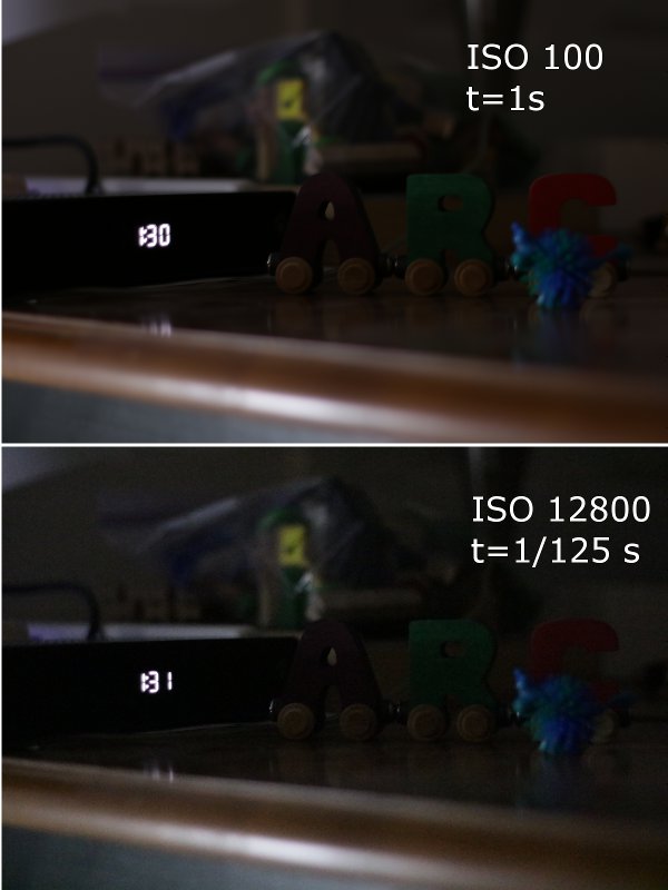
A little while back, I did a comparison of the different ISO settings on my camera, and a bunch of people commented that it would be interesting to try to match two photos at different levels. So, here's that:
These aren't quite perfectly matched, because the time settings give me a limited range of options, but it's pretty close. The higher ISO setting ought to be 128 times more light-sensitive than then lower, and it's 1/125th of the exposure time.
And... those look pretty similar. I'm honestly not sure how one would quantify this, so I won't try to; there's a bit more noise evident at the high ISO level, particularly on the edge of the table, but that might also be the slightly higher exposure.
Anyway, the conclusion is basically the same as in the previous post: modern DSLR cameras are pretty darn cool.


I see the "grain" effect most clearly in the solid colors of the letters, particularly B because it is lighter.
I wonder if you see it best when you have a pure color that is sensed mostly by only one of the "grains" on the "film".
The "faster" image looks darker to me. Maybe the difference in sensitivity is closer to 64:1, not the advertised 128:1.
Also of interest would be how well they do is really dark situations, say astro-photography. What happens with exposure times of several minutes?
@CCPhysicist: I think you need to get your eyes checked. The only thing I see that looks even vaguely like letters is the digital clock at the left.
I can barely tell the difference between the two, apart from the higher ISO image being taken ~1 minute later (per the clock). I wouldn't have caught the difference in noise levels if Chad hadn't called my attention to it--it's barely there.
I can very clearly see the wooden A-B-C train in the center of the image, a truly classic still life choice because of the pure color of each letter.
@#2: Agreed, and that might contribute to seeing more grain in the image.