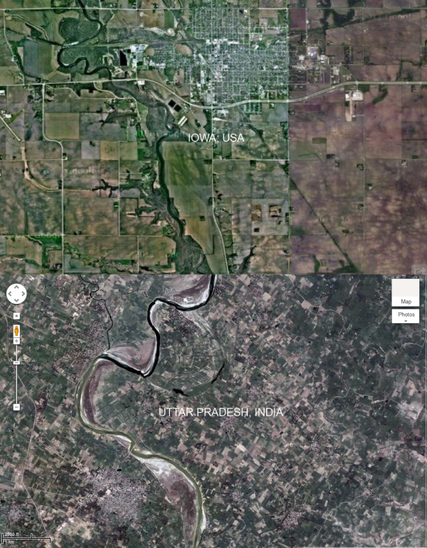
Located in the northeast of India, the state of Uttar Pradesh is known for the Taj Mahal, the Ganges and the holy city of Varanasi. It's also home to the eastern 'Badlands', an area that boasts high levels of poverty, crime, and acute pressures on land. (In fact, land is in such short supply that people will have living family members legally declared dead in order to speed up the inheritance process.) Peasant farmers work small family plots, and with each successive generation, the plot is divided amongst the children, getting smaller and smaller until people are farming strips of land "no bigger than a basketball court".
I thought it would be interesting to see this competition for land use from the air. Each plot of land represents a smallholding of one family, so the more plots there are, the more intense demand on land must be. For comparison, I pulled an aerial photo of Iowa, USA, where mechanised farming drives the development of huge plots, and low land pressure / successful business allows it. Despite differences in farming, borders nevertheless serve the same function in both cases - being a demarcation of ownership. Sure, that's a bit of a wide assumption, but it's just a thought experiment, so bear with me. Aerial photos aren't exactly the same scale from one place to the next, so one of these has been rescaled in Paint.net. I actually made this image a long time ago, so apologies that the locations are a bit vague.
Result? Pretty stark. Shame I couldn't get them at the same resolution, as the impression is that the Iowa scene has been zoomed, when it's actually at the same scale. So what's the point? I thought that you might be able to use a pattern-matching algorithm to automatically scan aerial photos and estimate the size and number of plots. This might work as a remote measurement of land availability and demand, and thereafter crime, poverty, etc.

