Dataviz
This video from Xperia Studio very effectively conveys how data visualization can both leverage and challenge our conceptions of "reality." The night sky we've seen since childhood, like everything else we see, is just a tiny slice of the spectrum - only what we can perceive with our limited physiology. An app that lets us "see" otherwise invisible wavelengths is not merely a prosthesis that cleverly enhances our sensory perceptions, it's a tool to expand our worldview, by reminding us that what we see is only a limited subset of the whole: we could as easily see quite a different world, and…
Photo of Vermont highway courtesy of Kyle Cornell
Last week, I had my long-awaited vacation semi-ruined when, thanks to Hurricane Irene, my flight back from the West Coast was cancelled. I had to rent a car and drive across the country in a rush - not my favorite way to spend three and a half days. But based on what I saw passing through New York, and what I've heard about the damage in Vermont, I can't complain: flooding has overturned homes, isolated entire towns, and destroyed everything some families own.
Vermonters are a notoriously self-sufficient bunch, and I haven't seen that much…
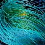
Gold Cortex
16 x 20, 2010
Greg Dunn
I used to have a beautiful gold Japanese folding screen, which was purchased by my great-grandmother's feisty sister on a trip in the 1920s. I loved the gold patina and the surprisingly modern impact it had on my wall. At the moment, it's loaned to a friend, but looking at Greg Dunn's artwork, I couldn't help but be reminded of the best aspects of my screen: the gold leaf, crisp black patterns, and way that the scene seemed half natural, half abstract.
The biggest twist Greg, a 6th year graduate student in neuroscience at the University of Pennsylvania,…
"Magnetic Field Outflows from Active Galactic Nuclei"
P.M. Sutter, P.M. Ricker, H.-Y. Yang, G. Foreman, D. Pugmire/ORNL
Wired has an article/webgallery of award-winning scientific visualizations which is worth a lunchtime visit. (Having trouble with Wired's interface? The videos collected there are the winners from SciDAC 2011's "Visualization Night" challenge, so you can also just watch them here.)
These visualizations are not your usual public-facing educational animation. Rather, they're just what you'd see at a scientific meeting - dry, functional, aimed at a specialist audience, and…
The New York Times did a special Sunday supplement on graduate programs. The editorial graphics they commissioned have much truth to them, grasshopper.
From the Smithsonian, a short video about using technology to virtually reassemble ancient art from fragments long carried away and dispersed:
Majestic sixth-century Chinese Buddhist sculpture is combined with 3-D imaging technology in this exploration of one of the most important groups of Buddhist devotional sites in early medieval China. Carved into the mountains of northern China, the Buddhist cave temples of Xiangtangshan were the crowning cultural achievement of the Northern Qi dynasty (550-77 CE). Once home to a magnificent array of sculptures--monumental Buddhas, divine attendant…
I was playing The Fracking Song last night about midnight, and my boyfriend was grooving to it. At the end he asked, "what was that about?" "Uh. . . fracking."
"Which kind of fracking?"
Yes, we are a BSG household.
Anyway, it may be an explainer, but it's actually quite a nice little piece of music too. And I'm a sucker for good typography any day.
Is your fracking attention span longer than 2:33? Then go dig around in ProPublica's fracking investigation. "The Fracking Song" is by members of Jay Rosen's NYU graduate journalism class. Nice work, guys!
Daniel Margulies of the NeuroBureau, an open neuroscience community, shared this opportunity:
The Brain-Art Competition 2011
Submission Deadline: 11:59PM CDT, Sunday, June 5th, 2011
Award Notification: June 28th, 9PM at the Cirque du Cerveau Gala (OHBM Annual Meeting), Musée National des Beaux-Arts du Québec.
In order to recognize the beauty and creativity of artistic renderings emerging from the neuroimaging community, we are launching the first annual Brain-Art Competition. Countless hours are devoted to the creation of informative visualizations for communicating neuroscientific findings…
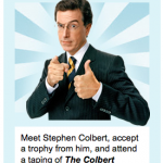
Calling all dataviz peeps: you know you want to meet Stephen Colbert. All you have to do is win DonorsChoose's version of the Netflix Prize.
It's a contest called "Hacking Education". DonorsChoose explains, "We've opened up [our] data, and invite you to make discoveries and build apps that improve education in America. Help to shape your school system's budget by revealing what teachers really need. Build the first mobile app for hyper-local education philanthropy. We've got a list of suggestions to help get you thinking."
Good luck!
So lately I've been trying to understand open source licensing options for software code, which is hard, because I'm not a coder. (If I don't understand an xkcd, it's almost always because it's some sort of Python joke.)
Anyway, Michael Ogawa made some videos a few years back depicting the growth of various projects (Python, Apache) as various developers came on board and committed code to the pool. His Python video is fascinating; it starts in 1991 with Guido van Rossum, who slowly attracts other developers. Through 2000, you can easily watch individual participants come in and out of the…
The placebo effect, of course!
A video by Daniel Keogh (Twitterfeed) and Luke Harris.
h/t Ed Yong.
Okay, I knew that planets are big, intellectually, but a well-done graphic is worth a thousand words, and a pretty HD video is even better. Brad Goodspeed made this video to suggest what other planets would look like, if they orbited Earth at the same distance as the Moon does. I've embedded it, but you should seriously watch it in HD, full-screen for maximum effect.
Scale from Brad Goodspeed on Vimeo.
I have nightmares like that. Seriously. But is the video accurate?
In addition to being full-on creepy, Brad's video produced a fascinating discussion in the comments and on various sites…
I get mail with wonderful links in it, but I'm hard pressed to find the time to post them, so my apologizes to those who've sent me things and not heard back. I'm beyond swamped. In the meantime, perhaps you'll enjoy these two nontraditional takes on "mapping." First up, map as music (or is it vice versa?):
"Conductor" by Alexander Chen
Conductor turns the New York subway system into an interactive string instrument. Using the MTA's actual subway schedule, the piece begins in realtime by spawning trains which departed in the last minute, then continues accelerating through a 24 hour loop.…

I think DNA is amazing. I think biotech inspires great design. And if you've read this blog at all, you know I love sciart. But I just cannot understand the new infogenetics product from DNA 11 - the company behind that trendy gel electrophoresis wall art. While I'd normally just say "I don't get it" and move on, DNA 11 claims that their "augmented art" is "the ultimate intersection of biology, art and technology." I don't know how that could get more squarely in the BioE wheelhouse. So let's take a closer look at how, exactly, biology and art intersect in the "Ancestry Portrait" (pictured…
Here are some essay links I've had open as tabs in my browser for over a week, waiting to be posted. Unfortunately, I don't have time to do the extensive commentary they deserve, so I'm admitting that, and just posting them already. Enjoy.
Graphical Abstracts & Biologists as Designers
Andrew Sun discusses "graphical abstracts" at nature network:
Although they are irrelevant to the quality of the research in my opinion, graphical abstracts (GAs) are in fact increasingly appreciated nowadays. No matter you like them or not, chances are that you have to draw one in order to publish your…
Hans Rosling's Joy of Stats is now available in its entirety (one hour) from YouTube! Thanks to flowingdata for the heads up.
Because people have been discussing Google ngrams a lot, and because there are always major caveats to new datamining methodologies, I have to link Natalie Binder's excellent series of posts urging caution, not only about the methodology, but about assuming too much about ngrams' utility in social research.
Binder says,
The value of the Ngrams Viewer rests on a bold conceit: that the number of times a word is used at certain periods of time has some kind of relationship to the culture of the time. For example, the fact that the word "slavery" peaks around 1860 suggests that people in 1860…
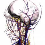
Google Labs just released a new "experiment" - Body Browser. You have to upgrade to Google Chrome beta if you don't already have it, but when you do, you can play with a 3-D, rotatable reconstruction of a (female) human body. Sliders let you fade the circulatory, skeletal, muscular, and nervous systems in and out over the body organs; you can toggle labels on and off, and you can zoom, spin, and rotate in a way that would only be cooler if it were on a touchscreen iPad. (Yeah, that's what I said, Google. Do it!) Check out this screenshot:
Toggle a few sliders and you can wrap the vessels and…
This video from the University of Minnesota's Institute on the Environment is like a conservationist's version of the "Right Here, Right Now" video about social media (although the music isn't as good). It has crisp design, good infographics, and makes a very important point: that nature has massive, unappreciated economic value.
I'm not saying that money should be the main reason for environmental protection; I value nature for purely aesthetic and scientific reasons, over and above economics (although aesthetics and science both have economic value - realized through tourism and R&D).…
The BBC is screening a new documentary, "The Joy of Statistics," hosted by Hans Rosling of Gapminder. This is a short clip; you'll probably recognize the data and presentation from a couple of years back, but the Minority Report-style, virtual full-body interface is new. Granted, it starts off a little reminiscent of a local news meteorologist gesturing stiffly at a greenscreen. But within the first minute it starts to seem more natural, and the data (comparative life expectancy, wealth, and population in the developed and developing continents) is always eye-opening. The BBC seems to be…