Science in Advertising
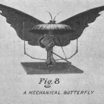
Check out this great slideshow of fascinating advertising novelties from 1911, over at Scientific American.
Photo of Vermont highway courtesy of Kyle Cornell
Last week, I had my long-awaited vacation semi-ruined when, thanks to Hurricane Irene, my flight back from the West Coast was cancelled. I had to rent a car and drive across the country in a rush - not my favorite way to spend three and a half days. But based on what I saw passing through New York, and what I've heard about the damage in Vermont, I can't complain: flooding has overturned homes, isolated entire towns, and destroyed everything some families own.
Vermonters are a notoriously self-sufficient bunch, and I haven't seen that much…
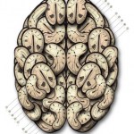
Gold Cortex
16 x 20, 2010
Greg Dunn
I used to have a beautiful gold Japanese folding screen, which was purchased by my great-grandmother's feisty sister on a trip in the 1920s. I loved the gold patina and the surprisingly modern impact it had on my wall. At the moment, it's loaned to a friend, but looking at Greg Dunn's artwork, I couldn't help but be reminded of the best aspects of my screen: the gold leaf, crisp black patterns, and way that the scene seemed half natural, half abstract.
The biggest twist Greg, a 6th year graduate student in neuroscience at the University of Pennsylvania,…
This 1967 IBM propaganda film, "Paperwork Explosion," couples an eerily deadpan refrain of "more time on paperwork," with a creepy pseudo-country neighbor* urging us to embrace Progress.
The film's frenetic soundtrack and abrupt transitions embody the familiar hysterical nervousness of an increasingly automated era, while striving the whole time to convince us that technology will relieve the pressures of the modern workplace, allowing us to "think" instead of "work". Looking back, of course, it's clear that technology instead cranked the pressure up. If writers like Nicholas Carr are to be…

Miracle of Science: the Cambridge bar around the corner from MIT, where the menu is a (pseudo) periodic table. May I recommend the grilled chicken salad with cilantro lime dressing, "Sc"?
An invitation from scienceforcitizens.net:
As record levels of snow blanket much of the United States this year, Science For Citizens is collaborating with an important climate research project at the University of Waterloo called Snow Tweets. We're pleased that this is the first of many scientific projects that you'll be able to do on Science for Citizens.
To help researchers track climate change, we're requesting that you find a ruler, put on a warm coat, go outside, and measure the depth of snow wherever you happen to be. And then report the depth to us right here. That's all there is to…

I think DNA is amazing. I think biotech inspires great design. And if you've read this blog at all, you know I love sciart. But I just cannot understand the new infogenetics product from DNA 11 - the company behind that trendy gel electrophoresis wall art. While I'd normally just say "I don't get it" and move on, DNA 11 claims that their "augmented art" is "the ultimate intersection of biology, art and technology." I don't know how that could get more squarely in the BioE wheelhouse. So let's take a closer look at how, exactly, biology and art intersect in the "Ancestry Portrait" (pictured…
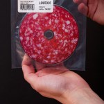
Unfortunately, the shift to digital music sales has largely eliminated the art of traditional album design - framing the music in cleverly designed sleeves and cases. The new Shidlas cd, "Saliami Postmodern," is a meaty exception. Yum:
Via Fubiz (the weirdest thing about the fubiz post is when they show the cd in a Discman. Who still has those?)
Design by Mother Eleganza.
IBM has a new commercial depicting the constant streams of medical biodata that can be gathered from a human body, and hopefully improve healthcare. In a shameless play to elicit warm fuzzies, they made it about very young babies:
Awwwww. With all the glowing data, it's sort of like a baby TRON. And what's with the virtual-data-baby-mobile? Is it made of giant diatoms, or what?
Wait. . . I know what this reminds me of. . . it's a PLANKTON PARTY!
BTW, there's also a "behind the scenes" clip of the IBM commercial, with the apparent sole purpose of giving the babies extra cute camera time.…
Reader Miles suggested Danny Cooke's graceful documentary about ornamental glass & sign artist David A. Smith, who uses traditional techniques like gilding, silvering, and etching to create ornate glass signs and windows with aesthetics from Victorian to Art Nouveau. Time-lapse sequences offer a surreal glimpse of Smith dexterously floating giant panels of glass around his studio, gently pressing them against grinders to carve the distinctive beveled patterns and fonts so familiar from vintage pubs or storefronts.
David A Smith - Sign Artist from Danny Cooke on Vimeo.
Particularly if…

From a post by Erin Fitzgerald, a DoD Science Policy Fellow who consulted on the design of Mattel's new "Computer Engineer Barbie:"
It might seem silly to get excited about a new Barbie doll. But, to me, she will help reinforce in math-loving little girls that they, like Barbie, can grow up to be computer engineers. It has been well documented that in recent years far fewer women are pursuing computer science degrees, so such role models are very important. What Computer Engineer Barbie will do, I think, is broaden the realm of not only what is possible, but what feels accessible--being…
The UK History of Advertising Trust has initiated a ghostsigns archive to document old painted billboards - the kind you see on the sides of brick buildings, fading away unnoticed. These old signs are being destroyed daily (by gentrification, new construction, and new billboards being put over them), and very few new ones are being created (for an example, see my previous post on the artists behind the Stella Artois mural in NYC).
Unfortunately, preserving such signs permanently is difficult - and, some argue, not even desirable:
The core dilemmas are that they are not architectural…

Women have white matter, men have duct tape. Or so implies Louann Brizendine's latest book, the Male Brain, dissected in this post and comments at Language Log:
You may remember the controversy surrounding her previous book, the Female Brain, which (in the UK edition) depicted women's cerebrums as overstuffed, exploding purses. So for men, this is actually a step up. (Maybe men and women can cooperate and they can duct tape our brain shut? Wait. . . that doesn't sound good.)
A few thoughts on this ad I spotted last week in Boston:
1. Yes, that appears to be a giant gel electrophoresis. Geez, this town is nerdy.
2. I hope that attractive woman is supposed to be a genetics PhD. Because we're all supermodels.
3. Why didn't I ever think to do a random restriction digest and blot on my own DNA back when I was in the lab 18 hours a day, so I could false-color it in Photoshop, hang it above the mantel, and brag about my trendy home decor? Bah! I suppose maybe there were rules about that sort of thing.
4. The loft development website asks, "What's your design DNA"?…
One of my pet peeves is the idea that BMI provides an accurate indication of individual health. It doesn't. It's useful across populations (and may be useful to individuals to monitor progress), but when it comes to indicating which individuals are "healthier", BMI fails miserably - and our new Sciblings at Obesity Panacea do a great job of explaining why.
If, as a policy matter, we want to differentiate between the healthy and unhealthy - which is a big if, depending on how libertarian you are - let's make such assessments meaningfully, using a workout that proves general endurance and…

For the annals of humorous translation mistakes, this package from a digital antenna we bought last fall promises to . . . do something. I'm not sure what.
For John O, who enjoys terrible advertising.
A blunt animated message for Surfrider's Rise Above Plastics, with Portland's Borders Perrin Norrander (full credits here)
Via Notcot and others.
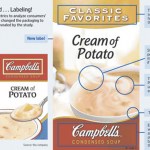
Campbell's is redesigning their iconic red-and-white soup packaging. Why? The answer's in your brain - or so they think:
Campbell's said traditional customer feedback wasn't telling the company why soup sales weren't doing so hot. "A 2005 Campbell analysis revealed that, overall, ads deemed more effective in surveys had little relation to changes in sales," the WSJ says.So they turned to "science." Campbell's hired Innerscope Research Inc. to conduct tests on a whopping 40-person sample to see what design elements produced the most "emotional engagement."The team clipped small video cameras…
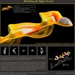
Modeling the flight of a bat (click to enlarge)
Dave Willis et. al., Brown University and MIT
Visual complexity is a paradox. On the one hand, complexity is a compelling feature known to capture a viewer's attention and stimulate interest. . . . On the other hand, complexity only arouses curiosity up to a point. When a visual is extremely complex, viewers may tend to avoid it altogether. -- Connie Malamed
I had a great time this weekend devouring Connie Malamed's oversized treasury of data visualization, Visual Language for Designers. The book couldn't be more appealing: it's like someone…
Why time goes slower when we get older
Rhonald Blommestijn
for Douwe Draaisma interview, Audi Magazine
Dutch graphic designer Rhonald Blommestijn's illustrations play with medical and technical themes in unexpected ways. Check out his blog, and his series of concept illustrations for the Netherlands Organisation for Scientific Research (NWO).
The Effect of Playstation on the Human Body
Rhonald Blommestijn
For Playstation Belgium
Rhonald Blommestijn
For the Netherlands Organisation for Scientific Research (NWO)