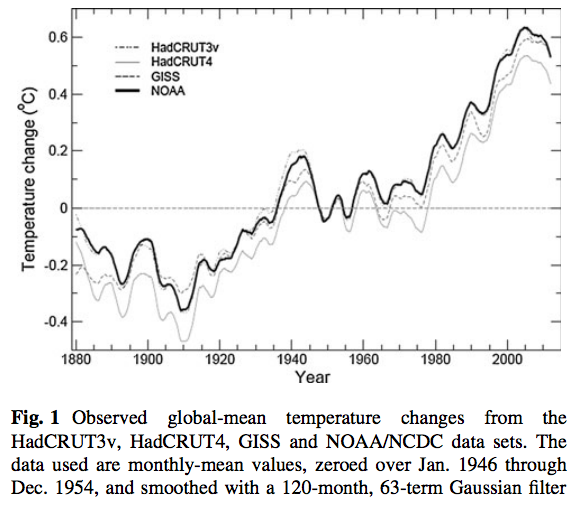
![]() A probabilistic quantification of the anthropogenic component of twentieth century global warming is a paper just out that examines an important conflict in the conversation about climate change and global warming. Before getting to the details, have a look at this graph from the paper:
A probabilistic quantification of the anthropogenic component of twentieth century global warming is a paper just out that examines an important conflict in the conversation about climate change and global warming. Before getting to the details, have a look at this graph from the paper:
This is temperature increasing on the earth over a century or so. Notice that there is what looks like a warming around 1940 on top of an otherwise mostly warming trend, followed by a bunch more warming.
The Fourth Assessment Report of the IPCC, in 2007, referring to data that ran up to 2005 inclusively, said the following:
Most of the observed increase in global average temperatures since the mid-twentieth century is very likely due to the observed increase in anthropogenic greenhouse gas concentrations.
Later, in a congressional hearing, Patrick Michaels, a climate science denialist (one of the meteorologists famous for his rejection of the data and science demonstrating a human induced warming trend) said to a congressional committee, of the statement by the IPCC:
... greenhouse-related warming is clearly below the mean of relevant forecasts by IPCC ... the Finding of Endangerment from greenhouse gases by the Environmental Protection Agency is based on a very dubious and
critical assumption.
A probabilistic quantification of the anthropogenic component of twentieth century global warming examines both claims and concludes that Michaels is wrong. From the abstract:
This paper examines in detail the statement in the 2007 IPCC Fourth Assessment Report that "Most of the observed increase in global average temperatures since the mid-twentieth century is very likely due to the observed increase in anthropogenic greenhouse gas concentrations." We use a quantitative probabilistic analysis to evaluate this IPCC statement, and discuss the value of the statement in the policy context. For forcing by greenhouse gases (GHGs) only, we show that there is a greater than 90% probability that the expected warming over 1950–2005 is larger than the total amount (not just ‘‘most’’) of the observed warming. This is because, following current best estimates, negative aerosol forcing has substantially offset the GHG-induced warming. We also consider the expected warming from all anthropogenic forcings using the same probabilistic framework. This requires a re-assessment of the range of possible values for aerosol forcing. We provide evidence that the IPCC estimate for the upper bound of indirect aerosol forcing is almost certainly too high. Our results show that the expected warming due to all human influences since 1950 (including aerosol effects) is very similar to the observed warming. Including the effects of natural external forcing factors has a relatively small impact on our 1950–2005 results, but improves the correspondence between model and observations over 1900–2005. Over the longer period, however, externally forced changes are insufficient to explain the early twentieth century warming. We suggest that changes in the formation rate of North Atlantic Deep Water may have been a significant contributing factor.
Not only is the IPCC assessment correct according to this new paper, but it is a bit of an understatement.
So much for that little bit of climate science denialism.
_____________________________________
Wigley, T., & Santer, B. (2012). A probabilistic quantification of the anthropogenic component of twentieth century global warming Climate Dynamics DOI: 10.1007/s00382-012-1585-8

Greg, I suspect that "Notice that there is what looks like a warming around 1940 on top of an otherwise mostly warming trend, followed by a bunch more warming" may not be what you meant to say...
Why not?
Ah, probably more tongue and cheek than I first thought... there's just a brief dip around 1940, so I thought that you were referring to a brief period of cooling that is still part of a longer-term trend.
The figure shows temps (pseudo-) Gaussian filtered. Which is fine. But people should be aware that the ´decline´ at the very end (2005+) is an artifact of the filtering/smoothing function...
wereatheist: Good point. In fact, the line goes up at the end in real temperatures.
...*is easily explained as* an artifact...
to put it better
Greg, there is no ´line´, and it´s noisy, but, yes trends do continue which is not surprising.
Because, at least, heat trapping by GHG is real. Simple physics.
And then, there are feedbacks. Unfortunately, they´re mostly ´positive´, meaning it´s bad.
Why are so many meteorologists AGW denialists?
wereatheist, I'm pretty sure Dr. Laden, who was a reader for my thesis on fresh water proxies for climate change, does not need you to tell him how this works.
BW: It's OK, he's right, a squiggle is not a line. I was using the term in a vernacular sense, but some time ago Wikipedia defined "line" so now it must be used just so.
Technically, in paleoclimate circles, this is a squiggle. I should have used that term.
sorry about talking about the obvious.
The obvious is not always obvious.
One of my comments was intended for the edification of The Publc. Guess which.
forgot ´solely´
Not a native anglo-saxon
Good question. I suspect it may be similar to the question of why so many engineers are creationists...