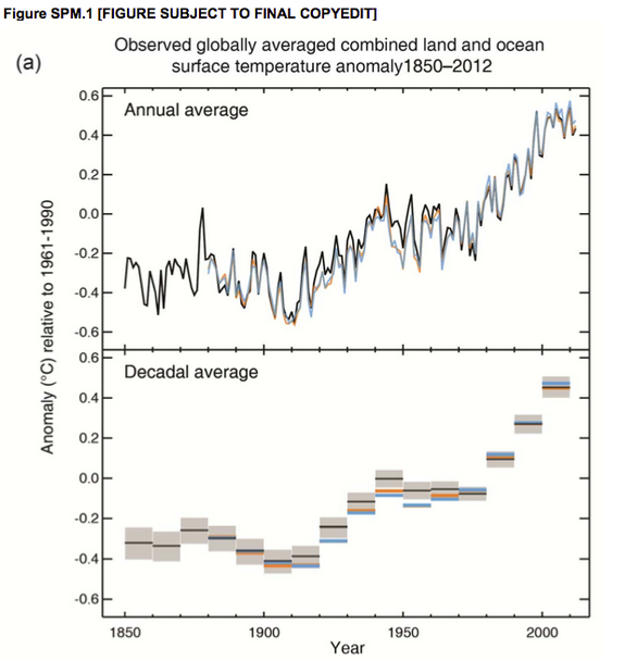
Each of these graphs from the IPCC policy summary shows the global surface temperature relative to a 1961-1990 arbitrary baseline. The upper graph shows the annual average, and thus captures a sense of variation reflecting a wide range of causes, but with a general trend from the early 20th century to the preset of increasing temperatures. The second graph shows the same data but using a decadal average. Notice that when you squint your eyes, turn your head sideways, and take some LSD you can see a highly significant decline, hiatus, pause, or even cooling in global temperatures that, if you've taken enough drugs, seems to obviate global warming. But if you look at the data by decade, even very strong mushrooms are not going to let you see what isn't there.
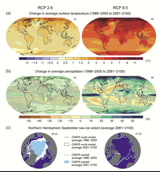
Snow and ice, there's less of it.
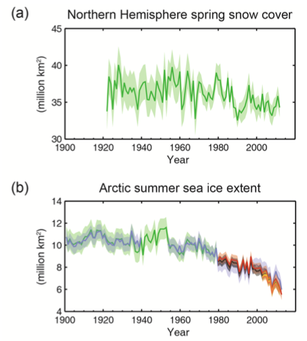 Less snow, less ice. The drop in arctic ice cover each summer is catastrophic and the rate at which it has happened was not predicted. This is one of a handful of reasons that everybody I now in the climate science world regards the IPCC report as conservative, even optimistic. Nobody saw this coming. What else are we going to not see coming?
This is why we use the term climate change. Everywhere here you see a color, the climate changed. Blue means more wet, brown more dry. The IPCC report is somewhat equivocal on drought cause by climate change, but reasonably certain about rainfall shifts. This reflects, I think, the lag time of the IPCC process. The IPCC is somewhat current but not as current as it needs to be. Including the most recent data and most recent thinking, what the IPCC is very certain will happen over the next century with respect to drought and rainfall is very much happening right now.
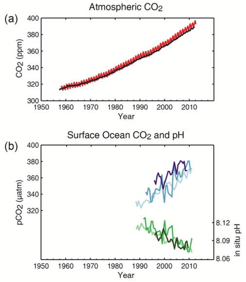
This is a complicated story but this graph summarizes it nicely. More CO2 in the atmosphere means more CO2 in the ocean, and this leads to acidification. That is a bad thing.
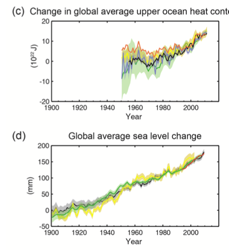
Most of the sea level rise over recent decades has been from the ocean getting warmer. But in the future expect the larger proportion to be from glaciers melting.
Here's the change in ocean surface pH:
It is getting hotter. It is getting wetter, or dryer, depending on where you are. And the big ice hat our planet wears is falling off.
I'm pretty sure the upper limit on this graph is going to be an underestimate. Mark my words. You can take that to the bank, but do pick a bank that is on top of a hill.
It's hotter everywhere, except, like, Iceland.



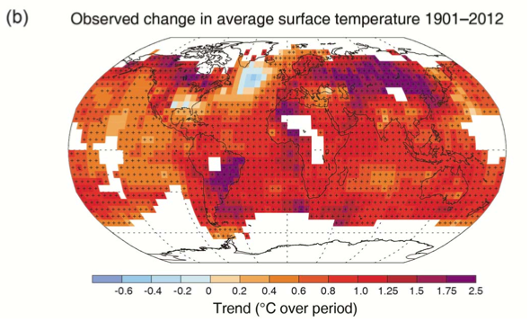
Iceland has warmed too. It's the meltwater from Greenland/Arctic keeping a section of the north Atlantic subpolar gyre cooler. This area keeps parts of the Europe habitable ;-), to jump into wild conclusions.
But the problem is that the gov'mint will not let me drive to work if my car brakes do not pass inspection so I will agree with the 35 or mechanics if that gets me a safety sticker then they are right and the 97% are a conspiracy to stop me from driving.
That's the same self-destructive logic that the re-puke-ians in congress are using in denying the 97% of scientist.
Looking at those graphs reminds me of the "murder scene" in _2001: A Space Odyssey_, wherein "HAL," the disturbed AI, turns off the life support to the hibernating astronauts on the Jupiter voyage. What you see in the film are the graphs of the astronauts' vital signs slowly but inexorably going flat, as the visually-sanitized deed is done.
Since, in the intervening 40 years, our collective cinematic tastes have devolved to the point where nothing less than graphic splattery gore gets attention, perhaps it would be appropriate for someone to take that approach to the climate change maps. And yes, I'm as serious as a proverbial heart attack about this:
Set up an interactive climate map, where mousing-over any region on the globe brings up the most brutally graphic pictures of the consequences: Floating corpses of flood drowning victims here, skeletal children with distended bellies there, victims of water wars over there, heat wave casualties elsewhere.
This could also be done as a video and posted on video sharing sites.
97% of people who stand to gain from convincing you of something say its true, 3% say don't. Who do you believe? More bogus arguments and skewed logic. Give it a rest guys.
With reference to brakes, I'll pull the wheels, and check them myself. ;-)
@jyyh - I don't think the cause of the cooling in that part of the north Atalntic is well known. It appears to go in hand with greater warming over the south Atlantic, which would suggest something to do with the ocean overturning circulation, but that's just speculation on my part.
19990, first sentence. Not sure forecasts go out that far :P
Good catch!
lceland has warmed too. It’s the meltwater from Greenland/Arctic keeping a section of the north Atlantic subpolar gyre cooler. thank you nice
"Climate change puts us at risk of extreme weather that costs hundreds of billions every year." http://clmtr.lt/c/Ees0Y0cMJ