
We're gonna need a bigger boat. Well, actually we're gonna need a bigger y-Axis. This has been happening for a while.
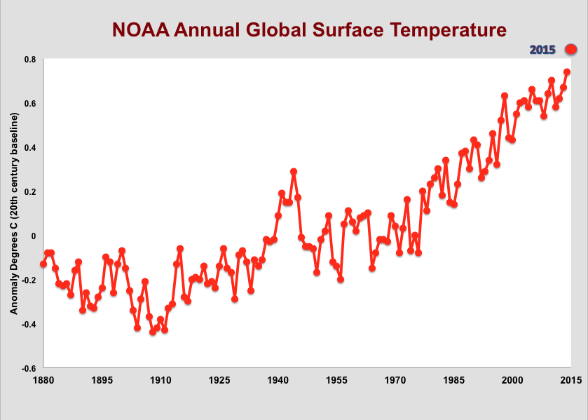
NOAA has just published September's global surface temperature, which turns out to be 0.90C above their baseline (20th century average). According to NOAA, this is the highest value for September on record, 0.19C higher than last year, which was also a record. The graph above shows the year to date average, though September, for NOAA's entire data set.
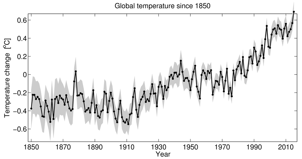
Ed Hawkins, a climate scientist at the University of Reading, recently tweeted a graph he produced to show global surface temperatures since 1850, noting that 2015 year to date broke his graph.
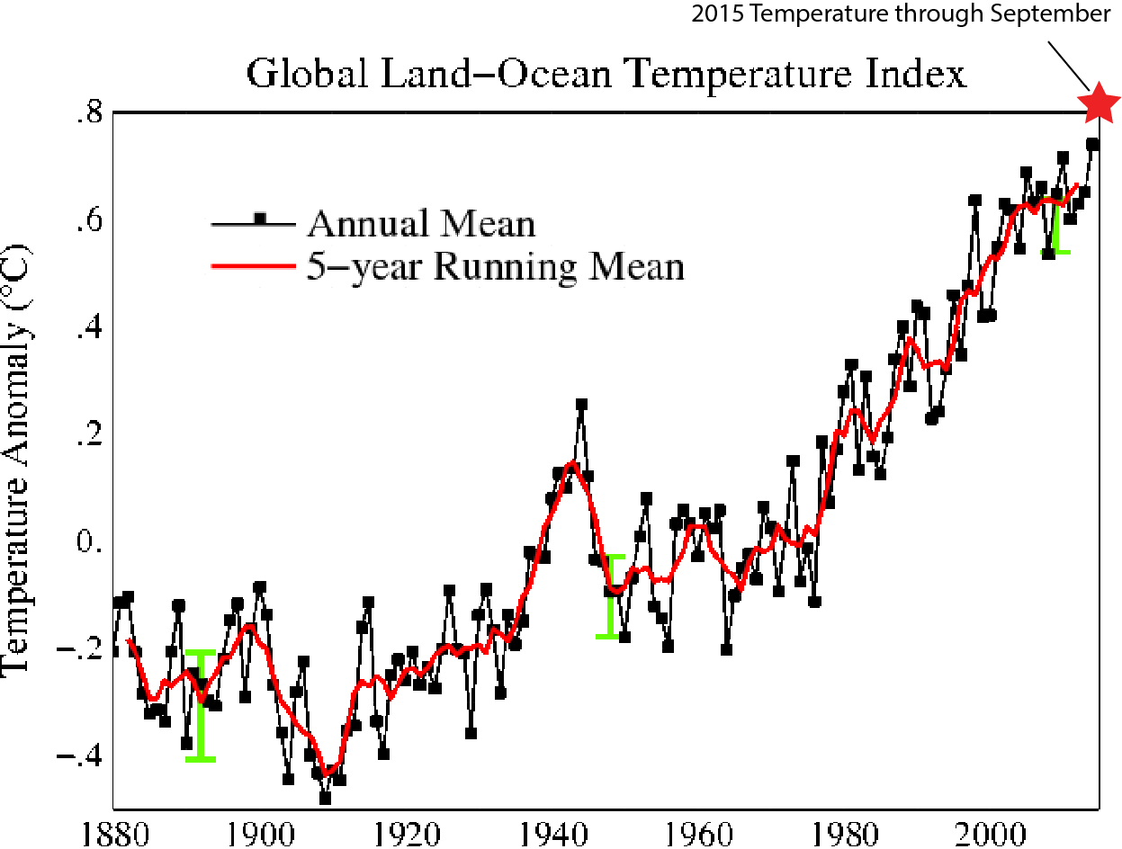
Using NASA GISS data, climate scientist John Abraham broke his graph too:
Using the NOAA data, I made the following chart, showing annual surface temperature measurements for their entire record through 2014. Then, I added an estimate for 2015, based on year to date numbers.
Broke the graph again.
Good, fine & warm weather. I like it. But it seems you have a little problem. What's wrong with you?
Rüdiger, read the post! My Y-axis is broken!
Rüdiger - the global average warming hides a multitude of effects that are far from the benign holiday to a warmer clime that you seem to believe. The link below is a great piece of why this is the case. In Europe, 1-in-50 years 'hot summer' events have increase in probability to 1-in-5 years events, and these are the kind that killed 70,000 people in 2003, so not worthy of a jokey, good, fine and warm weather jibe. In addition, and more serious in a way, is that the polar regions are warming at twice the rate as elsewhere, leading to disruption of the jet stream(s) and consequent disruption of established weather patterns. While attribution is problematic (a loaded dice that gives a 6 may or may not be due to its loading, but the overall long-term trend of sixes surely is). This issue is too important for a jokey failure to engage with the science. I have a problem with that attitude, for sure.
Here is the link....
http://climatesight.org/2012/04/03/climate-change-and-heat-waves/
Golly, I'm very sad to hear about your broken Y axis. I've heard from my doctor that there are pills one can take....
Probably the same doctors that treat "Fragile X-Axis Syndrome".
Greg,
Find out what Republican politicians take for their broken stuff, take some, and you won't need no stinking Y-axis...or an x-axis...or math--and you can probably do away with all concern about numbers n shit--except for the one that represents the payoffs from the PPK (psychopathic planet killers)...
Let me be clear: The number that represents the payoffs from the PPK that Republican politiicans receive is strictly a Republican politician concern, and surely the only number that means anything to them. We know you don't got no such stinking number;)
#6 Richard Erskine