
Image: NOAA
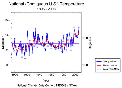
Between the effects of El Niño and global warming, 2006 was the warmest year on record since records were first kept in 1895. According to the preliminary data, 2006 averaged 55 degrees Fahrenheit, which is 2.2 degrees F (1.2 degrees Celsius) above the 20th Century average and 0.07 degrees F (0.04 degrees C) warmer than the previous record-setting warm year, 1998 (see figure, below). These temperatures were collected using a network of more than 1,200 U.S. Historical Climatology Network stations. The resulting data, primarily from rural stations, were adjusted to remove artificial effects resulting from factors such as urbanization and station and instrument changes, which occurred during the period of record.
The unusually warm start to this winter reflected the rarity of Arctic outbreaks across the country as an El Niño episode continued in the equatorial Pacific. A contributing factor to the unusually warm temperatures throughout 2006 also is the long-term warming trend, which has been linked to increases in greenhouse gases. This has made warmer-than-average conditions more common in the U.S. and other parts of the world. It is unclear how much of the recent anomalous warmth was due to greenhouse-gas-induced warming and how much was due to the El Niño-related circulation pattern. It is known that El Niño is playing a major role in this winter's short-term warm period.
Cited story.
May as well link the Real Climate post on that topic. Also recommended is Jeff Masters' post.
Since the end of anomalously warm 2006, the intermountain west has been plunged into a bitter cold snap (though, similar cold snaps occurred nearly every winter before about 1990 or so), and the midwest has gotten a dreadful ice storm NWS warning . It may seem I'm confusing climate with weather here, but as afarensis pointed out, historically ice storms of this sort have occurred farther south this time of year, and been smaller in extent.
I think they got that past their political minders by claiming the first figure was an election forecast.
Bob
And the price an everything is still going up and sure doesn't reflect on my utility bills..Arggggggggg
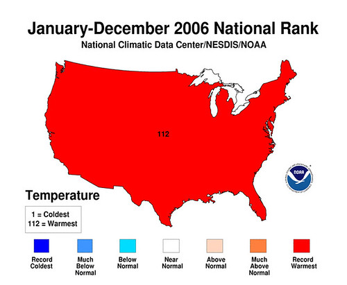
That solid red image is rather uninformative. It seems to have been chosen more for shock value than anything else. The statewide and regional maps alongside the precipitation maps are more interesting. http://www.ncdc.noaa.gov/oa/climate/research/2006/dec/12month.html
What's totally bizarre is that here in LA, we've now set both record highs and record lows for January this month. Couple weeks ago we had a 90 degree day. Just last night, it was below freezing here.
Hey Grrrl, The NOAA chart totally inspired me. Thanks for that.
Getting things done in Academia
advice for grad students
Actually the dramatic highs and lows such as experienced in L.A. is one of the predicted results of global warming.
I wrote a comment for this article nearly 2 days, with links to several other articles on the same topic - would you please look through the comments that got stopped for having too many links?
Um, so what accounts for temps almost as high in the early 20's and late 30's and the big drop around 1970?
Global warming... sheesh. This is like looking at a one day chart of the Dow Jones and drawing conclusions about long term trends going back to 1930.
Vic
The steady increase to 1940 is partly due to increases in
human-emitted greenhouse gasses, but also partly due to increases in
solar radiation. The fluctuations between 1945 to 1975 are due to
mostly human-emitted sulphates blocking sunlight (thus counteracting
the still-rising GHGS), and also due to fluctuations in solar
radiation. Post 1975, human-emitted GHGs rise so fast they overwhelm
all else.
See this
graph (and then hit the 'back to text' link at the bottom for
context). It graphs the forcings which have acted as heating or
cooling forces on our climate. Note the graphs do not all have the
same scale on the left side; solar, which has the least variation
since 1750, ranges from maybe -0.37 Wm^2 (depending on
reconstruction), to +0.35 Wm^2 . Well-Mixed Greenhouse-Gasses (WMGG)
starts at 0 and ranges up to almost 2.5 Wm^2. Also, the 0 axis on each
graph is relative to an appropriate historical average, not
absolute. Compare to the Gisstemp
or CRU temp
graphs. The steady temp increase to about 1940 matches up well with
the rise in the solar radiation shown graph 6.8 (d), and also with the
similar-sized rise in WMGGs, shown in graph 6.8 (a). I believe that
explains said rise (and also the many reports of warm temps in the
1930s).
From 1945 on, notice the solar radiation fluctuates rather than
rising. WMGGs continue to rise. Now look at graph 6.8 (b), look at the
sulphates line. Starting at about 1945 is a strong increase in the
cooling effect of sulphates (negative numbers on the graphs indicate
cooling effect). The increasingly negative sulphate forcing
counteracts the rising WMGGs, and then some, resulting in weak cooling
from 1945 to about 1975 . Past 1975, rising WMGGs nearly overwhelm
all else.
One feature you refer to, which I haven't explained, is the cooling
which ends in about 1906 or so. 6.8 (c), the solar radiation graph,
seems to show a weak decrease in solar forcing from about 1898 to
about 1906. That may be the explanation.
A similar graph, which sorts the forcings differently, is here.
Please note that above, I intend to speak only of forcings resulting
from various factors, not raw amounts, although my phrasing is
addimittedly ambiguous.
Thank you Hedwig for rescuing those two comments.