
...at least when it comes to road signs. The NY Times magazine has a fascinating article about how changing the font of road signs helps drivers see them, particularly late at night. The font that will be used is call "Clearview":
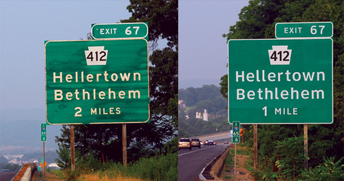
The improved font is on the right (these are real signs). From here.
Looks clearer to me. It's interesting.
If only there were a Mac font...
My own favourite example of poor signage design vaguely related to fonts comes from Wales. There, all(?) signs are in both English and Welsh; the English is printed in some sans serif upright font (dunno which one offhand, but it is readable), and the Welsh in an italic (or slanted, can't quite recall) version. So far, so good.
The problem is there is no consistency as to where on the signs the two languages are placed. Sometimes the English is on top and the Welsh on bottom, sometimes it's the other way around, and sometimes (albeit rarer, as far as I can recall) they are side-by-side (and, I assume, which one is on the left probably varies?). That makes navigating in Wales a real treat, especially since the spelling in either language isn't always agreed--the map says Bygtih (I just made that up) whilst one sign says Buthr/Yobithge/10miles and the next sign says Bezoug/Bigyth/12miles, and when you finally get to the place (3 miles later), the "Welcome to..." sign says Oythiryg. All pronounced "Neigh".
Fortunately, a few lhours in the pub tends to make you forget about the massive problems you had in finding the place...
Fonts have always mattered. Signage exploded when the interstate highway system began under Eisenhower in the 50s, but nobody on the engineering side bothered to look at legibility.
At the same time, all the advertising billboards along the very same highways and byways have made excellent use of fonts because money matters, and if they don't see, you don't sell.
The highway people have absolutely no excuse for this half-century-old disparity.
I have always despised sans serif fonts for their illegiblility. "Ells", "Eyes" and "ones" all look the same. And how about the lousy fonts used on most vehicle license plates.