
Here are three iconic graphs (unfortunately, there are many, many more) showing just some of the clear observational evidence that we're changing the climate.
The first is the atmospheric concentration of carbon dioxide, measured at the Mauna Loa observatory in Hawaii. It shows the little ups and downs in concentration that varies with the seasons, but also the inexorable rise in this powerful greenhouse gas. There are now thousands of stations measuring these gases.
The second is the deviation from global average temperatures over the past 130 years. It also shows the natural variability (ups and downs) of temperature, together with the disturbing rapid rise that scientists say is due to human factors (especially, the rise in greenhouse gases shown in Figure 1). The temperature data come from NASA's GHCN-M version 3.1.0 dataset. Again, there are other global datasets. They all show the same thing.
The third graph is the volume of ice in the Arctic (extent and depth together give you total ice volume), showing the rapid decline is the Arctic ice cap -- far more rapid than even conservative scientists expected ("conservative" in the non-political sense). These data come from the PIOMAS Polar Science Center.
Read 'em and weep.
[UPDATE NOTE: On April 4, I updated the second graphic with the latest (through 2012) combined land/ocean temperature anomalies. The overall trend is unchanged. I would also note, there are other datasets from research groups around the world, all of which show the same trends. Thanks to Richard (see comments below) for calling attention to the newest data.) The data come from: ftp://ftp.ncdc.noaa.gov/pub/data/anomalies/monthly.land_ocean.90S.90N.df_1901-2000mean.dat.
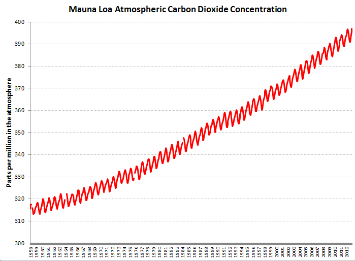 Atmospheric CO2 measured at Mauna Loa, Hawaii.
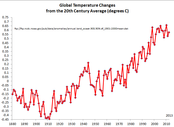 Updated Global (combined surface and ocean) temperatures from NASA Deviations from the average global temperature since 1880. Data from NASA . http://www.ncdc.noaa.gov/cmb-faq/anomalies.php#anomalies. Thanks to Richard to asking for the most recent data.
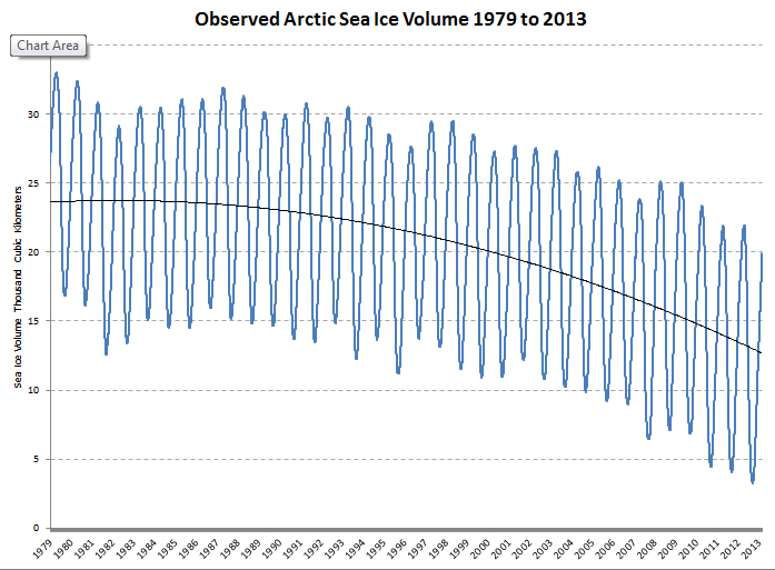 Arctic sea ice volume from the PIOMAS dataset.
I hope Peter Gleick is writing another definitive book, this time on Climate Variability and Change. His other books were authentic and have withstood the tests of time.
These graphs need to go back tens of thousands of years if you want to convince the climate deniers! I'm not one, but I'm practiced in arguing with them ;)
It's hard to imagine that the Arctic summer ice can have more than four to eight years left, given recent trends. I keep wondering whether climate change denialists (a couple of my own nitwit relatives in particular) will change their tune when they see a satellite photo of an ice-free Arctic. Or is this one of those situations where denial will become even more frenzied because, as Greer noted of the French Revolution, the longer we put off doing something the more burdensome any meaningful action would be, and it's now too burdensome to be thinkable to most people?
Here is the Global sea ice data. Above average.
http://arctic.atmos.uiuc.edu/cryosphere/IMAGES/global.daily.ice.area.wi…
Arctic sea ice is also normal for this time of the year.
http://arctic-roos.org/observations/satellite-data/sea-ice/observation_…
This is wrong. The first link conflated Arctic and Antarctic yet even this shows declining ice. Minor increases in the Antarctica have a different cause -- in fact, partly due to increasing freshwater runoff and changes in ocean circulation patterns. And the second link shows clearly that ice is far below average.
Fist off, how do we know we are not in a normal range since man has only been keeping track for a fraction of time. I’ve seen several studies indicating no warming in 15 years. Also I see he does not mention the fact that the Antarctic sea ice has been increasing, guess it doesn’t fit the narrative. Final point, one volcano eruption can equal man kind’s total green house emission in one event. This has happened thousands of times in the past in fact several super volcanoes are over due for a massive eruption at any time. When this happens we are going to have to rely on fossil fuel even more and be thankful for it. I agree pollution is a problem that can affect people and should be regulated but to push for money to curtail climate change is a mistake. We should be preparing for any number of likely natural disasters that will happen this decade not concentrating on climate change.
This comment also contains several fundamental errors, worth pointing out. First, we have extensive data going back millennia showing historical changes in temperature, greenhouse gases, and much more. Second, the "studies" indicating no warming in 15 years are not real scientific studies -- they are claims being made by climate deniers who cherry-pick data (typically 1998 or so -- a warm year). Take a look at the second graph -- it shows that warm year and you can see for yourselves whether this claim of no warming is valid. But more important, real scientists have responded clearly to this claim -- look beyond the simple claim to deniers to what scientists say about variability in temperatures over time. Third, no single volcano can emit anything like human contributions to greenhouse gases. Moreover, most of what volcanoes emit are the /opposite/ of greenhouse gases -- they mask the warming effect. And scientists track volcanoes very closely. The changes we're seeing are completely unrelated. Fourth, the Antarctic ice claim is misleading. Again, scientists have a good understanding of what causes sea ice to form or diminish and this has been clearly discussed. The disaster occurring in the Arctic is in no way balanced by changes (or contradicted by those changes) in the Antarctic.
But I partly agree with the final point: we must be preparing for the coming changes. But ignoring climate change will mean more and more, faster and faster, changes. This would be a global disaster.
What these graphs show is that change is occurring. He then assumes that is "we" who are changing. It. This is pure political sophistry. The climate of this planet has changed regularly for millions of years, and will continue to do until our son becomes a red giant and burns us to ash. To say that climate change is manmade is wishful thinking in support of a political position not supported by real science and real data. It is sophistry!
This is, of course, completely false. I am "assuming" nothing. I am summarizing the conclusion -- that humans are responsible (and clearly responsible) for these changes -- reached by every single National Academy of Sciences and professional scientific society on the planet. I would normally delete this kind of uninformed, ideological comment, but thought this one would be useful to show that one of the position of "deniers" is to accept that change is occurring, but deny that humans are responsible. This position is simply at odds with all the science and facts and evidence that is available.
Part of the above comment is the result of making the false assumption that because the climate changes naturally, any changes now occurring must also be natural. This is a classic error obvious to all.
So let me just leave you with this, sometime in the near future there will be massive earth quakes, tsunami, hurricanes and massive volcano eruptions. Cherry pick data all you want but you know this will happen. What a giant waist of time and money pushing the man made climate change theory is when more immediate calamities await man kind.
SkepticalScience still has the best answer to the "no warming for 15 years" meme:
The Escalator
Of course the Arctic ice volume has dropped quite a lot in the last 15 allegedly warming-free years. And how do we know that that's not a return to the conditions that usually held sway up until the year when satelittes were invented? Well, there have been humans living in the area for a long time who have traditionally paid close attention to the location and quality of ice, since their lives depended upon it. But they aren't white, so I guess they don't count as sources of information.
"satellites" - argh
Nice graph for #2 but it does not match the data you supply as a source. Your adjustments to the original data accentuate the fit to an exponential curve.
The data have not been modified. They are plotted directly from the source.
Even James Hansen agrees the global mean temperature has been flat for a decade, flummoxing the models.
http://www.economist.com/news/science-and-technology/21574461-climate-m…
Matt, this is incorrect, but I'll approve the comment and just respond in case other readers are similarly confused. First, that is not what Hansen said, or meant, if you carefully read the economist piece and what Hansen has said since. In addition, this variability in temperatures over time is normal and doesn't "flummox" the models. Indeed, the models also represent periods of greater and lesser cooler. Furthermore, scientists have carefully and clearly addressed this issue, noting that the surface temperatures (which my graph shows) is only PART of the change underway: extensive heat is also going into the upper ocean, the lower ocean levels, melting ice, etc. None of these have "stopped" happening. Finally, go look at the response on Skeptical Science's website about the claim there is a "hiatus" in warming. They carefully summarize why this claim is false and misleading.
Thanks, Peter, for responding to and correcting the idiotic denier commenters on this thread.
Go Peter!
From your source link. Which one are you plotting?
The Monthly Global Land Temperature Anomalies (degrees C)
The Monthly Global Ocean Temperature Anomalies (degrees C)
The Monthly Global (land and ocean combined into an anomaly) Index (degrees C)
The Monthly Northern Hemisphere Land Temperature Anomalies (degrees C)
The Monthly Northern Hemisphere Ocean Temperature Anomalies (degrees C)
The Monthly Northern Hemisphere (land and ocean combined into an anomaly) Index (degrees C)
The Monthly Southern Hemisphere Land Temperature Anomalies (degrees C)
The Monthly Southern Hemisphere Ocean Temperature Anomalies (degrees C)
The Monthly Southern Hemisphere (land and ocean combined into an anomaly) Index (degrees C)
The Annual Global Land Temperature Anomalies (degrees C)
The Annual Global Ocean Temperature Anomalies (degrees C)
The Annual Global (land and ocean combined) Anomalies (degrees C)
Richard. Many thanks for your question: I've gone back and updated the datasets with the newest data (from the Annual Global (land and ocean combined) Anomalies (degrees C) through 2012. And I've replotted the graph and (just to avoid confusion) removed the added trendline. The data can be downloaded from: ftp://ftp.ncdc.noaa.gov/pub/data/anomalies/monthly.land_ocean.90S.90N.d….
Peter Gleick
Something I stumbled on, maybe this could be improved: the graphs have completely different timescales. My brain hurts a bit trying to normalize their relation in my head ...
Yes, data sets like this often have different start/stop dates for when data are collected and available. And, of course, different y-axis units. And, of course, different geophysical lag effects. All this makes it hard (and not always wise) to try to plot them on the same graph!
Thanks Peter. Also appreciate your quick educated responses to the trolls. Keep it up.
Richard from Australia it is the
The Annual Global (land and ocean combined) Anomalies (degrees C) dataset Peter has shown.
Thank you Peter.
Good to see that the co2 concentration is no longer accelerating. Given the logarithmic relationship, that means that the radiative forcing should be decelerating. Good news indeed!
Thanks Peter!
:)
AJ, this isn't right. In fact CO2 concentrations are accelerating. There is variability year to year due to many factors (including economic recession), but rates remain high, and last year were especially high. Take a look at this:
http://www.huffingtonpost.com/dr-james-hansen/doubling-down-on-our-faus…
Figure 2 shows the rate of CO2 increase is continuing to rise, not decline. Second, the impact is not “logarithmic”, so the rate of impact is also continue to rise. Third, the lag in the system also means that even if we’re successful in reducing emissions (which we are not yet), impacts will get worse for a lot longer, before they start to recede, and some impacts will be irreversible on time-scales of interest to humans.
It's amazing how people can, in one breath support the scientists' evidence for a possibility of a massive storm/volcanic eruption sometime in the near future, and yet dismiss the exact same scientists' evidence for man made global warming. Cherry Picking to the max. Yes, Patrick, I'm talking to you.
Peter,
Dr. Hansen's plot looks pretty flat for the last decade or so using the 12 month running mean measures. Certainly the recession was a significant factor, but there are also a few other economic trends emerging as well, such as the move to natural gas, the relative slowing of Chinese and Indian growth rates, and with their increasing wealth probably a reduction in their energy intensities as well. Time will tell if the rate of co2 increase has been stabilized or not.
"Impact" is a nebulous word. With regard to the rate that heat is going into the pipeline, the impact is logarithmic. Socio-economically, my view is that the sign of the net global impact is in doubt. At a regional level, my guess is that there will be both winners and losers. As for the shape of heat coming out of the pipeline, it depends on how this is modelled. If the co2 growth rate is constant, then my bet is that the rate of temperature increase would be close to constant for the next few decades. These are only the opinions of a non-expert, so if you disagree that's fine.
"Here are three iconic graphs (unfortunately, there are many, many more) showing just some of the clear observational evidence that we’re changing the climate."
Um, after looking at those three iconic graphs they are clear observational evidence that the climate is changing. However they are not clear observational evidence that CO2 or humans are the cause. Sorry, you should know better.
But that is also true. I'm not going to do your homework for you but if you're legitimately interested in that question there are plenty of good resources and summary scientific studies that address the question of "causality" and attribution.
Hi,
Thanks very much, Peter, for the work you and your peers are doing. It must be pretty daunting at times to have to spend so much energy debunking the same uninformed claims and lies, over and over again. If I were a climate scientist, I would probably be exhausted and burnt-out repeating the same things since years to ostrich-like people.
If my children can grow up in an hospitable world , it will be thanks to you and people like you.
Thank you.
This may seem like a simple question but it doesn't make sense to me. How do you get a "Global average temperature"? There is no such thing because there are too many variables. Do you tale a reading from 1000 locations across the globe on a particular day and average them out? Do you take a reading from 100 locations over a year and average those out? Are there more taken in the southern hemisphere than the northern hemisphere? A global average temperature sounds like an impossible reading to calculate.
Thanks
Hi!
I think this figure showing the Arctic Sea Death spiral is the best illustration of what is happening with the Arctic Sea Ice.
http://skepticalscience.com//pics/arctic-death-spiral-1979-201302.png
This other figure also shows where we are heading
http://climatecrock.files.wordpress.com/2012/09/stroeve768-copybig.jpg
Peter, I think it useful to turn the question back on the deniers. A good question would look something like this: Given the known properties of C02 to trap heat, and given that humans are emitting some 30 billion megatons of the stuff into the atmosphere every years from burning fossil fuels, how can we not be heating the planet?
We have reached the stage where the onus of proof is not on Peter, or climate scientists, but those disputing the evidence. You can deny a fact, but you have to try, at least, to answer a question. Let's see how these brave denier answer...
can you email me some graphs that have bigger x-axes (like, cuz it seems these graphs should go way farther back in time to show how the recent warming during the human era is UNPRECEDENTED) like, back thousands if not 10's or 100's of thousands if not millions of years? I believe what you're saying, but I'd like to see how recent warming compares to warming that's naturally occurred in the past. thanks :)
Google "Vostok climate record" to get a graph of CO2 and temperature going back 400,000 years. The recent changes are unprecedented!
I'll send you a couple of others. Thanks.
Thanks, it's always great to be reminded of these figures. Now the task remains to muster up the effort to invest in adaptation and mitigation.
Mismanagement of water resources, deforestation and degradation of tropical rainforest, loss of biodiversity, desertification, etc. all remain pressing issues to be addressed.
Much progress has been made because of the contributions of scientific communities and folks like Peter Gleick. This field of scientific research is invaluable.
Richard Lindzen, MIT (among other eminent scientists) begs to differ, eg: http://fabiusmaximus.com/2013/01/07/lindzen-global-warming-47630/
Nanoo Windsor:
Yes, yes, but Lindzen is one of a tiny minority of scientists with climatology credentials who does. OTOH, 97% of working, publishing climate scientists support the consensus for AGW.
This is not an argument from authority, but an argument from expertise. The scientists supporting the consensus are the ones who have put the time in building their knowledge the hard way: years of working with the data and discussing it with their peers, then submitting their findings to public scrutiny in referred journals, at conferences and in the public eye. Consensus is crucial, because if a "skeptic" can't convince the majority of the experts, she's likely to be fooling herself. That's what "peer review" means, and science can't progress without it.