
On April 2nd, I posted three iconic graphs showing some of the clear observational evidence that we’re changing the climate. That post produced a substantial, and largely thoughtful response, and a request for more information and data along these lines.
Here are three more, along with a bonus fourth, all with a theme of exponential growth – the powerful force that is behind much of the concern about climate change and many other environmental and social challenges. Figures like these are increasingly called “hockey stick” curves, after the work of Professor Michael Mann and others in the climate community, but such rapid exponential changes, which often signify problems (unless your bank balance looks like this) are common in other scientific fields as well.
First: a root of the problem. Global population. Figure 1 shows the world’s population from 1300 to the modern era. Today’s population exceeds 7 billion.
Figure 2 from the 2013 US national climate assessment shows two thousand years of atmospheric concentrations for carbon dioxide, methane, and nitrous oxide: three of the most important and dangerous greenhouse gases.
Figure 3 shows over 10,000 years of carbon dioxide concentrations with measurements taken from ice cores (and a clear discussion at the website of Skeptical Science), and most recently from the Mauna Loa station (those instrumental data were shown, in more detail, in my April 2nd post).
Figure 4 is a clear, albeit disturbing graph that includes recent key findings on ancient temperatures reconstructed by the paleoclimate community for the past 20,000 years, plus the most recent instrumental record, plus projections from state-of-the-art climate models, showing how the world is racing into uncharted waters.
More “significant figures” to come.
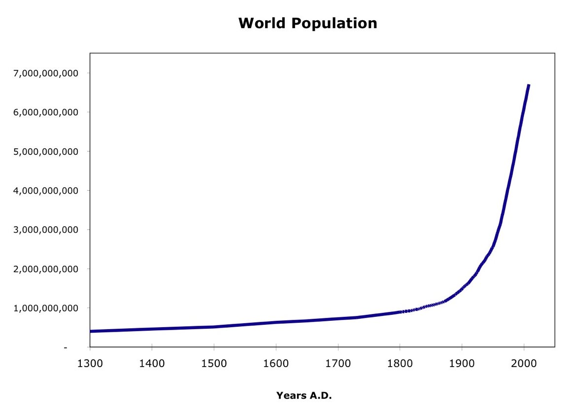 Figure 1. Global population over the past 800 or so years. Today's population is over 7 billion, and growing.
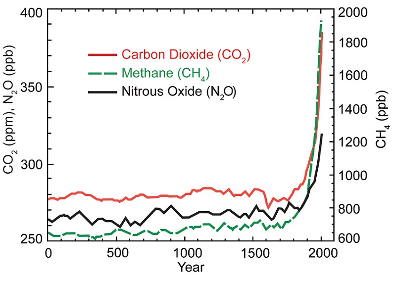 Figure 2. 2000 years of atmospheric concentrations of major greenhouse gases (CO2, methane, nitrous oxide), from http://www.globalchange.gov/HighResImages/1-Global-pg-14.jpg.
 Figure 3. 10,000 years of atmospheric carbon dioxide concentrations from paleoclimatic records, and recent observations. http://www.skepticalscience.com/co2-measurements-uncertainty.htm
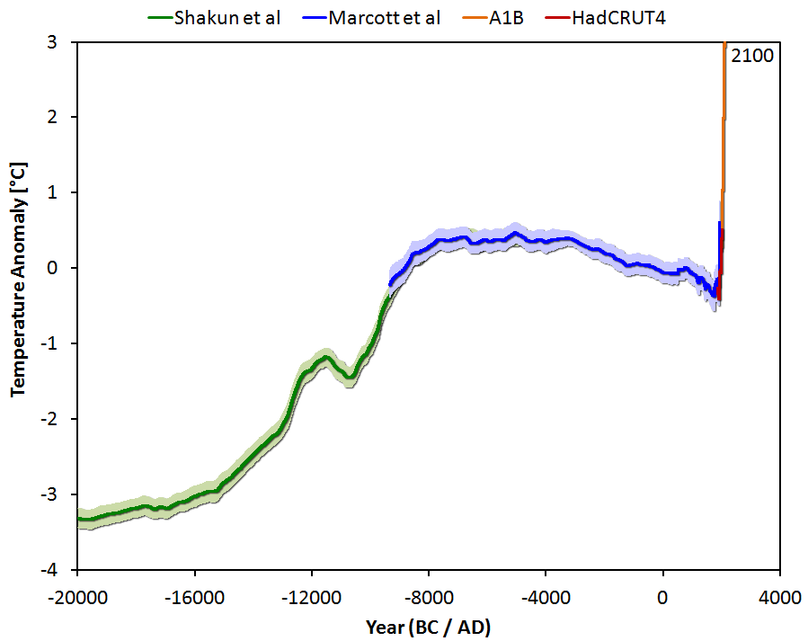 Figure 4. 20,000 years of global estimated temperature, from paleoclimate reconstructions, recent observations, and model projections. http://tamino.wordpress.com/2013/03/22/global-temperature-change-the-bi….
Interesting to see that the CO2 levels were slowly rising over last 10000 years but the temperature slowly falling... Would be useful also to have the CO2 levels over last 20000 years to maatch the last graph.w
Sorry for the negative comment, but it's not accurate to call these "exponential plots". I know that presenting them in a linear scale causes more impact, but the only reasonable way to know if these graphs are exponential is plotting them in a log scale.
For example, the population plot (which has no attribution, but I believe the data comes from wikipedia) grows faster than an exponential. You can see in http://en.wikipedia.org/wiki/File:World_population_growth_%28lin-log_sc… that in the last 2000 years that the graph looks more like two or maybe three different exponentials.
This comment is not in any way to contradict the main point of your post. It's just that there are so many papers that incorrectly claim to show exponential growth or decrease, that I feel we should be more careful with it.
I plotted the gain of atmospheric moisture from data found in the EPICA-C ice core. It has a similar shape to the CO2 projection.. So, I project that moisture was just as important in the PHT as CO2 and other GHGs.
However, the real problem is in the population and that is not going to change without a catastrophic event. And, global warming may well be that event. I identified what the Dansgarrard-Oescheger Events were in my text book and that puts them in a cyclic nature. They added about 5 degrees C to the temperature when they passed this first known time. after 100 ka. Apparition after global warming has leveled out, will add at least 2 degrees C to the then high temperature. Imagine what that means. Keep in mind there are 25 of these masses in orbit. But, they may have been a one time event. That is they had terminal paths or were ejected into outer space. What are they? That is one the theories in my text on Poly-Celestial Structures ( PCS ) and The End of The Last Ice Age. Search on that..