
I've been writing quite a bit this week about my search for a cross platform spread sheet program that would support pivot tables and make pie graphs correctly.
This all started because of a bug that my students encountered in Microsoft Excel, on Windows. I'm not personally motivated to look for something new, since Office 2004 on Mac OS 10.5 doesn't seem to have the same bugs that appear on Windows. However, I would like things to work for my students. Since I don't want to have to write instructions for every software system on the planet, Google Docs would be my ideal answer, if it supported pivot tables, since it runs over the web and presents a consistent interface on all systems.
Anyway, I heard from many enthusiastic Open Office fans and I asked if they could show me if OO has the features I want (pivot tables and pie graphs).
The is the second post describing what we found.
Before we proceed, I neglected (in the challenge) to provide readers with sufficient information about our experiment. This post has a flow chart that shows where the data came from and what we were trying to do with it.
The results:
Challenger #1
Matt Platte thinks we need a biology spellchecker. Oh Matt, if only you knew! Free-form data entry is exactly why we're stuck with all those horribly long pull-down menus whenever we need to type a state or country name at a web site. But, more on that issue another time.
He also gave us an interesting formula for parsing data.
I don't know, Matt. In Excel, I just select the column, open the Data menu and choose "Convert text to columns." It's pretty easy, but I know this isn't obvious, 'cause I had to make a movie to show how to do this.
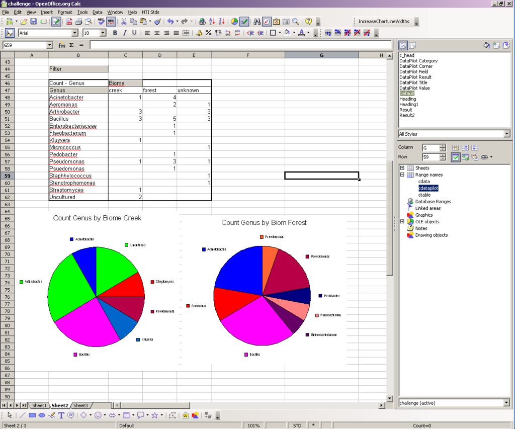
Enough chit chat. Matt almost has it right and the rhododendron entry (spelled correctly!) shows he has a good sense of humor. But, there are two problems - one of course lies with that data clean up issue (it's not Matt's fault that there isn't an anthrobacter). The other, though is a real problem. The same colors are getting used twice in the same graph for different species of bacteria (Bacillus and uncultured, Acinetobacter and rhodendron, and Arthrobacter and Streptomyces).
Does this mean the there are limited color choices in Open Office? This wouldn't be good since it makes it harder to interpret the data.


Challenger #2
Paul Schofield also got this almost right. I really liked the way that he placed the key right in the middle of the two graphs (swingkyd agrees). That's a great way to show that the graphs are using a consistent coloring scheme.
My image doesn't look as nice as Paul's since I reduced it to make it fit. Paul's graphs have the same problem as Matt's though. Pie graphs should not show different kinds of data with the same color.

Challenger #3, swingkyd
Again, this is almost right, but the repeated color mistake has been repeated again.

Challenger #4
Sorry, Tomas . The top graphs are missing the keys and both sets of the colors wrong.
The reason that we're graphing the data as pies is that pies allow us to compare the overall populations of the two biomes. This doesn't work the members have the same color wherever they appear. For example, if I have Arthrobacter and it's colored yellow, it should appear with a yellow color in both graphs.
Challenger #5
The last challenger, gkpeter, had the same repeated coloring problem, but did use that very nice way of putting the key in the middle.

Challenger #6
Joe approached this challenge in a completely different way. He lost some of our bacterial species and abandoned the pie graph idea altogether. I can see some merits to his approach (not losing the data, making a bar graph). I like the overall picture that you get with a pie, though, but the bar graph does have some appeal.

I do wonder: are the color choices in Open Office really so limited? Can you use more colors when you need them?
And, it's only fair, too that I show you that I get a little of the same repeated color problem with Excel on my Mac. Bacillus and Pseudomonas are both shown with the same color, here, when I'd rather have them be different. At least the color only repeated once. I guess as we get more types of bacteria, we're going to see this problem more often.

So, thanks everyone! I will look into OO a bit more and see if I can get around the coloring problem or maybe I'll give up on pies and use bar graphs, which I can do in Google Docs.
Whatever happens, I appreciate your help.
Yes, it does seem that you can change colors in OO. Also, the problem seems to lie in the fact that the default # for chart colors is 12. I don't know how to add more colors to this. Does anyone know how? Since there are about 15 different Genus fields, it reuses them.
I am computer geek. I have been for a very long time. However, I have not bothered to take the time to learn Linux or any MAC OS. It isn't because I am afraid of new and different things, indeed, I am constantly downloading and trying out new programs. For myself, any OS other than Windows is a waste of time to learn. I feel this way for three reasons: 1) I can do anything I want within Windows, 2) Everyone that I know, that needs my help with computers (family, co-workers) use Windows and 3) most of the rest of the world runs on Windows. IMHO teaching students new programs that are not mainstream in the academic/business world is fine, but I think that they should already know how to use mainstream products first, for many reasons realted to getting a job.
The other thing I wanted to say is that I am a little confused as to what the exact problem is that your students are having with Excel. Is it just the repeated color thing? That's easy to solve. I use Excel 2000 at work and know that this applies to all subsequent versions as well: go to Tools > Options and click on the "Color" tab. You will either now see all of the default colors, or you will see more tabs; you want to get to the "Chart Fill" colors. All you have to do now is click on the colors that are repeating, then click "modify" and change those colors to ones not already used. That's it.
Matthew:
Here's the problem. They make a pivot table. Then, when they try to prepare two different pie graphs from the pivot table, Excel on Windows 2003 won't let them do it. It only lets them graph one series or the other. Windows 2003 also hides some of the pivot table when they try this.
My students were trying to work around this by making multiple pivot tables, but then they had a problem because the colors weren't working out. One pivot table would use yellow for Bacillus, for example, and the other pivot table would use blue.
If you look at the Excel graphs from Challenger #4 above, that's what you see. This is a problem because we want to compare the information in the two graphs.
I did find a work around with Excel 2003, if you copy the data from the table and paste it into a new worksheet, you can graph things properly.
But then it turned out that one of my students was using VISTA. And I don't have a copy of VISTA or Office 2007 (yet) so I don't know how to troubleshoot the problem (yet).
Did you have the time to read the pdf someone pointed to about pie charts? The author has me convinced that bar graphs do a better job of presenting the information in a manner that allows the reader to compare the samples. Pie charts look nice, but the idea isn't just to look nice. (If I had skilz I'd link to the comment, #27 by cm in the challenge post).
Using a bar graph with % of the total (instead of the number of hits) would work pretty well.
Ron: I downloaded the paper but I haven't read it yet. I agree, though, bar charts may be a a better solution for this kind of analysis.
There is also the problem of no standards in color rendition. In your first 'pie' ("creek") on my PowerBook G4 I see 8 sectors, but only 5 colors, which makes the graph ambiguous.
I once maintained an online build summary for a project with dozens of developers using many kinds of machines. I built a test page of all the available colors, then tested each of the machines in use on the page. The upshot was that if our color coding got into more than five flavors, at least one user would find it unintelligible.
The same information in 'pies' could be presented unambiguously by a simple flat-text list of component-fraction pairs, with descending order preferred.
"Convert text to columns", eh? That's for the Wii generation. Geezers use hand-crafted formulae, preferably recursive. (Actually I didn't know such a labor-saving gadget existed.)
My lame color defense is that I spent exactly zero time on fixing/choosing colors. Same with legends, titles and showing values on the chart. If the two charts shared colors for the same genus, well, that's just a lucky break.
Finally, I was also too lazy to look up any of the creature names so if there's a "jointed" bacterium doing arm curls somewhere it should probably be called arthrobacter. If found in an Austrian oak forest it would be arthrobacter arnoldii.
Re: Sandra
In excel 2000 at least, if you create multiple pivot tables from the exact same data source, the colors remain consistent. Regardless, if they do not, the students can at least go into one of the charts and click on each color in the legend to change them to whatever they should be, this would also take care of duplicate colors.
AND
IMO if you're going to put the legend between the two pie charts (which looks nice), and the colors are the same for both charts, you may as well turn off one of the legends, no need for 2 legends if each genus is represented in both charts.
Well, the main point of the charts is to see which types of bacteria are found in which biomes. We don't know what to expect ahead of time, but we can guess that some will be found in both places and others, only in one place.
I'll have to concur that the bar graph looks much more informative to me than the pie charts that so many people (in every field, not just here) seem to be in love with - at least for this dataset. And I agree, I think the problems with the pie charts will only get much worse as you keep adding categories (genera).
Then again, maybe I'm just a nerd.
Bar graph > pie chart. Pie charts are bad for comparison, since you have to look at one chart, find the color, then look over at the other chart, find that color again, then try and estimate how big the slice is compared to the first one...forget it. bar graph? find the bug you're looking at, compare bar sizes. done. it's not even close.
The question is not what type of graph is "the best one", but, in a definite context, which one is better to show what one wishes to show. The problem is that usual spreadsheets offer some graphs that are really crap (the "donut", and the pie chart shown in perspective, completely distort visually the percentages they're supposed to show). And they're very poor with some others that are very useful (scatterplot, anyone ?).
I agree that the bar chart is a good option. I hadn't thought about it before since I wanted a nice image that showed the diversity of species.
Now, the question is - what bugs does this have?
Joe... He lost some of our bacterial species and abandoned the pie graph idea altogether.
I know it's not really the point, but I didn't lose them, I threw them out ;-) Somehow I got the idea (maybe it was on your video instructions now that I think of it) that you weren't interested in the bugs from an "Unknown" location. So I purposely removed them right up front.
And I really didn't intend to re-write the assignment. I actually did make the pie graphs, I just had a hard time seeing a story there, so I tried a different way of presenting the data.
Why do I feel like I'm whining at the prof for taking points off? ;-)
Thanks for organizing this little "challenge" it was fun to work through. You've developed some great resources on your site and I hope your students enjoy having a chance to actually study, analyze and learn some messy "real-world" stuff.
Thanks Joe,
and don't whine. You made me, and everyone else, realize that maybe my way of graphing might not be the best way. ;-)
Sometimes we all get stuck trying to go one direction and it might not be the best way to go, but when it's challenging it's all we can focus on. I'm no exception.
For my plots, Open Office itself takes all the credit for the good points and none of the blame for the bad.
The fact that both graphs use the same key is because I used default colour schemes and the same table (so number of data points) for both. The scheme just cycles through the colours, so unless you mix up the order or something, you get the same colour scheme on both.
As for the repeated colours, that was just laziness and not wanting to have to actually apply any effort to maintain the first point.
Adjusting the colours in a pie chart is as easy as double clicking the chart and clicking the area tab. All colours can be adjusted from there with a wide range of options (all text colours can be used I believe), as well as adding ten different hatchings (over any background colour), colour gradients or bitmaps.
Again, putting in another ten or fifteen minutes would have made things a lot cleaner and nicer. Knowing what I was doing would have probably helped as well.
As for pie charts vs bar charts, I'd say it entirely depends on what you are comparing.
A single pie chart is just about perfect for comparing the relative numbers within a certain sample or population. However, I would rarely use pie charts when you need to compare two different and independent data sets. The only times I can think of where that would be suitable is when you have the same sample size on each, or when you are comparing percentages of a total (as in politics showing and comparing election results with previous years).
Eh, the good old CricketGraph III....
I suggest that a basic issue has nothing to do with technology glitches - the choice of graph type. Pie charts with the number of slices shown are pointless. The eye flips all over the place trying to figure out which slice is which. And trying to compare two such graphs is even worse.
Another fundamental point which isn't clear to me is what message the chart is supposed to be delivering. That affects choices like sequence of slices/bars/whatever.
I am not a scientist, but I have considerable experience of graphs in a business context. It really sounds to me as though the "technology issues" should be set aside until you pin down just what message you're trying to deliver and what sort of graph (if any) is best suited to the task.
In OpenOffice, you can create custom colors from a continuous palate & pretty much do whatever you want. Excel probably has the same feature. (We're an OpenOffice household because there are 5 computers and that's a lot of MS Office licenses)
But the default colors seem to need tweaking in both products. The Excel For Mac graph looks so much better because possibly the Macintosh developers have read Edward Tufte's Visual Display Of Quantitative Information and know to avoid large areas of saturated color. From what I've seen of Microsoft products, nobody in Redmond has ever heard of Tufte.
(Saturation gives you another axis on which to distinguish similar colors. Make the narrower section more saturated, the wider section less saturated even if they are similar hues)