I've made occasional references to the book that I have been editing forever. Well, it has finally entered the home stretch:
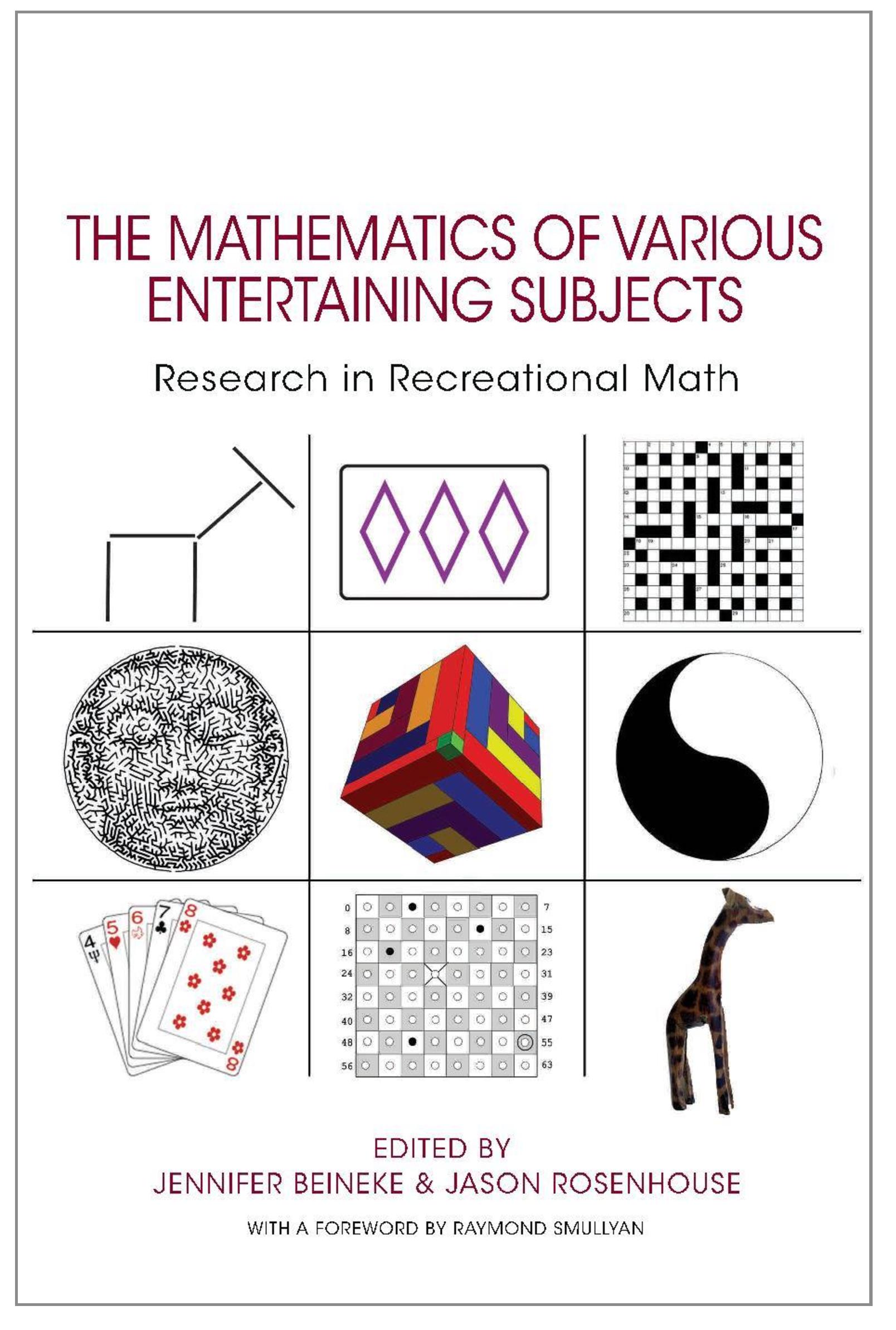
The book is a companion volume to the 2013 MOVES Conference in recreational mathematics, organized by the Museum of Mathematics in New York. The publisher is Princeton University Press. It features seventeen papers, mostly based on presentations given at the conference. Be warned: this is not a trade book. Some of the papers are pretty formidable.
“MOVES” is an acronym for “The Mathematics of Various Entertaining Subjects.” Hence the name of the book. We have just made the last round of edits to the manuscript, and the book should be heading to the printer soon. We expect to have finished books in December.
It's been a fun project, despite various frustrations and delays, and I'm quite proud of the book. The MOVES conference is meant to take place every two years, and the 2015 edition was held in August. Princeton University Press has asked Jen and me to do a second volume in the series, and it seems likely that that will happen. Given some of the mistakes made the first time around, we should know what to avoid this time!
MOVES is a good acronym but "The mathematics of various entertaining subjects" is a rather clunky title. Is it possible for the presentation on the cover to make it more obvious where the name comes from? Different colour for the initial letters, or put the words one above the other and boldface the initials, or something?
(The cover image here also looks as if it's been squished horizontally by maybe 8%. Better to shrink it vertically too, surely. But I'm guessing that the cover may be less finalized than the text inside...)
As it happens, Jen and I were not so wild about the title either. But the folks at the Museum of Math strongly wanted the book to have the same title as the conference, and they won out. Keep in mind that the book jacket will have two flaps and a back to make it clear that the title comes from the conference.
I fattened up the image so that it doesn't look so compressed. Is it better?
I assume like your previous books this one, too, is accessible to the reasonably-intelligent-but-not-by-any-means-a-mathematician reader?
Really like that you landed a Foreword from Raymond Smullyan
let's wait for it :-)
Yeah, proportions look about right now. (But the image here is full of JPEG compression artefacts; I take it those won't be on the actual cover!)
The flaps and back cover will explain the origins of the name to anyone who picks up the book to look at it. The thing I worry about is whether the clunky-sounding title will mean that fewer people get that far than otherwise would. Which is why I wonder whether doing something that makes it visually obvious that there's something funny about the title, and hints that it may be the way it is for a good reason, might be helpful. But I don't know; your publisher will have much more expertise on this stuff.