
As it does every summer, the Arctic Sea ice is melting off. Over the last several years, the amount of sea ice that melts by the time it hits minimum in September has generally been increasing. So, how's it doing now?
The graph above shows the 1981-2010 average plus or minus two standard deviations. Before going into more detail than that, you should look at the following graphic.

The top chart shows the march of Arctic Sea ice melt for first ten years of the baseline data set only, and the bottom chart shows the last ten years of the same data set. This tells us that the two Standard Deviations for the period 1981-2010 hides an important fact. Since Arctic Sea ice is melting more and more every year, a proper baseline might be the first several years of this period, not the entire period.
Now refer to the graphic at the top of the post. This is the current year's ice extent. Notice that it is tracking right along the lower edge of the 2 Standard Deviation zone. In other words, the present year is exhibiting what we have been seeing all along: An Arctic with much less ice.
Now look at the years that post date the baseline period, 2011 through the present, including the wildy extreme year of 2012 when a record melt was set.
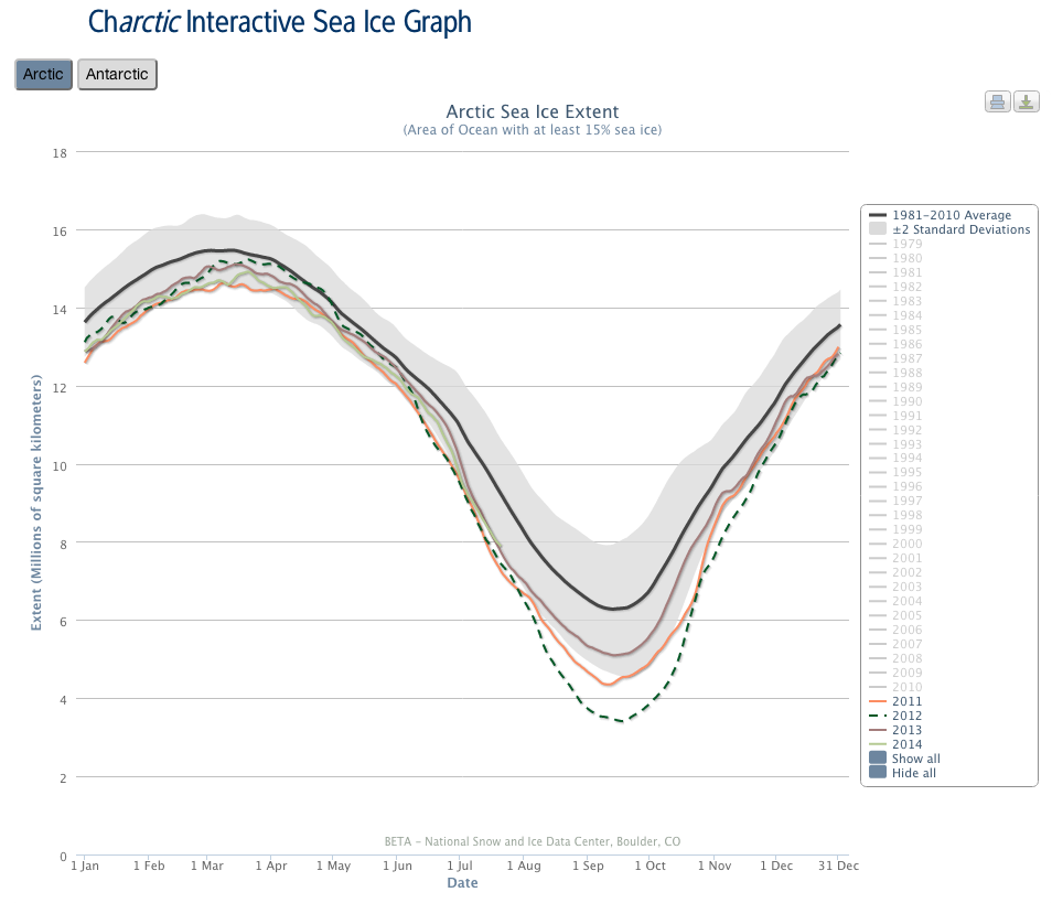
Here we see that collectively, the last three full years and the present partially documented year exist at the lower end of, or lower than, the 2 Standard Deviation zone. This suggests that the current trend is an extension of the previous couple of decades. More melting on average over time. One would hope this would level off, and maybe it will. But we certainly can not make that claim at this point.
Note that it is very hard to predict the ultimate minimum for a given year, even at this point. (Even so, I did it here way at the beginning of the season). We'll have to wait and see.
A couple of questions (which you've probably answered elsewhere, of course). First, why does the data series start so recently, in 1981? Is that just when consistent satellite data became available?
Second, has anyone rebinned these plots in form of moving-window averages? Your second and third overlays are examples of this, and are pretty blatant demonstrations of statistical bias (in the sense of non-uniform scatter, or equivalently different underlying PDFs). I wonder if, for example, tracking five-year or ten-year moving averages would reveal a clearer trend than the year-by-year fluctuations.
Michael. Yes, this is the period for which there is similar and good data.
I think these data have been analyzed all sorts of ways. It is common to smooth the curcpve with a moving average for climate data and I've done this with these data.
One question I have that is too early to answer but not to early to start playing with is this: at some point the decrease in surface ice minimum has to slow down, I assume above zero somwhere. At what point can we say that is happening? For several years the drop was virtually every year. Now it looks like it might be wiggling in place a bit.
Some corrections: the baseline is 1981-2010, so your graph showing 1979-1988 is not the first ten years of the baseline. (Should be 1981-1990.)
Also, the baseline is 30 years, so you are showing (almost) the first third and the last third of the baseline period, not the first half and last half.
The conclusions remain the same, in any case.
Finally, it's worth stating that all of the graphs come from http://nsidc.org/arcticseaicenews/charctic-interactive-sea-ice-graph/ where you can choose which set of years to view and zoom in on areas of interest, as well as viewing Antarctic sea ice extent (a new feature).
Also, about a year ago, the baseline was changed from 1979-2000 to 1981-2010. Until recently, it was possible to display the older baseline on these graphs. It was substantially higher than the current baseline.
It is the first ten years of the data, and the last ten years of the baseline, which seems silly but the purpose is to no use the last few years so they can be broken out separately. . (I had noticed that I need to fix the chart)
There was a post on the NSIDC website last year when they changed the baseline. They changed it to match other climate baselines, even though it no longer starts from the start of the data.
Also, I misinterpreted your images when I first saw them to mean "the first ten years of the baseline" and "the second ten years of the baseline". Looking again, it's clear that you meant "one ten year set" and "another ten year set".
So my first comment overstated the need for correction.
Right: I wanted two data sets from early vs. late.
This is the post where I originally used this approach in order to counter some rather idiotic claims being made about sea ice recovery:
http://scienceblogs.com/gregladen/2013/09/01/is-annual-arctic-sea-ice-o…