
The "Web Phylogeny" of Living the Scientific Life (Scientist, Interrupted),
22 December 2008.
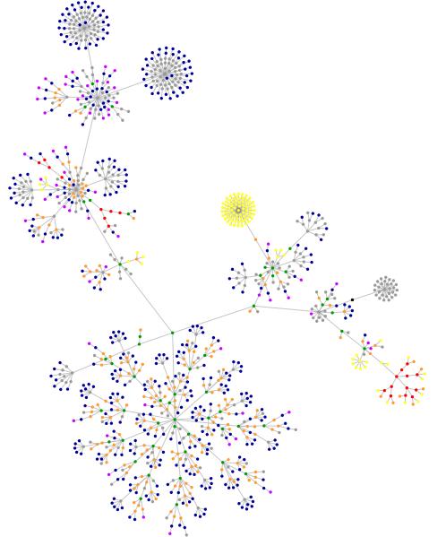
Image: created by Websites as Graphics.
KEY: What do these colored dots mean?
blue: for links (the A tag)
red: for tables (TABLE, TR and TD tags)
green: for the DIV tag
violet: for images (the IMG tag)
yellow: for forms (FORM, INPUT, TEXTAREA, SELECT and OPTION tags)
orange: for linebreaks and blockquotes (BR, P, and BLOCKQUOTE tags)
black: the HTML tag, the root node
gray: all other tags
Back in theice ages, two years and seven months ago, I had a "web phylogeny" constructed for my blog. As you can see, it has changed a bit from two years and seven months ago. I suspect that the changes will be even more refined if I let the program continue to work for an hour or so (I let it run for 15 minutes).
But I am curious to know what your blog phylogeny looks like? Did you do this for your blog a few years ago too? If so, how does that compare to your current blog phylogeny?
A few weeks ago the head of our computer sciences department was showing Cano and I something the had been developing for which took several databases of gene and protein information and drew a similar graph. The idea was to show how different genes, proteins and phenotypes (e.g. diseases) were connected. It looked really like a really cool tool for bioinformatics.
My graph is here. It's not as pretty as yours - what's your yellow dandelion?
If you want to play arround you may try TouchGraph (http://www.touchgraph.com/TGGoogleBrowser.html). It actually displays where your site links to.
Another nice tool is PUBNET which allows to display data from PubMed (http://pubnet.gersteinlab.org). E.g.
my PubNet
Unfortunately, PubNet currently has some problems handling PMIDs.