Here's a nice pic:
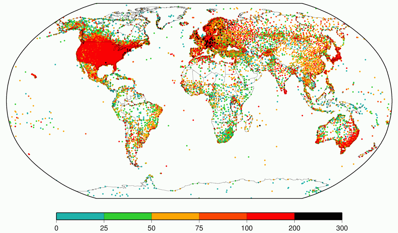
Its from http://surfacetemperatures.blogspot.co.uk/2014/06/global-land-surface-databank-version.html (but I cut it a bit to make it prettier). The colour bar is number of years.
Refs
* Understanding the effects of changes in the temperature scale standards through time
- Log in to post comments
More like this
Tamino (Open Mind) is a pretty good blog, but I hadn't realised until recently just how scary the denialists find it. As a case in point, I commented at NoTricksZone, who had said:
the GLOBAL WARMING STOP has been extended yet another month, now at 17 years and 9 months... Earth to Warmworld. Earth…
I see I'm keeping up my habit of posts that are near-incomprehensible even to me after only a few months; its just like writing Perl. Anyway, here's my pick of the year, whilst we're in that grey quiet phase between Christmas and the New Year.
Jan: Science (and the related Peer review)
Feb: The…
In early December I wrote a post called "2014 will not be the warmest year on record, but global warming is still real." The very first thing I said in that post is that I was going out on a limb. I also discussed whether or not one year mattered, and I discussed the nature of the phrase "X is…
A few days ago I noted that April 2014 was one of the warmest Aprils on record. This morning, NOAA has released its data showing that April was actually a bit warmer than I had suggested.
NOAA has already stated that "The combined average temperature over global land and ocean surfaces was the…
Isn't the greater Alpine region pretty? Lots of black dots with more than 200 years of data. They put a lot of effort in data rescue.
Ya victor,
it looks like they have about 2K stations that we dont have..
Should be fun to use them as out of sample test