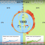
This graphic, by Boggis Makes Videos and put on YouTube just a few days ago, breaks all the rules of how to make effective, understandable graphs for the general public. However, if you follow all those rules, it is difficult or impossible to get certain message across. Therefore, this graphic is necessary if a bit difficult. I would like you to watch the graphic several times with a prompt before each watching so that you fully appreciate it. This will only take you six or seven minutes, I'm sure you weren't doing anything else important.
Pass 1: How to read the graph
This graph's basic…
climate change graphics
Scott Adams is the creator of Dilbert, the once funny but now highly repetitive cartoon about a nerd who has a job in an office.
Dr. Gavin Schmidt is high up in the top ten list of world class climate scientists. He is Director of the currently under siege GISS Unit of NASA, where much of the climate science done by that agency is carried out. If you read my blog, you've read his work, because you also read RealClimate, where GS writes about climate science in a manner designed to be understandable to the intelligent, honestly interested, thoughtful individual.
Adams has a history of going…
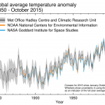
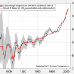
The World Meteorological Organization has announced that they expect 2015 to be the warmest year on record, and that we are in the warmest five year period on record. We are speaking here of global surface temperatures, though similar descriptions probably apply to the upper 2000 meters or so of the ocean as well.
The global average surface temperature in 2015 is likely to be the warmest on record and to reach the symbolic and significant milestone of 1° Celsius above the pre-industrial era. This is due to a combination of a strong El Niño and human-induced global warming, according to the…
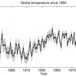
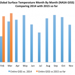
We're gonna need a bigger boat. Well, actually we're gonna need a bigger y-Axis. This has been happening for a while.
NOAA has just published September's global surface temperature, which turns out to be 0.90C above their baseline (20th century average). According to NOAA, this is the highest value for September on record, 0.19C higher than last year, which was also a record. The graph above shows the year to date average, though September, for NOAA's entire data set.
Ed Hawkins, a climate scientist at the University of Reading, recently tweeted a graph he produced to show global surface…
Every year the sea ice that covers the northern part of the Earth expands and contracts though the winter and the summer. The minimum extent of the sea ice is usually reached some time in September, after which it starts to reform.
Human caused greenhouse gas pollution has increased the surface temperatures of the earth, as measured on the land at about heat height with thermometers, and on the sea at the surface, mainly with satellites. Warming of the surface has continued apace for several decades, though with some expected squiggling up and down in how fast that is happening.
Greenhouse…

The recently produced Massive Open Online Course on climate science denial is chock full of great videos that should be at everyone's fingertips. HERE is a list of the videos. Use it well and powerfully.
That is a good question, and difficult to answer. If it turns out to be, it will be the warmest calendar year in the instrumental record, which goes back into the 19th century.
Regardless of what El Nino (ENSO) does, 2015 will be a warm year. Why? Because everything is warm and getting warmer and even if 2015 is less warm than 2014, it will be warm. There is no other possibility.
Even without the effects of El Nino, though, it is possible that 2015 will be warmer than 2014 because we see a lot of heat out there. If the present, relatively weak El Nino continues for a while, it will likely…
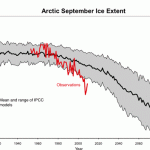
Arctic sea ice decline happened faster than expected. This has the effect of accelerating global warming because less of the Sun's energy is reflected back into space by ice.
Northern Hemisphere snow also sends some of that energy back into space. The amount of snow cover we have is also declining.
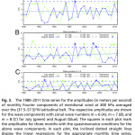
Difference from average annual snow extent since 1971, compared to the 1966-2010 average (dashed line). Snow extents have largely been below-average since the late1980s. Graph adapted from Figure 1.1 (h) in the 2012 BAMS State of the Climate report.
The warming of the Arctic region is also…
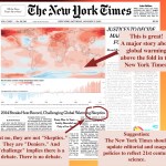
The New York Times put the news of 2014 being the warmest year on their front page, in the precious space known as "Above The Fold." But, the venerable paper of record continues to give credence to science denialists by calling them "skeptics," and continues to imply that there really is a debate between consensus based science and politically motivated denial of science. To underscore this point I created the above graphic.
I would also like to congratulate the Washington Post for putting this piece by Joby Warrick and Chris Mooney on the front of section A1.
And, TIME has also placed…
This is serious. A highly regarded and widely recognized planetery physicist put together the most dangerous scientific ingredients that exist: skepticism of the established science, a comprehensive list of hypotheses that stood in opposition to that established science, a huge amount of data, a healthy amount of funding including a good chunk from energy companies that mainly sell fossil carbon based fuels, and a hand selected research team of others who were also skeptics.
In the end, he came up with an explanation for what people call Global Warming. Personally, I believe him. I think…
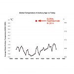
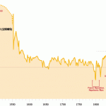
With what may be the warmest year in centuries about to close, I thought it would be fun to have a graphic comparing the march of global average temperature over several years about a century ago with the present state of affairs. This graphic is based on NASA's data, using John Abraham's estimate for the 2014 temperature (it might end up being a tiny bit different). There is more information about those sources here.
[click on the graphic to get to a larger version]
Just to be clear on how to read the graph ... the red dot is not anywhere in particular on the horizontal scale. The X and…
The Road to Paris is a web site created by the ICSU, "...a non-governmental organization representing a global membership that includes both national scientific bodies (121 National Members representing 141 countries) and International Scientific Unions (30 Members)," founded in 1931. If the ICSU had not existed when the UN was formed, the UN would have formed it. Think of the ICSU as the UN of Science. More or less.
(Follow Road to Paris on Twitter.)
Anyway, Road to Paris refers to the 2015 international meetings on climate change, and the purpose of the web site is to provide excellent…
Not really a fully fledged blog post, just a quick link pointing you to something interesting.
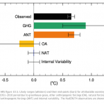
More than 100%? Sounds funny, doesn't it? Let me rephrase. Humans have caused so much climate change that some of the climate change changed some of the climate back.
Still sounds kinda funny.
OK, try again: Humans have caused a whole bunch of global warming. Nature has caused a small amount of global cooling, which has offset a little of the human caused global warming. But also, humans have caused a little bit of global cooling as well.
Make sense? OK, look at this graph:
I'm sure you've…
Did you ever read a textbook on economic history, or an in-depth article on the relative value of goods over the centuries expressed in current US dollars? Have you ever encountered a graphic that shows long term trends in rainfall patterns or other climate variables, using a couple of simple lines, designed to give a general idea of relative conditions during different eras? Here are a few examples of what I'm talking about.
This is a graphic made by a major investment firm culling information from dozens or perhaps hundreds of sources into a single graphic. This is the graphic as it was…
A new paper advances our understanding of the link between anthropogenic global warming and the apparent uptick in severe weather events we’ve been experiencing. Let’s have a look at the phenomenon and the new research.
Climate Change: The Good, The Bad, and the Ugly.
It is mostly bad. Sometimes it is ugly. I was looking at crop reports from the USDA and noticed an interesting phenomenon in Minnesota, that is repeated across much of the US this year: Fewer acres are in crops but among those acres that are planted there is a high expected per-acre yield. The higher yield will make up for the…
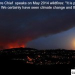
First let me check ... are all those denialists who have been claiming that wild fires have become rare done talking yet?
OK fine.
Yes, depending on where you go and what you look at we are having a problem with wild fires in the US and elsewhere (i.e., Australia). Part of this is probably due to weather whiplash. Periods of heavier than usual rain means more fuel grows, periods of dry make the fuel ready to burn, maybe even add some extra windy conditions, and the fires are worse than usual. This leads to landslide conditions being worse later on when the unusual rains occur.
Anyway,…
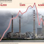
Above is a graphic someone tossed at me on twitter the other day. It makes it look like CO2 emissions went way up then went way down so everything is fine. It is, of course, a lie, of sorts.
IT is actually kind of hard to find a graph just for US CO2 that goes back in historic time, but this graphic for the global energy industry clearly shows that the big picture is an upward trend:
The dip we see in recent years is simply an effect of the economy going bad, and things people do that emit CO2 being done somewhat less. Kevin Schultz wrote this up on his blog:
After a five-year decrease in…
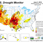
I made a movie you might enjoy. There may be something else out there like this, probably better than this one, but it is still cool. I downloaded all the PDF files from the US Drought Monitor archives, using the version of the connected US that has only the year, month, and day on the graphic. Then I slapped them in iMovie and sped the animation up by 800% over the default 1 sec. per pic. I do not have today's rather horrifying image on it, which I've placed above.
Here's the movie:
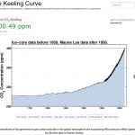
This Scripps Institution of Oceanography, UC San Diego website provides daily updates, analysis, and information on the state of climate. Follow @Keeling_curve to get daily updates of the CO2 value. Through this site, the public can also help support the continuation of the iconic Keeling Curve and of complementary measurements of atmospheric oxygen made at Scripps. These measurements enable society to witness climate change and inform strategies to address it.
CLICK THROUGH READ MORE GIVE MONEY
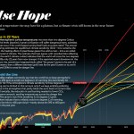
I needed a copy of the "False Hope Graph" that Michael Mann painstakingly created for his Scientific American piece "Earth Will Cross the Climate Danger Threshold by 2036" for a presentation I'm doing, but it had to be simpler, leave some stuff off, and be readable across the room on a screen. The original graphic looks like this:
It is a major contribution showing the relationship between climate sensitivity and climate change in the future depending on various important factors. The graphic I made from it is here (click on it to get the big giant version):
You'll notice I left only one…