Data Presentation
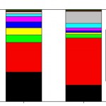
There was a article in Scientific American about diversity in STEM collecting together the best demographic data available about the science and engineering workforce. It's a useful collection of references, and comes with some very pretty graphics, particularly this one, showing the demographic breakdown of the US population compared to the science and engineering fields:
Demographic breakdown of general population vs. science and engineering, from the Scientific American post.
This is a very professionally made graphic, but also misleading in the worst way. When I first looked at this, I…
Having just returned from a long trip where I gave three talks, one of the first things I saw when I started following social media closely again was this post on how to do better presentations. The advice is the usual stuff-- more images, less text, don't read your slides, and for God's sake, rehearse the talk before you give it-- and it's generally very good. Given the two very different types of presentation I gave over the last few weeks, though, I think it's important to add one note about the design of the visuals, which is this: when you're putting a talk together, keep the final…
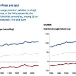
While I'm complaining about statisticulation in social media, I was puzzled by the graph in Kevin Drum's recent post about college wage gaps, which is reproduced as the "featured image" above, and also copied below for those reading via RSS. I don't dispute the general phenomenon this is describing-- that the top 10% of college grads earn way more than the average, and the bottom 10% way less, and somewhat less than high school grads-- but I'm baffled about what was done to generate this graph.
Specifically, I'm puzzled by the vertical axis, which is labeled "Real hourly wage (natural log)."…
Matt Reed, who will forever be "Dean Dad" to me, has a post on "new" topics that might be considered for "gen ed" requirements, that is, the core courses that all students are required to take. This spins off a question Rebecca Townsend asked (no link in original), "Should public speaking be a general education requirement?" the idea being that public speaking is such an essential skill that everyone ought to learn it at some point. Reed adds "entrepreneurship," "[computer] coding" and "personal finance" as other things that might fall into the same essential category.
Now, it's important to…

In which the skewing of a data plot in Ron Unz's epic investigation of college admissions makes me more skeptical of his overall claim, thanks to the misleading tricks employed.
------------
Steve Hsu has a new post on a favorite topic of his, bias against Asians in higher ed admissions. This is based on a giant article by Ron Unz that I don't have time to read, and illustrated with the graphic that's the "featured image" for this post (which I will also reproduce below for the convenience of RSS readers).
What does this show? There's a tangle of colored lines representing the fraction of…
My timekeeping course this term is a "Scholars Research Seminar," which means it's supposed to emphasize research and writing skills. Lots of these will include some sort of poster session at the end of the term, but I decided I preferred the idea of doing in-class oral presentations. Having assigned that, of course, I felt I ought to give them a class with advice on how to give an oral presentation. I went looking for advice on this, and found that I wrote a guide to giving good PowerPoint lectures back in 2006 (God, I'm a blogging dinosaur...), which holds up pretty well. So, I dusted that…
In the same basic vein as last week's How to Read a Scientific Paper, here's a kind of online draft of the class I'm going to give Friday on the appropriate ways to present scientific data. "Present" here meaning the more general "display in some form, be it a talk, a poster, a paper, or just a graph taped into a lab notebook," not specifically standing up and doing a PowerPoint talk (which I've posted about before).
So, you've made some measurements of a natural phenomenon. Congratulations, you've done Science! Now, you need to tell the world all about it, in a compact form that allows the…
The new school year is upon us, so there's been a lot of talk about academia and how it works recently. This has included a lot of talk about the cost of higher education, as has been the case more or less since I've been aware of the cost of higher education. A lot of people have been referring to a "Student Loan Bubble," such as Dean Dad, who points to this graph from Daniel Indiviglio as an illustration:
That post is a week old, which is a hundred years in blog time, and I wish I'd gotten to it sooner, because it's a terrible graph. Indiviglio says:
This chart looks like a mistake, but it…
As long as I'm picking on education research papers in Science, I might as well call out the one immediately after the paper I wrote up in the previous post. This one, titled Graduate Students' Teaching Experiences Improve Their Methodological Research Skills, is another paper whose basic premise I generally agree with-- they found that graduate students who had teaching responsibilities as well as research responsibilities did a better job of writing research proposals than graduate students who only did research. From all appearances, it's a good study, and makes a valuable point.
And yet,…
This morning, via Twitter, I ran across one of the most spectacular examples of deceptive data presentation that I've ever seen. The graph in question is reproduced in this blog post by Bryan Caplan, and comes from this econ paper about benefits of education. The plot looks like this:
This is one panel clipped out of a four-part graph, showing the percentage of survey respondents reporting that they are satisfied with their current job. The horizontal axis is the years of schooling for different categories of respondents.
So, I looked at that, and said "Wow, people with more education are…
This morning's Links Dump included a post from Mad Mike and an entire blog on improving academic posters. For those not in the sciences, one of the traditional means of communicating research results is at a poster session where tens to hundreds of researcher each prepare a poster (usually 3'x5' or thereabouts) about their project, hang them up, then stand by them to answer questions.
Mike and the Better Posters bloggers have some very good tips on graphic design for the benefit of the scientists "gamely trying to not look depressed at the complete lack of attention their posters are…
There have been a bunch of interesting things written about education recently that I've been too busy teaching to comment on. I was pulling them together this morning to do a sort of themed links dump, when the plot at the right, from Kevin Drum's post about school testing jumped out at me. This shows test scores for black students in various age groups over time, but more importantly, it demonstrates one of my pet peeves about Excel.
If you look at the horizontal axis of this plot, it shows regularly spaced intervals. If you actually read the labels, though, you'll see that they're anything…
I gave a short introduction to how to give a presentation today to the students who will be presenting their research in our twice-weekly Summer Student Seminar Series. This included examples of a data slide that is bad in the ways that students' first attempts at data slides tend to be bad, and the same graph re-done in a more appropriate manner. As long as I'm doing format conversions of this anyway, I figure it might be amusing to post them here. So, here's the bad graph, with the bullet points highlighting the mistakes:
And here's the good version:
(The seminar series features three…
Inside Higher Ed has a news squib about gender disparities in academic science, which points to a Nature story about a survey on job satisfaction (bad IHE, giving a false impression on the story!). The gender portion of the story is limited to a short section at the end of the article, and one graph:
The larger story is actually pretty positive, but I fear that as IHE did, too much attention will be focused on this one graph (which, by the way, is surprisingly badly done). There's a fairly narrow point about the presentation of this that I think is worth making (even though it will likely be…
A few days back, Matthew Beckler added the Kindle edition to his sales rank tracker for How to Teach Physics to Your Dog. Given my well-known love for playing with graphs of data, it was inevitable that I would plot both of these in a variety of ways.
So, what do we learn from this? Well, we learn that people in the Albany. NY area don't own Kindles:
OK, maybe that's not obvious to everybody...
When you look at that graph, the blue line is the Amazon sales rank of the physical book edition, while the red line is the Amazon sales rank of the Kindle edition. The two track each other pretty…
Regular readers will know that I have a bit of a Thing about bad graphs used in the media and on blogs. When people use stupid presentation tricks to exaggerate features of data to make their argument look stronger, it bugs me. But what really irks me is when people use stupid presentation tricks to trample their own arguments.
Today's exhibit for the prosecution is this graph by Mike Konczal via Kevin Drum comparing median wages to household debt over the last thirty years:
The blue line is debt, the reddish one income (adjusted for inflation, I believe). Both data sets are normalized so…