
While I'm complaining about statisticulation in social media, I was puzzled by the graph in Kevin Drum's recent post about college wage gaps, which is reproduced as the "featured image" above, and also copied below for those reading via RSS. I don't dispute the general phenomenon this is describing-- that the top 10% of college grads earn way more than the average, and the bottom 10% way less, and somewhat less than high school grads-- but I'm baffled about what was done to generate this graph.
Specifically, I'm puzzled by the vertical axis, which is labeled "Real hourly wage (natural log)." That seems to imply that this is a log scale in disguise, so a particular vertical interval corresponds to a multiplication of the starting value, not an addition. But then the scale is completely wacky-- a value of 100 for the natural log would imply that a college grad in the 90th percentile earns 1043 times the wage of a high-school grad, which is rather more than the entire economic production of the planet. That's an understatement, by the way-- 1043 is something like the number of atoms in an asteroid with a mass of 1,000,000,000,000,000 kg.
Give that the figures for both men and women are very close to 100 at the modern end of the time series, I suspect that they divided college-grad income by high-school-grad income, took the log, and then scaled everything so the most recent data point has a value of 100. Which is the kind of thing economists like to do. I say "I think" because the figures is lifted almost directly from this 2010 report (PDF), which doesn't explain the vertical axis in any detail, either.
(Why take the log at all? Good question. I suspect because the high income is a large-ish multiple of the small, and using a linear scale would put the lower lines too close together to see any variation. A log scale spreads things out, and as a bonus makes the smaller numbers negative. The re-scaling completely obliterates any ability to reconstruct the underlying data, though.)
Really, this doesn't matter to anyone other than a giant nerd like me, because they don't do anything remotely quantitative with the data in the figure. Basically, they just say "Look, high-earning college graduates make more than high school grads, and low-earning ones somewhat less," and leave it at that. They could've left the puzzling numbers off entirely, and avoided distracting me, but they're working for the liberal Center for American Progress, not the American Enterprise Institute, so they use numbers on graphs to signify that they weren't just sketched on a cocktail napkin.
The underlying point-- that college-graduate wages are spread over a wider range than most people realize-- is a good one, worth thinking about. I also share Kevin's skepticism about some of the interpretation of this, particularly when you consider that some fraction of those recent grads are going to be in graduate or professional school earning minimal wages for several years in hopes of a larger payoff down the road.
But the labels on that graph are really distracting, at least if you're a giant nerd.
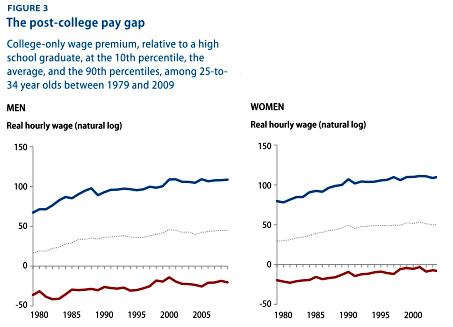 Figure from Kevin Drum's blog, modified from Schmitt and Boushey report.
It's been a while (i.e., a couple of versions ago) since I have attempted to plot a log scale in Excel, but at the time it would only give you one major tick per decade, at best. (There might be a secret axis setting to change that, but I haven't looked, because there are better tools for plotting data). I suspect that Kevin tried to work around that issue, but wasn't completely accurate in describing what he did. I say this because while those graphs look a lot better than what you get by default in the Excel version I was using back then, they still scream Excel to me.
To be frank, the graph essentially constitutes an exercise in numerology. Not only is the y-axis scaled inappropriately, you can't even take the log of hourly wages in the first place. It's not a dimensionless number. You may as well take the log of meters.
It's sad to think that decisions affecting the lives of millions get based on such charts.
You may as well take the log of meters.
But you can do that, as long as you are clear that 1 meter is your reference length. Signal intensity is often measured in decibels, which is a logarithmic scale based on some reference level (typically but not always 1 mW). The problem (one problem, anyway) is that it's not clear what the reference level is in these graphs. That could have been easily solved by specifying the reference level (wage/salary per unit time). Of course, they also botched the scaling: we don't know what 100 means (only that the explanation they gave is absurd), whereas we would know that 100 dB means 10^10 times the reference level.
It's true that most people don't do that nowadays, because there are plotting utilities to handle the raw numbers. But electrical engineers and signal processing types still do, largely for historical reasons (log-log graph paper was hard to obtain when they started working on such things).
You're more charitable than I am: Those graphs appear to be made-up bullshit.
Even if you assume there's a slipped decimal place-- that 100 should be 10, etc-- that still implies that the "average" female college grad makes about 150 times as much as the "average" female high school graduate.
I don't know how they're massaging "average" but in Illinois, minimum wage is $8.25. Even if the average high school graduate is only working ten hours a week, that implies an annual income of well over half a million dollars a year for the average college grad.
As to the issue of dimensions, I'm pretty sure they took the log of the college-graduate wage divided by the average high-school-graduate wage (that is, ln(coll$/hs$)), which is a dimensionless number. That's why the high-school wage is zero for all years.
I don't think this is a genuine attempt at any sort of decibel scale (where everything would be multiplied by ten because reasons). I'm pretty sure that 100 is totally arbitrary-- after taking the log, they normalized everything to the last data point in the time series, and then multiplied by 100.
Niall: "You may as well take the log of meters."
Eric Lund: "But you can do that, as long as you are clear that 1 meter is your reference length."
It's even better, if you do things formally: log(Xm) = log(X)+log(m). Ignore the fact that "m" is a unit and not a number. Changing the unit of measure (e.g., foot vs metre) translates your data, whereas changing the base of the log scales it.
Some might see that as a bug, but it's actually a feature: if you're looking for something qualitative or even semi-quantitative (e.g., comparing histograms), you don't need to be distracted by those annoying numbers on the side or bottom of the graph, because they are (qualitatively) irrelevant.
The comparing histograms example was not hypothetical; I once had an engineer interrupt my presentation because the numbers on the horizontal scale didn't make sense (until you realize they're natural log, not base ten), whereas the main (only) point of the graph was to show that two histograms were significantly different ("look, this one's bimodal").
Occasionally (like in my histogram example, or the example that is the subject of this blog post), the mantra "always show the scale on your axes" backfires.
Their first figure reminded me that I had posted a longer time series of those data a year before:
http://doctorpion.blogspot.com/2009/06/gender-of-college-students-vs-ti…
You only hit the surface of the problem with that graph. What is worse is that it does not show the 90th and 10th percentile of HS grad wages, so they can be compared over time to the same median (not mean) HS grad wage. Might even be fun to have "median income of a 25-34 year old HS teacher" on that graph, but I'm more concerned that the "HS grad" population might include many with some college (or even a 2-year degree) but without a 4-year degree.
Not only that, the authors ignore their own graphs when making some of their claims. The "penalty" (if there is one, because we don't know the earning potential of the persons at the bottom before they went to college) of going to college has been decreasing, just as the unemployment rate of HS grads is higher than that of other populations.
Finally, the cover of that report, featuring a black man leaving a college building, reminds me of an ancient cartoon "a strong back is a terrible thing to waste" from the National Lampoon that showed a black student lifting a calculus book.
One more oddity - the x scales are different between the two graphs.
Well it's definitely not a decibel scale, because decibels use logs base ten. Nepers use natural log. But that's more pedantry than I think is warranted here.
If the vertical scale were simply labeled "percent more (less)" it would be clearer. I presume the actual formula used for the value on the vertical axis is equal to 100*{ln(wi/wo)-1} where wo is the high school wage and wi is the wage of the referenced group.