I'm off camping - so this week I'll be posting some old entries on microscopy, enjoy.
OK here's a post geared mostly to cell biologists. My big pet peeve about reading the scientific literature is ... colored fluorescent images.
Why do people insist on pseudo-coloring their images? I know that you want pretty pictures and as every kid knows the more colorful the picture the more adoration one gets from approving parents ... but we're talking about data and instructing/convincing your fellow peers about new findings.
So why is color bad for data presentation?
- Your eyes are better at detecting various shades of grey than shades of any hue. Or to rephrase, it's easier to see details in a black & white image.
- Your eyes can also simultaneously detect many more shades of grey than any hue. This is sometimes called dynamic range. If your protein is enriched in one area of the cell and sparse in another location, it's easier to convey the range of concentrations in black & white.
- Then there is the famous green/red overlays. I hate those! You can never tell whether an area is green (just protein 1) or yellow (protein 1 & 2).
So let me illustrate (literally!) what I mean.
Here is the same image (of a protein localized to the endoplasmic reticulum) in black white, and the 3 colors commonly used:
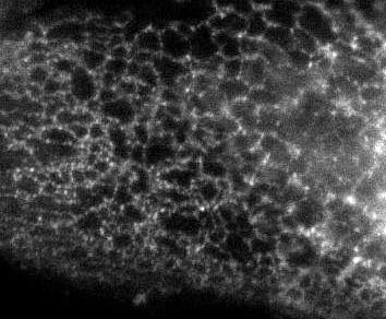
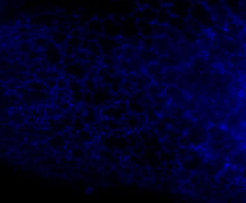


You're thinking, well it isn't so bad ... but in a journal article these images are usually scaled down ... lets do that.
Besides the blue & red pic, they're still not too shabby ... but go ahead and print these 4 images and all detail will be lost in the red and blue images. Greens tend to fair a bit better, but the black and white will be just fine and clear. Yes clarity is the aim of data presentation, not pretty pictures.
Color is really only useful for colocalization.
You need to adjust the contrast.
Thanks for that - had no idea!
But isn't the whole point of colour to help visualize co-localization? Otherwise, i agree that grayscale is much better for visualizing the location of a single protein.
Yours is a great example of useless uses of coloring.
Thanks. I'll use this to beat people over the head to get the point across.
I don't quite get your point. Who would render a single-dye micrograph in color? I have never seen that in any journal (except maybe if the authors show the single channels in addition to the overlay picture). Are you suggesting that co-localization images should be printed in b/w ?
I must say that I also don't quite follow your argumentation using the human eye's capabilities. Is it really true that in a printed paper (or more typical nowadays: a compressed PDF) the human eye is the limiting factor? I would rather guess that the print or the compression algorithm is limiting. Color images probably have a lower resolution than b/w images.
There's an alternative false-color option for colocalizations in which one tag is cyan, the other is, er, something else I can't remember, and the overlap is white. Not only does this render coloc images useful (rather than completely useLESS) to colorblind folks like me, I should think that even normal color vision would have an easier time distinguishing white from color than yellow from green.
The best solution, of course, is open data -- make the original digital files available as supplementary data. That way readers can render the images however they want to.
Something like 5-10% of men are red-green colorblind, including some key members of my own imaging-heavy lab; that's why we use "green + magenta = white" for co-localization overlays. I also find the yellow hard to tell from the bright green.
Colors are pretty, though.
It's funny, when I originally posted this, all the coments were about colocalization. When you present colocalization data you should always present each micrograph as a separate black and white image and a third panel with a grean/red or a green/magenta overlay of the two micrographs.