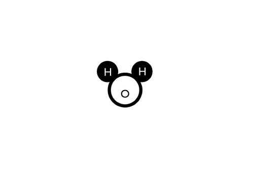
Recently used this graphic at a student conference opening, and it was met with a surprisingly good reaction. Weird how no matter how hard you look at this, you can't get past the Disney influence.
Mickey got some cool tattoos on his ears, didn't he?
I noticed that your bond angle isn't true to that of water - 104.5 degrees - so I made a truer image. It looks less like Mickey and more like an eye with two nasty cysts.
I'm a total killjoy. Sorry.
as a non-chemist i have a question - is there a 'right way' to draw water? why are the Hydrogens always on top instead of on bottom, or turned 90 degrees?
Hi Megan,
As Dave S. mentioned, the angle of the two H's are crucial in the correct visual connotation of H2O, but whether they are viewed up, down, sideways, any perspective really, is just a matter of choice.
I might add that most times, the atoms are represented in a way where the atoms are merged together, which again is technically the proper way to draw it out (this is because the "balls" usually denote both protons, neutrons and electrons in the atom, and since the electrons are whizzing around and occasionally being shared, there's spacial overlap).
Dave S: No worries on being a kill joy. Your image looks like a koala bear to me - I wonder if the "O" is nudged up slightly, whether it will default back to looking like Mickey.
It might just be my skewed perspective, but the H-on-top perspective seems upside down to me. I'm more used to seeing them on the bottom (as "legs"). -- Just checked "Biochemistry (2nd ed.)" by Garrett & Grisham - H on the bottom with a "wide stance".