
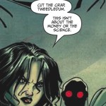
This appears to be from a graphic novel called The Unknown. But I happen to think it's the ultimate all-purpose illustration for every discussion of science policy ever.
I want it on a T-shirt!
via io9
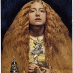
The Bridesmaid
1851
John Everett Millais
The Now Smash Of Style for Vogue Italia, via Haute Macabre
May 2009
Craig McDean
A quick note: remember I blogged about Crayon Physics a while ago? Well, Adrian wrote a massive review of the game at his blog. While he has reservations, he concludes,
Crayon Physics is worth more than a lot of other things you can buy for twenty American dollars, and it gave me days of genuine good fun, an outstanding aesthetic experience, one of the most inspired themes around, and the chance to exercise my own creativity in the level editor.
If you were interested in Crayon Physics, definitely check his review out.
OMG! This Chris Beckett story is totally about me!
You can read the title story of The Turing Test online, and it's well worth checking out. In a dystopian future, Jessica runs a gallery where art increasingly involves human body parts and is designed to shock and appall bystanders.
Now I have to go read it. . .
via iO9
Well, not really. Artist Carel Brest van Kempen timelapsed stills of an acrylic painting to show his work process. It's remarkable how quickly the anole comes to life!
I especially enjoy watching the glazes go on and come off - each time he blots out part of the painting, I think, "oh NO!" But that's because I work in watercolor, which is pretty near irreversible. Acrylic is much more forgiving.
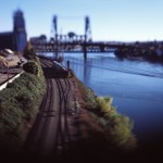
These eerie photos by Alin Dragulin are exactly why tilt-shift photos are sublime. The toy-like cars and buildings seem cute and nostalgic, but the lack of focus traps the viewer in a claustrophobic middle ground, with no idea what story is transpiring. And why does everything seem so still? It's like a childhood memory written by Stephen King.
I asked Alin if he used a digital tiltshift filter to create the Toyscapes, and he said:
The Toyscapes are taken with a 4x5 camera and traditional film. I shoot digital for much of my work but these series of photos MAKE me slow down and be still.…
This week, Nieman Journalism Lab is running a fascinating series of video interviews with the New York Times' R&D group on the possible future face of news media. I know - you're wondering why the supposedly financially moribund NYT is wasting money on nerds who play with Kindles. Who do they think they are, Google? But it might be a good strategy after all.
As Fortune and the Columbia Journalism Review recently pointed out, with outlets all around them slashing premium content (like science), the NYT's best strategy may be to instead become increasingly "elite:"
Meanwhile, the company is…
And if so, will it make us even stupider? Only one more week until we find out! This could be the datahead's ideal engine:
It'll tell you the family, genus, species, and caloric value of an apple, and it'll forecast Apple's stock price, but it won't give you apple pie recipes. It'll tell you the box office take of the first "Star Trek" movie, but it won't tell you the theater where you can see the newest "Star Trek" movie.But a technical audience is still big. This could unlock a lot of data that students, research assistants, lawyers, marketing managers, financial analysts, and scientists…
Over at his Discover blog, Carl Zimmer has asked readers to help choose a cover for his new non-majors evolution textbook. If you have a good eye for design, as I'm sure many BioE readers do, go over and help him pick the most appealing cover!
It's a hard choice, as so many design choices are. I'll leave my vote until after the fold so I don't prejudice you.
Okay; so I like all of them, but don't *love* any of them. My problem with the orchid, which I think is the most elegant and subtle design, is that it doesn't say "evolution" to me. It says "botany." Then it says "yawn." The minute I…

Okay, these dolls by David Foox are just plain disturbing. And they're not just a concept - you can actually BUY ONE.
Via Street Anatomy.
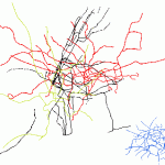
We all know some cities "feel" smaller than others. But this set of subway maps presented at the same scale makes the differences obvious.
Just for fun, I made this image layering four of maps from major world cities in red, black, gold, and blue. Recognize the cities? Answer after the fold. . .
Sizewise, the winner here is London, shown in red. New York, in black, is a close second. The much less complex gold-green pattern is Washington, DC - note that it only approaches the size of New York and London because of the long spindly commuter line reaching north into Maryland. And that dense…
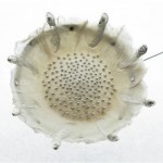
Long pin (detail)
Hand-made paper with cast silver seed inclusions and fine silver.
Sabrina Meyns
Irish artist Sabrina Meyns makes jewelry out of paper and silver. This piece may be less durable than your typical jewelry, but it's certainly more robust than the fragile poppies it mimics, and the translucency and delicacy is breathtaking. Unfortunately, her site only has a few examples of her work, but hopefully we'll see more of her in the future.
Via Daily Art Muse
An interesting perspective from education professor John Kitchens:
President Obama, you must understand that mandating standards without equitable funding creates punitive systems of education, and current forms of high-stakes testing too often pit student against student, and eventually citizen against citizen. The struggling economy will likely renew the sense of competition and education for the sake of occupational gain, while a sober look at the number of jobs available in the near future will reveal the futility of these motivations. However entrenched these ideas about education are in…
You've probably already heard that Merck and Elsevier are being called on the carpet for producing a medical "journal" - Australasian Journal of Bone and Joint Medicine - that appeared to be peer-reviewed, but was actually a marketing ploy to encourage doctors to prescribe Merck drugs. Ouch.
Elsevier told The Scientist,
"Elsevier acknowledges the concern that the journals in question didn't have the appropriate disclosures," the statement continued. "It is worth noting that project in question was produced 6 years ago and disclosure protocols have evolved since 2003. Elsevier's current…

The Lady of Broken Hearts
Natalie Shau
Lithuanian artist Natalie Shau works in digital media, mostly using Photoshop. You can see more of Shau's work at her website and at the website of jewelery designer Lydia Courteille, for whom she illustrated a cabinet-of-curiosities themed ad campaign. hat-tip: Haute Macabre.

Some Kansas State University geographers have come up with some interesting maps of the US that purport to show the national distribution of the seven deadly sins. Obviously they can't gauge "sinfulness" directly, so they're using proxy data - such as STD infection rate to measure lust (above).
It's a fun thought exercise to assess the pros and cons of the various methodologies for measuring each sin. Consider greed, which was (as described in the Las Vegas Sun) calculated by comparing average incomes with the total number of inhabitants living beneath the poverty line. How does that…
Following up on my previous post about visual illusions, reader Jake alerted me to this story from the BBC:
A design student made a battered old Skoda "disappear" by painting it to merge with the surrounding car park. Sara Watson, who is studying drawing at the University of Central Lancashire (Uclan), took three weeks to transform the car's appearance.
Note that like a trompe l'oeil painting in a building, or an anamorphic projection, the perspective work on the car will only allow it to "blend in" seamlessly when seen from a specific vantage point - which might be why we only have one…

The Ambassadors, 1533
Hans Holbein the Younger
In the artistic technique called anamorphosis, an object is depicted in distorted perspective, so that the viewer has to take special action, like looking from a specific angle, to see the "correct" image.
The most famous example of anamorphic painting is Hans Holbein's The Ambassadors (1533), a double portrait in which the illusion of highly detailed reality is fractured by a blurred grey streak superimposed across the painting's bottom third. If one stands at an acute angle, close to the painting, the blurred streak resolves itself into a…
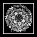
Medallion
Al Teich
Al Teich's photographs are explorations of symmetry and rhythm that resemble snowflakes, diatoms, or pollen grains. His method fuses old and new technologies: he photographs kaleidoscopes with a digital camera, incrementally moving them to adjust the image. Teich told the Washington Post, "The images are very beautiful but transient. There is an infinite variety of them, but they disappear when you turn the kaleidoscope." Teich, who has a bachelor's degree in physics and a PhD in political science, says "scientists see and enjoy beauty in many things - in science, of…
I was recently reading A Scientist's Guide to Talking With the Media, a useful and clearheaded book by Richard Hayes and Daniel Grossman of the Union of Concerned Scientists. Emphasizing the importance of science outreach, Hayes and Grossman praise the pop-sci luminaries who followed in the footsteps of Carl Sagan:
With his intriguing investigations into the activities of everyday life, Fisher joins a distinguished fraternity of public scientists that includes Barry Commoner, Jared Diamond, Sylvia Earle, Paul Erlich, and E.O. Wilson. These are some of the most famous of the hundreds of…