Paul Krugman tunes out the noise:
Temperature is a noisy time series, so if you pick and choose your dates over a short time span you can usually make whatever case you want. That's why you need to look at longer trends and do some statistical analysis. But I thought that it would be a good thing to look at the data myself.
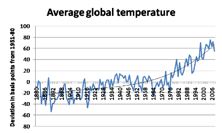
So here's the average annual global temperature since 1880, shown as .01 degrees C deviation from the 1951-80 average.
What this tells me is that annual temperature is indeed noisy: there have been many large fluctuations, indeed much larger than the up-and-down in the last decade or so. But the direction of change is unmistakable if you take the longer view. The fitted line in the figure is a 3rd-degree polynomial, but any sort of smoothing would tell you that there is a massive upward trend.


You neglected to mention your data sources.
You should consider that satellite data (only available since the late 1970's) shows a far smaller trend than the spike in your data set. In general sea surface temperature measurements also show far smaller increases for that period than land surface measurements, even though they tended to match before the 1980's.
There is fairly concrete evidence that the upgrades started in the early 1980's to the land surface temperature measurements have corrupted those trends, and that some combination of the sea surface temperatures and satellite measurements provides a more accurate dataset.
To me that data looks sinusoidal with a forcing function. That is to say, the real warming trend is given by peak-to-peak and trough-to-trough lines, not by a polynomial fitting.
So taking those 1892 and 1916 lows, and drawing a trend line to the 1964 and 1976 lows, shows the global warming trend. Not as scary that way, but more accurate.
Krugman has a started a very dubious trend of oversimplifying complex problems with 'fits'. My professor for numerical linear algebra when talking about errors in fits used a terrible fit Krugman used in a blog earlier this year. This one is right up that alley.
More than that, if it were a third order polynomial, we would expect the temperature to go into a dramatic rise now, despite all other predictions disagreeing with such a statement. What physical process would drive a third order rise in T with respect to time?
Here. is another example of Krugman misusing a 'fit'. Where's the R^2?
This is, in fact, the same graph my professor used to illustrate the point that because a fit can be made does mean that it is a good idea to do such a fit. Especially in the case from this February blog where the density of data points would have proven Krugman's argument anyway.
The data source cited by Krugman was NASA's Goddard lab, at http://data.giss.nasa.gov/gistemp/graphs/, which offers a number of other ways to view that and related data.
As to whether Krugman is oversimplifying this: Whether he's done so with other matters in the past doesn't speak to whether he's done so here. He may or may not have picked out the most dead-on unassailable graph to make his point. But the point seems sound enough: Look at the long trend as best you can, and you shall be -- or should be -- alarmed.
Duncan | June 29, 2009 10:06 AM:
Satellite data.
You're welcome.
llewely,
danke.
dave