Artists & Art
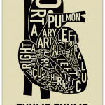
As a fan of maps, typography, and anatomy, I think this is a pretty sweet mashup.
From orkposters.com via Street Anatomy.

Japanese graphic designer Takashi Okada (hybrid graphic) does awesome things with black and white, digital ink and typography. Like this awesomely cryptic video clip, or this one.
Via NotCot and flylyf.

Evolve
Electroformed Copper, Vitreous Enamel, Sterling, Pearls, Lens, Feathers, Steel, Worm
Photo: Courtney Frisse
Last week I featured electroformed copper pendants by Kristina Glick Shank. I also found another outstanding electroformed copper artwork, this one by Kristin Mitsu Shiga. I think it's a wonderful idea to portray a chrysalid, the very symbol of transience, in metal - one of the most permanent materials possible. I am sorry it's titled Evolve - I don't love it when the concept of evolution is conflated with the concept of individual development. But this piece is so interesting…
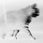
"The cat has too much spirit to have no heart."
Quote by Ernest Menaul, via A Blog Around the Clock
Chromogenic print by Hirsch Perlman: An Animus Cat Antagonist, 2008. Via 3quarksdaily.
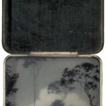
Los Angeles Electric Isle
Brooks Salzwedel
Brooks Salzwedel's solo show opened May 16 at the Tinlark Gallery.
The artist works in layers of graphite and translucent resin, which create an especially nice effect in vintage tins. Imagine if you picked up a rusty old tin on an abandoned worksite or in an old mining town, opened it, and found someone's half-remembered memory inside - gradually accreted there like candle wax. Salzwedel's work is a little like that.
Little Anacin Tin
Brooks Salzwedel
High Forest Tin
Brooks Salzwedel
Broken Wires
Brooks Salzwedel
Via NOTCOT
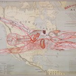
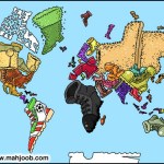
Another fabulously weird map, from the great blog Strange Maps. This one is entitled "The Man of Commerce" and dates to 1889.
According to the American Geographical Society Library,
The highly detailed 31" x 50" map/chart conflates human anatomy with the American transportation system, in an apparent attempt to promote Superior as a transportation hub.Its metaphor makes West Superior "the center of cardiac or heart circulation"; the railways become major arteries; and New York is "the umbilicus through which this man of commerce was developed."The explanatory notes conclude: "It is an…
I have a feeling that this is what Isis sees when she looks at a map. Only with sexier shoes, of course.
From one of my new favorite blogs - Strange Maps. Thanks to Jake for the find.
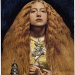
The Bridesmaid
1851
John Everett Millais
The Now Smash Of Style for Vogue Italia, via Haute Macabre
May 2009
Craig McDean
Well, not really. Artist Carel Brest van Kempen timelapsed stills of an acrylic painting to show his work process. It's remarkable how quickly the anole comes to life!
I especially enjoy watching the glazes go on and come off - each time he blots out part of the painting, I think, "oh NO!" But that's because I work in watercolor, which is pretty near irreversible. Acrylic is much more forgiving.
These eerie photos by Alin Dragulin are exactly why tilt-shift photos are sublime. The toy-like cars and buildings seem cute and nostalgic, but the lack of focus traps the viewer in a claustrophobic middle ground, with no idea what story is transpiring. And why does everything seem so still? It's like a childhood memory written by Stephen King.
I asked Alin if he used a digital tiltshift filter to create the Toyscapes, and he said:
The Toyscapes are taken with a 4x5 camera and traditional film. I shoot digital for much of my work but these series of photos MAKE me slow down and be still.…
This week, Nieman Journalism Lab is running a fascinating series of video interviews with the New York Times' R&D group on the possible future face of news media. I know - you're wondering why the supposedly financially moribund NYT is wasting money on nerds who play with Kindles. Who do they think they are, Google? But it might be a good strategy after all.
As Fortune and the Columbia Journalism Review recently pointed out, with outlets all around them slashing premium content (like science), the NYT's best strategy may be to instead become increasingly "elite:"
Meanwhile, the company is…
Over at his Discover blog, Carl Zimmer has asked readers to help choose a cover for his new non-majors evolution textbook. If you have a good eye for design, as I'm sure many BioE readers do, go over and help him pick the most appealing cover!
It's a hard choice, as so many design choices are. I'll leave my vote until after the fold so I don't prejudice you.
Okay; so I like all of them, but don't *love* any of them. My problem with the orchid, which I think is the most elegant and subtle design, is that it doesn't say "evolution" to me. It says "botany." Then it says "yawn." The minute I…

Okay, these dolls by David Foox are just plain disturbing. And they're not just a concept - you can actually BUY ONE.
Via Street Anatomy.
Long pin (detail)
Hand-made paper with cast silver seed inclusions and fine silver.
Sabrina Meyns
Irish artist Sabrina Meyns makes jewelry out of paper and silver. This piece may be less durable than your typical jewelry, but it's certainly more robust than the fragile poppies it mimics, and the translucency and delicacy is breathtaking. Unfortunately, her site only has a few examples of her work, but hopefully we'll see more of her in the future.
Via Daily Art Muse

The Lady of Broken Hearts
Natalie Shau
Lithuanian artist Natalie Shau works in digital media, mostly using Photoshop. You can see more of Shau's work at her website and at the website of jewelery designer Lydia Courteille, for whom she illustrated a cabinet-of-curiosities themed ad campaign. hat-tip: Haute Macabre.
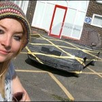
Following up on my previous post about visual illusions, reader Jake alerted me to this story from the BBC:
A design student made a battered old Skoda "disappear" by painting it to merge with the surrounding car park. Sara Watson, who is studying drawing at the University of Central Lancashire (Uclan), took three weeks to transform the car's appearance.
Note that like a trompe l'oeil painting in a building, or an anamorphic projection, the perspective work on the car will only allow it to "blend in" seamlessly when seen from a specific vantage point - which might be why we only have one…

The Ambassadors, 1533
Hans Holbein the Younger
In the artistic technique called anamorphosis, an object is depicted in distorted perspective, so that the viewer has to take special action, like looking from a specific angle, to see the "correct" image.
The most famous example of anamorphic painting is Hans Holbein's The Ambassadors (1533), a double portrait in which the illusion of highly detailed reality is fractured by a blurred grey streak superimposed across the painting's bottom third. If one stands at an acute angle, close to the painting, the blurred streak resolves itself into a…
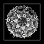
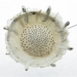
Medallion
Al Teich
Al Teich's photographs are explorations of symmetry and rhythm that resemble snowflakes, diatoms, or pollen grains. His method fuses old and new technologies: he photographs kaleidoscopes with a digital camera, incrementally moving them to adjust the image. Teich told the Washington Post, "The images are very beautiful but transient. There is an infinite variety of them, but they disappear when you turn the kaleidoscope." Teich, who has a bachelor's degree in physics and a PhD in political science, says "scientists see and enjoy beauty in many things - in science, of…
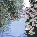
Circling Around, 2008
Jean Gumpper
Jean Gumpper's woodcut prints are mesmerizing. At first glance, the crisp edges and intricate detail are reminiscent of watercolor. But the works are actually pieced out of flat spots of block color, which gives them a stylized, minimalist, modern flavor - like gallery-quality IKEA. The final effect is one I've sometimes seen in quilts: the flatness of the colors and starkness of the edges combine to generate a sparkle and clarity in the complete piece, an illusion of motion through a brightly lit space.
From the artist's statement:
In my work as an…
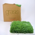
Check out this concept artwork called "Office Grass". What is it good for? Well, for one thing, to patch its apparently coincidental inverse artwork, "Dead Pixel in Google Earth:"