ephemera
The UK History of Advertising Trust has initiated a ghostsigns archive to document old painted billboards - the kind you see on the sides of brick buildings, fading away unnoticed. These old signs are being destroyed daily (by gentrification, new construction, and new billboards being put over them), and very few new ones are being created (for an example, see my previous post on the artists behind the Stella Artois mural in NYC).
Unfortunately, preserving such signs permanently is difficult - and, some argue, not even desirable:
The core dilemmas are that they are not architectural…
As I mentioned last week, I spent yesterday on a panel/in a workshop at Harvard's Kennedy School, "Unruly Democracy: Science Blogs and the Public Sphere." It was an excellent day - I met many interesting people and had some great conversations. Plus, I got to meet Dr. Isis in the flesh! Woohoo! Thanks to the Intersection's Chris Mooney and everyone at the Kennedy School's Science and Technology Studies program for putting on such a great event.
Obviously, I can't speak for all science bloggers, and I didn't even try. But what I did endeavor to convey in my brief talk was the difficulty of…
An urban art installation proposal by Nick Rodrigues would install sculpted pigeons in Cambridge, MA, each equipped with a "pico projector" that would project a live Tweet stream. According to the Artsake blog,
"Gossiping Birds" is a proposal by Nick Rodrigues (MCC Sculpture/Installation Fellow '07), one of ten artists chosen as finalists for a Public Art Commission in Cambridge, an initiative of the Cambridge Arts Council. The project called for site-specific public art proposals for the Cambridge Street Corridor, a one-mile stretch from Inman Square to Lechmere that spans three distinct…
Yesterday was a great day for space images. First, celebrating Hubble's 20th anniversary (via Wired):
This craggy fantasy mountaintop enshrouded by wispy clouds looks like a bizarre landscape from Tolkien's "The Lord of the Rings" or a Dr. Seuss book, depending on your imagination. The NASA Hubble Space Telescope image, which is even more dramatic than fiction, captures the chaotic activity atop a three-light-year-tall pillar of gas and dust that is being eaten away by the brilliant light from nearby bright stars. The pillar is also being assaulted from within, as infant stars buried inside…
The Anachronism (Full Film) from Anachronism Pictures on Vimeo.
The full length version of The Anachronism, a short film by Matthew Gordon Long, has been released online. The only thing wrong with it is that it isn't longer. Give yourself a treat this weekend, enjoy the steampunk, and, if you're like me, reminisce about taking a textbook out into the forest to name things in Latin! I'll just give you one warning: this is a filmmaker who, unlike many others, knows how to let a mystery rest undisturbed. Yes, the film leaves you curious as heck, but in the end, I think that's a much better…
Artist Balint Zsako does remarkable things with collage and biological/anatomical imagery. By embellishing his classically posed subjects with a plethora of arms, swaddlings of restrictive clothing, or provocatively opened fruit, he plays with our expectations: portraits become faceless, the suggestively private becomes public, and old-fashioned art becomes new again.
Whether it's we viewers stealing glimpses into bodies or between draperies, birds stealing seeds, or grasping hands matched perfectly to exogenous limbs, fruit, or instruments, Zsako's feverish imagery makes the very process…
Yes, they can! At least Tim Knowles thinks so: he attaches pens to the ends of branches and lets them doodle in the wind, like botanical spirographs.
Knowles says, "Like signatures each drawing reveals the different qualities and characteristics of each tree." It sounds cheesy, but it's true - the drawings really are distinct, and do capture something of the fluidity of a tree in the breeze.
Knowles' body of work is all about distinctive vectors and paths: he also did a series of "Vehicle Motion Drawings", and his "Postal Project" traces, seismograph-like, the movements of a package in…
That's what I said - you can print skin. Not print on skin, print the skin itself, cell layer by layer. Bioprinting custom skin grafts means you can customize a graft's depth to treat severe burns - using the patient's own cells to avoid rejection.
Kudos to whomever came up with this idea. Seriously: this is bio-DIY to the max. Wow!
Via Armed With Science.
Update: Jason at the Thoughtful Animal just sent me a 2008 minireview on this process by Henmi et al, "New approaches for tissue engineering: three dimensional cell patterning using inkjet technology." It appears to have been sponsored…
WTF! My boyfriend, an astrophysicist, says the Sun "does this all the time." I am going to hide under my bed now until I die.
A recommendation from reader Calle: a time-lapse view of a Rocky Mountains park over a year, accompanied by sound bytes from the news. Occasionally pretty eerie.
News, Weather & Sports - a year long time-lapse documents the seasonal changes and the recreational activities of visitors to a public park. This is a preview clip of a looping video art project by Dan Hudson (www.danhudson.ca). Location: Canmore, Alberta, Canada. Music: Chris Jennings. Support: Canada Council for the Arts.
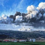
Via talking points memo, an amazing photo gallery of the Icelandic volcano causing so much disruption in Europe's airspace.
photo credit: Newscom/Zuma
Update: More amazing photos here.
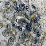
Memento 2.9, 2009
Alan Bur Johnson makes delicate clustered sculptures that consist of transparencies in silver frames mounted on dissection pins: "The installations resemble haiku in their enchanting, simple grammar - and, like precise syllables come to luminous life as each framed, wing-like component flickers independently in the wake of an exhalation or current of air passing through the room." (source).
Much of the fragmented imagery Bur Johnson uses in his transparencies (honeycomb, dragonfly wing venation, segmented legs) is insectoid, and the pieces are correspondingly loose,…
This is. . . .
A. A ghost.
B. The computer reconstruction of the structure of mammoth globulin.
C. The moon reflected on a river in England.
D. A new iPad app that lets you blow virtual smoke rings.
E. A newly discovered deep-sea jellyfish.
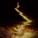
It's actually C, a ghostly photo of the moon taken by Tim Knowles. See more of his work at his website.
In this TED clip, Natalie Merchant sings haunting arrangements of old poetry from her new album, Leave Your Sleep (2CD). If you have limited time, skip ahead to about 8:00 for the beautiful ee cummings poem "maggie and milly and molly and may", followed by the gently rebellious "if no one ever marries me" by Laurence Alma-Tadema (who never did marry), and then "Margaret" by Gerard Manley Hopkins.
I'd forgotten how moving Merchant's voice is. I'll definitely be ordering this one when it's released.
Watch an interview with Natalie Merchant about this project at Granta.
Something I ran across by accident, while perusing our latest copy of Issues in Science and Technology: currently, the National Academies are sponsoring a Visual Culture and Evolution Online Symposium. It runs through Wednesday. What that means, apparently, is their panelists discuss the intersection of design, art, and culture with evolutionary biology concepts (sexual selection, genetics, adaptation, etc.) at a blog set up for the purpose.
The blog is basic (generic template), and a bit confusing. What seems to be happening is that panelists' ongoing contributions are folded into the posts…
I perversely love attending conferences where traditional journalists complain that bloggers are evil. :) Yesterday I heard that line again (in jest, relax) at a great discussion about changing media practices and the legal implications of various forms of content reuse, sponsored by the Online Media Legal Network. But the focus was a little bit different: are "new media" practices really that new? Historians know that almost two centuries ago, rival newspapers reprinted one another's content freely - often with snarky commentary, and nary a licensing fee or permission. Fact-checking fell by…
A fun poster by editorial artist Harry Campbell (you've no doubt seen his work in the NYT and elsewhere). Love the cut-aways and perspective changes - it reminds me of a children's book.
C.B., circa 1708: "These color circles, from a 1708 edition, are the earliest published examples of Newton-style color circles in an artist's manual."
Moses Harris, 1766: "Mimicking the spread of light from a source, Harris places the pure colors at the center of his circle and the lightest at the outer edge."
Schiffermuller, 1772: "Like many others with the same goals, he assumed that there is a knowable natural order to color, one that would confirm the relationship among all forms of knowledge."
More quotes and images from Sarah Lowengard's e-book The Creation of Color in 18th Century…
One of my fave April Fools' spoofs this week: Groupöupon, the high-end version of Groupon for the aesthetically pompous:
Make sure that your arms telegraph style and success with this indulgent line of Premium Sleeves designed by Fourth World, the designer brand renowned for combining the uncanny fashion sense of the first world's most impressive designers with the laser-like focus of third-world craftsmanship. Choose any of the extravagant materials from Fourth World's list, including ostrich neck, baleen, pressed toucan beak, snakeskin (heated), and mane. With each purchase, Fourth World…
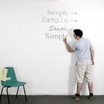
You may have heard from Slashdot that the University of Wisconsin is switching from Arial, a sans-serif font, to Century Gothic, a serif** font that uses 30% less ink, for default printing. The university hopes to save ink, which is both thrifty and eco-friendly. But you may not have seen this art project by Matt Robinson and Tom Wrigglesworth: they used ballpoint pens to scribble large-scale test versions of various fonts on a wall, and the ink level afterward was an analog readout for which font uses more ink. Ingenious!
Word to the nitpicky: while there's no rule that a sans-serif font…


