design
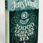
Jim Tierney designed a beautiful set of covers for some of Jules Verne's most famous works. The project was carried out as part of his senior year thesis.
He says:
I'm a big Verne fan, but a chance to re-design any classic book is always exciting. Classics usually allow for a more personal interpretation, since most people are already vaguely familiar with the premise of the books, and I didn't have to compete with one well-known cover, as I might have with a more recent book.
You can see the full set on the Faceout website.
A few thoughts on this ad I spotted last week in Boston:
1. Yes, that appears to be a giant gel electrophoresis. Geez, this town is nerdy.
2. I hope that attractive woman is supposed to be a genetics PhD. Because we're all supermodels.
3. Why didn't I ever think to do a random restriction digest and blot on my own DNA back when I was in the lab 18 hours a day, so I could false-color it in Photoshop, hang it above the mantel, and brag about my trendy home decor? Bah! I suppose maybe there were rules about that sort of thing.
4. The loft development website asks, "What's your design DNA"?…
Mark Goetz makes me LOL:
Via lots of places, most recently Pollster.
Won't the dismal, subdued palette of winter release its hold on you? Never fear, a stripe of spring magenta is approaching! This infographic by Fernanda Viagas and Martin Wattenberg of HINT.fm depicts the dominant colors in flickr photographs of Boston Common around the year, starting with summer at the top:
It makes me wonder what similar graphics would look like for other geographic regions - or even for flickr photos in general across continents or hemispheres. Would seasonal trends be detectable? Do we compensate for the dismal palette outside by photographing lots of technicolor…
Polly Law's Word Project is a series of mixed-media illustrations representing obscure words like dasypygal and nidifice. Though Law has exhibited her work in galleries, she hasn't found a backer to publish them as a book. . . yet. So she's seeking help at the entrepreneurial startup Kickstarter.com:
The Word Project book will be a soft cover, 10"x10". Each piece will get its own spread accompanied by its meaning, pronunciation & an example of use. Since 2002 I have been raiding the attics, basements and dusty cupboards of the English language in search of intriguing, odd & obscure…
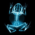
Delicious - and suprisingly convincing - x-ray images of animals with "skeletons" made of typography by Katerina Orlikova. Be sure to check out _Motion Picture, a running cat-like creature reminiscent of Eadweard James Muybridge's vintage motion photography.
Via Street Anatomy.
Print Magazine asked four designers to storyboard their own versions of Alice. I kind of like this script-rich lowbrow fantasy, with an anime-inspired Alice by Sebastian Onufszak:
In his seminal 1991 essay, "The Work of Art in the Age of Digital Reproduction," the video artist Douglas Davis writes that digital bits "can be endlessly reproduced, without degradation, always the same, always perfect."
This is different, Davis argues, from analogue information. In the past, copying an audio signal -- for example, dubbing a copy of a cassette tape -- always involved an unpredictable loss of clarity, which Davis compares to waves washing on a beach, always breaking slightly differently. But "digital bits, compatible with the new generation of tools that see, hear, speak,…
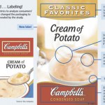
Campbell's is redesigning their iconic red-and-white soup packaging. Why? The answer's in your brain - or so they think:
Campbell's said traditional customer feedback wasn't telling the company why soup sales weren't doing so hot. "A 2005 Campbell analysis revealed that, overall, ads deemed more effective in surveys had little relation to changes in sales," the WSJ says.So they turned to "science." Campbell's hired Innerscope Research Inc. to conduct tests on a whopping 40-person sample to see what design elements produced the most "emotional engagement."The team clipped small video cameras…
The Evolution of Life in 60 Seconds is an experiment in scale: by condensing 4.6 billion years of history into a minute, the video serves as a self-contained timepiece. Like a specialized clock, it gives a sense of perspective. Every eventâ--âfrom the formation of the Earth, to the Cambrian Explosion, to the evolution of mice and squirrelsâ--âis proportionate to every other, displaying humankind as a blip, almost indiscernible in the layered course of history. This is useful, largely, for the sake of humility.
Each event in the Evolution of Life fades gradually over the course of the minute…
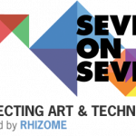
Feb 23rd (tomorrow) is the last day to snag advance tickets to the Seven on Seven conference in NYC:
Seven on Seven will pair seven leading artists with seven game-changing technologists in teams of two, and challenge them to develop something new --be it an application, social media, artwork, product, or whatever they imagine-- over the course of a single day. The seven teams will unveil their ideas at a one-day event at the New Museum on April 17th.
If you go, let me know how it is!
The future potential of synthetic biology is usually discussed in terms of applications in fields like medicine, food science, and the environment. Genetically engineered life forms are being designed to make medicines cheaply, to target tumor cells, to make more nutritious food, or to make agricultural plants that are easier to grow with less of an environmental impact, to clean up pollution or produce sustainable biofuels. What if synthetic biology systems were instead designed for use in culture or entertainment?
David Benqué, a student in the Design Interactions program at the Royal…
It literally took me a good 20 seconds to figure out what was. . . off. . . about the first photo in this great post by Emily at SheChive. Sigh. ;)
Thanks to Jake for the heads-up!
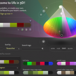
Those of you who like to play with color may be interested in the newColoRotate interface, designed to make editing color palettes more intuitive. This tool was produced by the same team that made the useful educational website Causes of Color, which I've blogged about before. It explains the differences between iridescence, interference, luminescence, etc. in simple language easy for nonscientists to understand.
There's a quick demo video of the ColoRotate Photoshop plugin below the fold.
Synthetic biology is still a new field, and victories are small and incremental. Much of the promise and peril of synthetic biology still lies in the future: genetic devices made to order, computer aided genome design, organisms specially constructed for specific industrial purposes. Will we use this biological technology for good--new more affordable and accessible drugs, better vaccines to emerging diseases, and clean energy--or evil--new deadly pathogens and immortal super soldiers? I think it's safe to say that almost everyone hopes that we'll get all of the good stuff without any of the…
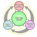
An interactive flowchart/concept map from Berkeley's Understanding Science project. Click around a while, and tell me what you think of it. Accurate? Too simple? Useful?
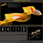
Modeling the flight of a bat (click to enlarge)
Dave Willis et. al., Brown University and MIT
Visual complexity is a paradox. On the one hand, complexity is a compelling feature known to capture a viewer's attention and stimulate interest. . . . On the other hand, complexity only arouses curiosity up to a point. When a visual is extremely complex, viewers may tend to avoid it altogether. -- Connie Malamed
I had a great time this weekend devouring Connie Malamed's oversized treasury of data visualization, Visual Language for Designers. The book couldn't be more appealing: it's like someone…
Why time goes slower when we get older
Rhonald Blommestijn
for Douwe Draaisma interview, Audi Magazine
Dutch graphic designer Rhonald Blommestijn's illustrations play with medical and technical themes in unexpected ways. Check out his blog, and his series of concept illustrations for the Netherlands Organisation for Scientific Research (NWO).
The Effect of Playstation on the Human Body
Rhonald Blommestijn
For Playstation Belgium
Rhonald Blommestijn
For the Netherlands Organisation for Scientific Research (NWO)
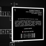
Another clever use of the periodic table in design: Washington State's Wines of Substance, who won Seattle Magazine's "Coolest Wine Label" Award in 2008.
According to Substance, "wine is as much an art as it is a science. What better way to express this basis than a Periodic Table of Wine with each varietal reflected as an element or substance?" Their interactive "periodic table" website is hardly scientific, but it does look pretty awesome:
In addition to looking all sciencetastic, Substance sponsors selected nonprofits - in January, 25% of all purchases go to Helpline Women's Shelter.…
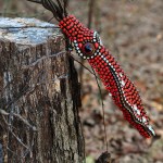
Here's one for PZ: the lovely proprietress of Sea of Shoes shares two stunning, huge jeweled cephalopod pieces by Paris-based jewelry team Hanna Bernhard. These are some seriously impressive wearables.
Many more photos at Sea of Shoes, plus a short interview with the artists.