Playing-With-Graphs
The topic of sports injuries is unavoidable these days-- the sports radio shows I listen to in the car probably spend an hour a week bemoaning the toll playing football takes on kids. Never a publication to shy away from topics that bring easy clicks, Vox weighs in with The Most Dangerous High School Sports in One Chart. You can go over there to look at their specific chart, which is drawn from a medical study of cheerleading; I don't find the general ordering of things all that surprising.
There was, however, one aspect of this that I found sort of surprising, namely the difference between…
A little while back, I used a photo of SteelyKid's toy Newton's cradle as the photo of the day, with a bonus video:
I mentioned that I was going to do some analysis of this at some point, but didn't have time right then. I had a bit of time to poke at this yesterday, though, so here's some physics making use of the normal-speed part of that video (I have another purpose in mind for the high-speed stuff; you'll need to wait for that).
The obvious thing to do with this is to plug it into Tracker and measure the position as a function of time. Here's a graph tracking the position of the two end…
A few years back, I did a couple of posts on the physics of a sad balloon (that is, a helium balloon that can no longer lift itself up to the ceiling), the first on simple buoyancy, the second on how long it takes for the helium to leak out. These were based on only a couple of data points, though, and it's always risky to extrapolate too far from just two points.
Of course, in a house with two kids, we have helium balloons show up with some regularity, and SteelyKid's birthday this year provided a bounty of them-- four shiny Mylar balloons, bearing cheerful images of Scooby-Doo, some cartoon…
Over at Wired, Rhett has a post providing mathematical proof that he takes too many photos. As is traditional, he includes homework at the end of the post, specifically:
Now it is your turn. Find the number of photos you have taken each year. Is it possible for you to detect changes in your life by significant changes in the image rate? Maybe you purchased a new phone or had a new addition to your family which resulted in an increase in images. That would be cool if you could see that in your data.
Well, I can't really resist a challenge like that, so I went looking at my own photo…
Yesterday's quick rant had the slightly clickbait-y title "GPAs are Idiotic," because, well, I'm trying to get people to read the blog, y'know. It's a little hyperbolic, though, and wasn't founded in anything but a vague intuition that the crude digitization step involved in going from numerical course averages to letter grades then back to multi-digit GPA on a four-point scale is a silly addition to the grading process.
But, you know, that's not really scientific, and I have access to sophisticated computing technology, so we can simulate the problematic process, and see just how much…

SteelyKid is spending a couple of days this week at "Nerf Camp" at the school where she does taekwondo. This basically consists of a bunch of hyped-up kids in a big room doing martial activities-- taekwondo class, board breaking, and "Nerf war" where they build an obstacle course and then shoot each other with dart guns. Which, of course, required the purchase of upgraded Nerf weaponry, as seen in the "featured image" above.
This thing fires darts at a fearsome speed-- they hit the ceiling with really loud "thwack" that was a huge hit with both kids. Of course, you know what's coming next,…
When I was writing up the state of blogging post last weekend, I thought about pulling together a Top Ten Posts thing, but didn't have time. also, Google analytics moved a bunch of stuff since the last time I used it, so I had a hard time locating the right options. Having tracked it down, though, I give you the ten highest-traffic blog posts from 2014, with the year of posting in parentheses, and the fraction of the total pageviews for the year that the post racked up, according to Google Analytics:
How Do I Kill the Squirrels who Are Eating My Car? (2010) 15.2%
Why Does Excel Suck so Much…
There was a article in Scientific American about diversity in STEM collecting together the best demographic data available about the science and engineering workforce. It's a useful collection of references, and comes with some very pretty graphics, particularly this one, showing the demographic breakdown of the US population compared to the science and engineering fields:
Demographic breakdown of general population vs. science and engineering, from the Scientific American post.
This is a very professionally made graphic, but also misleading in the worst way. When I first looked at this, I…

Over at FiveThirtyEight, they have a number-crunching analysis of the number of papers (co)authored by women in the arxiv preprint server, including a breakdown of first-author and last-author papers by women, which are perhaps better indicators of prestige. The key time series graph is here:
Fraction of women authors on the arxiv preprint server over time, from FivethirtyEight.
This shows a steady increase (save for a brief drop in the first couple of years, which probably ought to be discounted as the arxiv was just getting started) from a bit over 5% women in the early 90's to a bit…
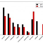
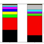
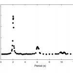
Over at Five Thirty Eight, Walt Hickey has a piece about cheerleading as a sport and injury rates, which is both a nice look at the way to use stats to measure the real danger level of an activity, and the sort of small details that can be teased out. The piece includes a table of injury rates for a wide variety of sports, seen above as the "featured image" and reproduced below. I don't really have anything much to say about cheerleading, but one thing did jump out at me from the table, leading to the question in the post title.
this table show concussion rates in competition and in practice…

Before going to the playground Saturday to investigate non-intertial frames, SteelyKid and I went over to campus to do some experiments in relativity. Galileian relativity, that is:
What you see here is SteelyKid sitting on a rolling lab cart with a camera bolted to it. She throws a ball up in the air a couple of times with the cart at rest, then I start pushing it across the room, and she tosses the ball a few more times. You can see from the video that, other than the motion of the background, the two cases look very similar.
This is a demonstration of the principle of relativity, which…
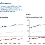
While I'm complaining about statisticulation in social media, I was puzzled by the graph in Kevin Drum's recent post about college wage gaps, which is reproduced as the "featured image" above, and also copied below for those reading via RSS. I don't dispute the general phenomenon this is describing-- that the top 10% of college grads earn way more than the average, and the bottom 10% way less, and somewhat less than high school grads-- but I'm baffled about what was done to generate this graph.
Specifically, I'm puzzled by the vertical axis, which is labeled "Real hourly wage (natural log)."…

As I've mentioned here before, I do a lot of work these days in my local Starbucks. This is slightly ironic, as I don't like coffee-- instead, I order tea, which I put in an insulated travel mug. I tend to get the tea, carry the mug back to the table, and let it steep while I boot up the laptop, then pull the teabags out. I get a hot water refill after I finish the first mug, and take it over to campus if I'm going in that day, and those generally carries me through the morning.
At some point, I noticed that when I had the cap on, I tended to end up with a small puddle of liquid next to the…

This year's "Flame Challenge" is to explain color in terms an 11-year-old can follow. I have opinions on this subject, a background in AMO physics, and access to scientific equipment, so I'm putting something together. In the course of this, though, it occurred to me to wonder how my different portable computing devices process color. And since I have access to an Ocean Optics USB4000 spectrometer, I can answer this question in more detail than anybody needs.
So, I have three principal electronic devices that I use to do computer-type things: a Moto X smartphone, an iPad, and a Lenovo…
There was a flurry of re-shares last week for this article about Yale shutting down a site that aggregated student course evaluations, which is fine as far as it goes, but repeats a stat that really bugs me:
About 43 percent of college letter grades in 2011 were A’s, up from 31 percent in 1988 and 15 percent in 1960, a 2011 study found. Over roughly the same span, the average amount of studying by people enrolled in college declined almost 50 percent, a 2011 study found, from 25 hours per week to 13 hours.
This is less bad than the usual, thanks to including the 1988 point, but it's still…

We spent this past weekend in Florida, visiting Kate's mom and her husband, who moved down there in October. This was a huge hit with the kids, who were very excited to fly on an airplane (four of them, actually, as we changed planes in Baltimore both ways). They also got a big kick out of driving around in a rental car-- The Pip chattered happily about "My new car" for a while-- which we did a lot of, going to a beach and the Mote Aquarium in Sarasota.
Doing all that driving in a rented SUV and a state with a 70mph speed limit got me thinking about optimum driving speed. Particularly on the…
There was some buzz Thursday about a poll showing that 40% of white people don't have any friends of a different race. Ipsos/Reuters include a spiffy "data explorer" where you can make graphs like the one above. It does not appear to provide an easy way to get at the actual wording of the question, which is kind of crucial, and thus renders most of the stories about it too vague to take all that seriously.
Of course, this is somewhat reminiscent of the gender bias story from a couple of weeks ago, where it was shown that single-gender physics departments are not a clear indication of sexism.…
Some time back, I spent a bunch of time writing a VPython program that simulated the motion of a pendulum, which turned out to do some strange things. In the comments to that, there were two things worth mentioning: first and foremost, Arnoques at #5 spotted a small error in the code that fixes the odd behavior noted in that post-- when I corrected it, the stretch needed to keep the pendulum swinging smoothly without oscillating in and out along the string was exactly what you would expect (the "factor" plotted in that earlier post is infinitesimally smaller than 1.0-- I got bored trying to…
After Thursday's post about sports and statistics, a friend from my Williams days, Dave Ryan, raised an objection on Facebook:
There's an unstated assumption (I think) in your analysis: that there is some intrinsic and UNALTERABLE statistical probability of getting a hit inherent in every hitter. If that is the case, then yes -- a hitter whose mean is .274 that hits .330 in the first half should, reasonably, be expected to regress towards the "true" outcome of .274 in the second half; and if the hitter winds up batting .330, it's a statistical outlier. But that ONLY applies if the underlying…

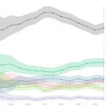
In which the skewing of a data plot in Ron Unz's epic investigation of college admissions makes me more skeptical of his overall claim, thanks to the misleading tricks employed.
------------
Steve Hsu has a new post on a favorite topic of his, bias against Asians in higher ed admissions. This is based on a giant article by Ron Unz that I don't have time to read, and illustrated with the graphic that's the "featured image" for this post (which I will also reproduce below for the convenience of RSS readers).
What does this show? There's a tangle of colored lines representing the fraction of…